Omnis Studio 11 provides a completely new IDE, new JavaScript components, and hundreds of other powerful new features, so developers are now able to build the next great customer solutions of the future more easily and in a much shorter time. In this blog post we’ll focus on the new JS components that you can use in your web and mobile apps built with Omnis Studio 11 – the following is only a summary, since you’ll find complete documentation for all the new features in the ‘What’s New in Studio 11’ guide (Whatsnew11.PDF) and in the online docs. All the new JS Components appear in the brand new Component Store that will appear when you create or edit JS Remote Form.
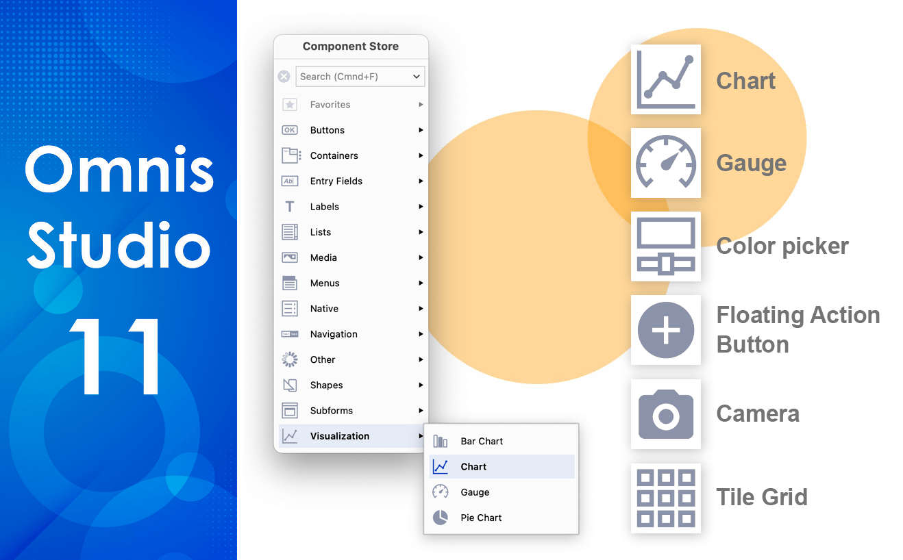
Component Store
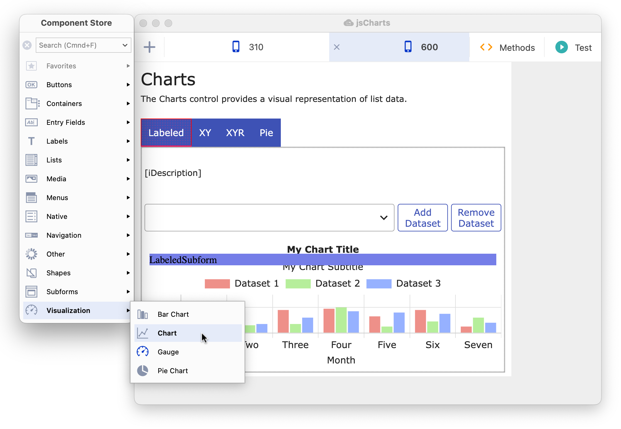
The Component Store has been completely redesigned and now appears in a vertical panel down the left side of the Remote form editor, with the components arranged in groups, such as Buttons, Containers, Entry Fields, and Lists; this provides a more compact layout than in previous versions where components were listed individually. The following screenshot shows a remote form in design mode and the Component Store is attached to the left side showing the Visualization group expanded, containing the new Chart and Gauge components.
When you open a Remote Form class to edit it, the Component Store is opened automatically and, by default, it is docked to the left side of the design window (see above). As you move a design window, the Component Store will remain docked and will move with it. You can Right-click on the Component Store to hide/show the labels and configure its layout and docking behavior.
JS Chart & Gauge Components
The new JS Chart component allows you to create different types of chart from list data to display in a remote form. It uses the open source JavaScript library Chart.js (available under the MIT license) integrated into the component, which provides a plethora of chart styles and combinations to represent 2D or multi-dimensional data, including the types: Line, Bar, Radar, Pie, Doughnut, Polar-Area, Scatter, and Bubble (see the new sample library in the Hub for all the types). The new Chart provides a modern interface for displaying list data, with scalable, vector based shapes and animated transitions, providing a great new UI for your web and mobile apps. As with other chart types in Omnis, the JS Chart control gets its data from an Omnis list variable, which should contain 2 columns, with each row in the list representing a complete dataset.
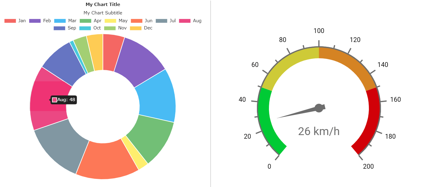
The new JS Gauge component provides a way to display numerical values on a Circular, Horizontal or Vertical linear scale, with options to customize the appearance and behavior of the gauge image and the scales – the value for the gauge is provided in the variable in $dataname, but the component provides a high-level of visual customization for the scales and range, including multiple colors in the range markers (see the example in the Hub).
JS Camera
The new JS Camera control allows the end user to capture images or scan QR codes and barcodes – this allows you to fully integrate image capture & scanning into your mobile apps, which can be applied to many different types of solutions such as manufacturing, retail, field research, or science. After returning a list of cameras and their IDs on the device, you can set the ‘camera action’ property to start the camera, capture an image, or start scanning, either a barcode or QR code. You can store the returned image or embedded information in a Character or Binary variable as appropriate.
JS Floating Action Button, Color Picker & Subform palette
The new JS Floating Action Button (FAB) features a round button that pops up a list of actions when tapped or hovered over, with the first option being a default action – the default icon is a ‘+’ but you can add your own such as an SVG icon. The FAB provides a modern button style to activate tasks in your web and mobile apps, for example, in a form displaying a list of contacts, you could use a FAB to provide options to add a contact (the default action), with further options to edit, call, or email a contact – this style of button is used in most modern email mobile apps.
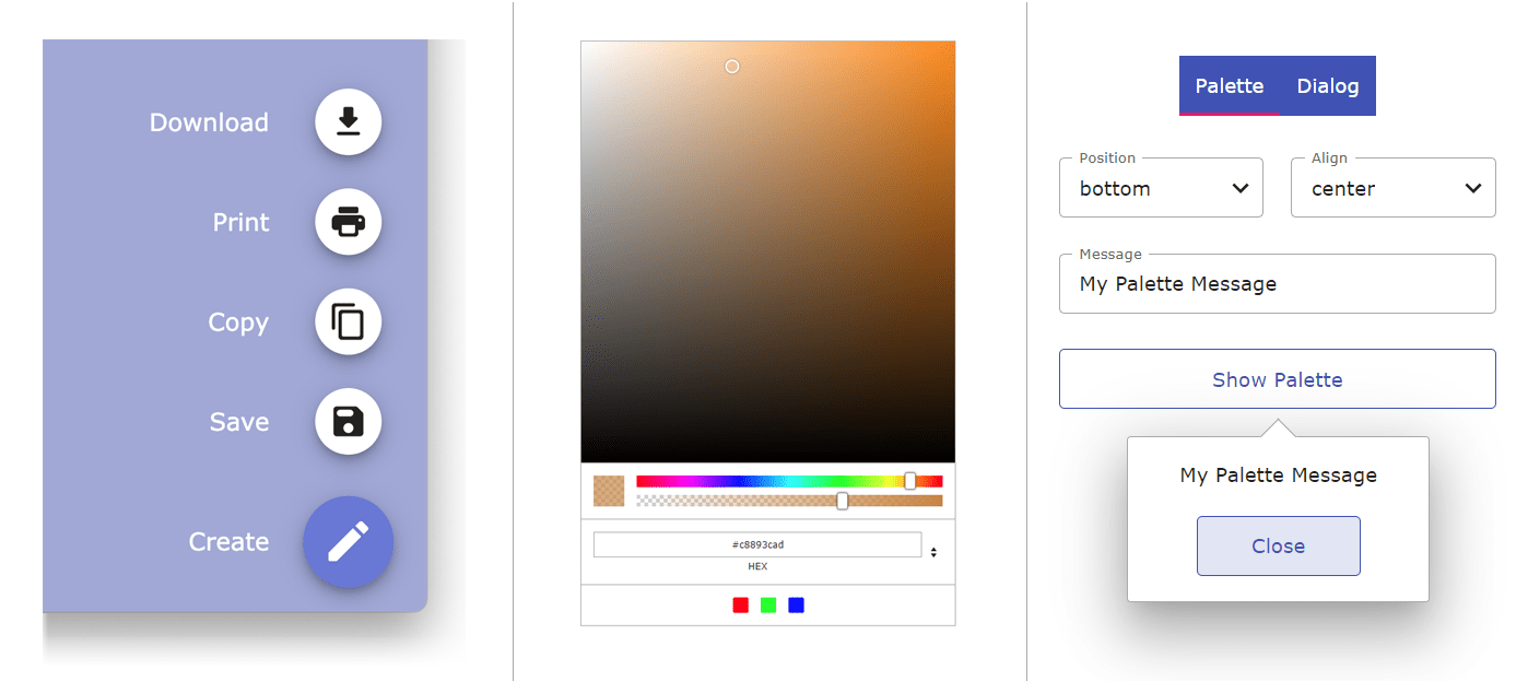
The new JS Color Picker allows the end user to select a color either by sliding a color slider and clicking on the color palette, or by entering a color number in RGB, HSL, or HEX format into the control (above center) – in addition, an alpha slider can be shown to allow the end user to select the transparency for the color. You can add a number of predefined color swatches to the color picker to allow the end user to select a preset color – for example, the color swatches could be colors defined in your corporate branding or colors that are in constant use in your app.
You can now popup a subform as a Subform Palette next to a specified control (above right). The subform could allow the end user to set an option, or you could provide some information such as a help tip. Subform palettes can be opened or closed using two new client commands, or a subform palette can be closed by clicking outside the subform.
JS Tile Grid Control and More…
The new JS Tile Grid control displays a scrollable grid of “tiles” which can be configured to show images, text and buttons. The layout of the grid and the visual attributes for the tiles are specified in a list variable assigned to the control, with each line in the list providing the definition for a single tile in the grid. The new Tile Grid example app in the Hub displays a number of tiles using images from the webshop example applet, which shows how the Tile grid can be used to provide a very visual selection or information grid for end users.
There are many more new components and enhancements to help you create web and mobile apps in Omnis Studio 11. These include the Scroll box which allows you to group several JS components together in a scrollable area, to produce a more compact UI for smaller screens.
A Side Panel is a vertical panel that can be displayed down the left or right side of a remote form (like a sidebar), containing clickable options, such as a menu of options or other content. Side panels are a common UI element in dashboard style designs and allow you to create a more interactive UI for your web & mobile apps.
Example Libraries and online Gallery
All of the new JS components are featured in the Samples section in the Hub in the new Studio Browser in Studio 11 – the same samples are included in the newly updated JS Component online gallery which is itself a Studio 11 web app.
To try out all the new components and other features in Omnis Studio 11, download a free 90-day trial version here: www.omnis.net/developers/free-trial/
Alternatively, existing users can contact the Sales office for their region to obtain details about upgrading to Studio 11. Please use the Contact us page: www.omnis.net/contact/
To view the new JS components online, visit the Component Gallery here: tinyurl.com/jsgallery11