Omnis Technical Note TNGI0031Nov 2020
Changing the style and color of Tooltips in Omnis
for Omnis Studio 10.2 or above
by Jeramy Jeffereis, US Customer Support and Consulting Services
Existing Tooltip Properties
Previously the tooltip section of the ’appearance.json’ file, in your Omnis Studio program files, had only two properties: colorinfobk and colorinfotext. These options would allow you to set the background and text color of the tooltip, which would then be drawn in the native style of your system. It is important to note that this tech note only applies to window classes and not JS Client applications.
New Tooltip Properties
In Omnis 10.2, we have added a total of four new properties to the tooltip section of the appearance preferences: systemstyle, tooltipbackgroundcolor, tooltiptextcolor, and defaultjustification.
The ’systemstyle’ property determines the style used to draw the tooltip. If set to true, tooltips will be drawn using the system style with ’colorinfobk’ and ’colorinfo-text’ being the background and text color respectively. If set to false, tooltips will be drawn using the Omnis style with ’tooltipbackgroundcolor’ and ’tooltiptextcolor’ being the background and text color respectively. This property defaults to true when left unset.
The ’defaultjustification’ property determines the default justification of the tooltip relative to the active area. It has three potential values, one for each justification: 0 for left justification, 1 for right justification, and 2 for center justification. If left unset, this property will default to left justification and if applying the default does not make sense for the object/class, it will be ignored.
The ’tooltippos’ property takes one of the following constants as an argument and uses it to determine where the tooltip appears relative to the control: kTooltipPosMouse, kTooltipPosRight, kTooltipPosBottom, kTooltipPosLeft, and kTooltipPosTop.
One other addition we’ve made is that tooltips of any style, Omnis or system, now fade in and fade out to provide the user with a cleaner interface for their applications. While the tooltip will always fade in, it will not fade out when it is immediately replaced by another tooltip.
Implementation
In this section we will walk through how to implement some of the new features available for tooltips in Omnis Studio 10.2 by way of demonstration. We will be using a window class to implement a push button that portrays the new features by switching between system style and Omnis style tooltips when clicked.
Setting Up The Library
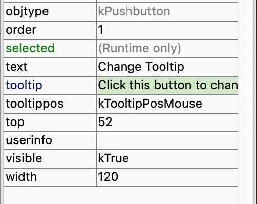
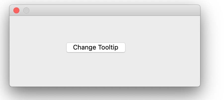
First create a new library, giving it any title you’d like, then create a window class in your new library and call it ’wMain’. Next, drag a pushbutton from the Component Store and drop it in the center of ’wMain’. We will utilize this button to demonstrate the new tooltip features. As such, use the Property Manager to assign the button object the following values for the following properties: assign ’switchButton’ to the ’name’ property, assign ’Change Tooltip’ to the ’text’ property, and assign ’Click this button to change the tooltip’ to the ’tooltip’ property. As you can see below, this should give us a button in the middle of the window class which we can now use to explore the new tooltip features.
Choosing Preferences
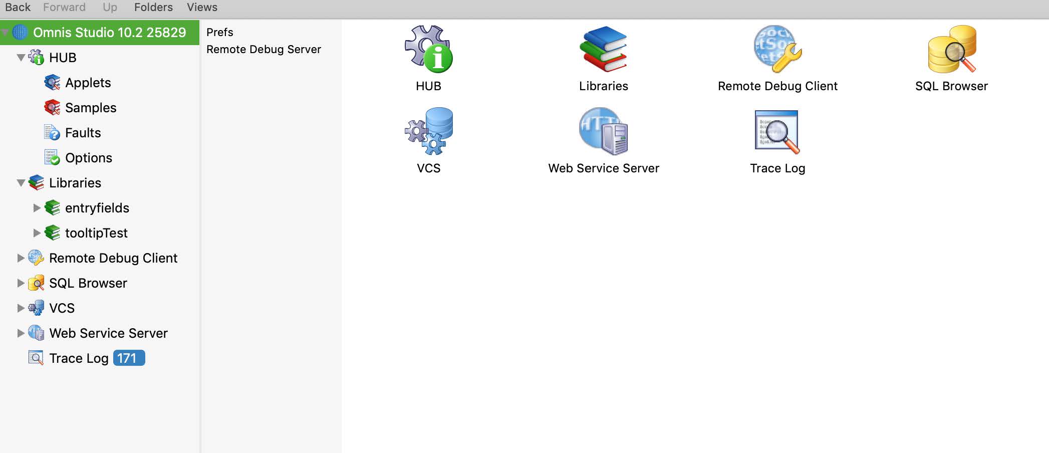
After this has been done, the next step is to assign values to these new properties through your preferences. To do this, first navigate to the ’Omnis Studio 10.2 x’ option at the root of the tree in the left section of your Studio Browser and then select Prefs from the middle section.
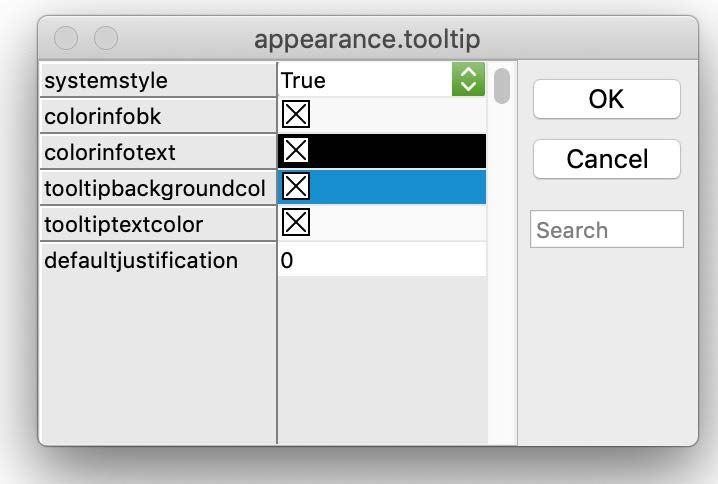
Now you should see the preferences in the Property Manager window. Navigate to the Appearances tab and from their click on the ’appearance’ option. This will present you with a list of options, of which you should select ’tooltip’. Once selected you will be presented with the aforementioned ’tooltip’ properties, which will determine the color of the tooltip text and background as Omnis switches between using system style and Omnis style tooltips. This means that whatever colors you set for ’colorinfobk’ and ’colorinfotext’ will be used as the background color and text color respectively when Omnis is set to use system style tooltips, i.e. when systemstyle equals kTrue. Likewise, whatever colors you set for ’tooltipbackgroundcolor’ and ’tooltiptextcolor’ will be used as the background color and text color respectively when Omnis is set to use Omnis style tooltips, i.e. when systemstyle equals kFalse. You can choose whatever colors you’d like for these or you can leave them as the system default.
Code For The Method Editor
Once this has been done, open up the method editor for ’wMain’ and inspect the event method of switchButton. Here we will write the code that switches between tooltip design on each click. First create a new Instance variable called ’iRow’ of data type row. Once this has been done add the following code to the event method of switchButton...
| On evClick Calculate iRow as $root.$prefs.$appearance If iRow.tooltip.systemstyle=kTrue Calculate iRow.tooltip.systemstyle as kFalse Calculate $root.$prefs.$appearance as iRow Do $root.$redraw() Else Calculate iRow.tooltip.systemstyle as kTrue Calculate $root.$prefs.$appearance as iRow Do $root.$redraw() End If |
Essentially what we are doing here is checking whether the systemstyle property of the tooltip section in appearance.json has been set to true. If set to true then the system style is being used to draw the tooltip, so we will set this property to false and redraw the root folder. Now, the tooltip will be presented in Omnis style. This means that the next time the button is clicked, the conditional will see that systemstyle is set to false, then set it to true and redraw, thus changing the tooltip back to the system style.


 Please logon or create a free account to download this file.
