Tech News Back Issues Issue: 092310
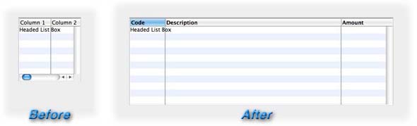
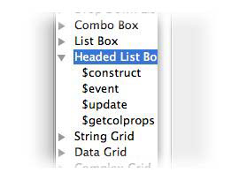
Component Library Design Objects CollectionsBy David Swain Reuseable custom components accessible directly from the Component Store! This may become one of the top ten features of Omnis Studio for many of you if you're not already familiar with it. Last Time...In the last issue of Omnis Tech News, we learned how to access the Component Library and we explored how we can make changes to the default classes in Omnis Studio and give them additional code and property values that are more appropriate for our individual (and team) development requirements. We explored a few other important things in the Component Library in a cursory manner as well, such as the various System classes (like #STYLES) that are found there. We also learned that there are different Component Store Types for the classes in the Component Library and tucked that knowledge away for later reference. The time has come to look at another of these Component Store Types. In this article, we will go a bit deeper and see how we can do similar things with customizing the individual components that we can place on our GUI classes (windows, remote forms, reports and toolbars) to provide them with more default power as well. We will be working with the contents of a Component Store Type called a Design Objects collection, which contains the objects that we can pull from the Component Store window for a specific type of design class. There is even an extra and, I hope, very pleasant surprise at the end of the article - but don't skip to there without reading through the basics on the way down! Design Objects CollectionsIf we open the Component Library and scroll all the way to the bottom of the list of window classes in that library (assuming that they are sorted by class type and then alphabetically, which would be the default sort order), we will find two windows named _Background Components and _Field Components . These are where the default background and field objects for window classes are stored for use in the Component Store window. Whatever property values and methods these objects contain here will also be manifest in those same objects when first retrieved using the Component Store. Each GUI class type that has moveable components (windows, remote forms, reports and toolbars) have such Design Objects collections for their default component objects. But the people who created Omnis Studio have given us the ability to set our own defaults for any such objects here in the Component Library to better meet our development needs and streamline our development workflow. The least we can do is examine what they have given us as see if we can't take advantage of it in our future development strategies! So let's open one of these up and see what mischief we can get into! Go ahead an open the Component Library window class named _Field Components . This is a great place to begin! This is the default component source for window class field components. Every type of built-in field is represented here, whether or not we have ever used each of them. The properties and methods these components have here are those that will appear on objects retrieved from the Component Store window. If we find ourselves making a lot of the same changes over and over again to certain field types, we can save ourselves a lot of future work by making those changes only once here. This is a very powerful way to configure Omnis Studio to better support our personal or workgroup style of programming. To make this more clear, let's do a little project... Customizing Default Component Object Property ValuesLet's consider a reasonably complex object that we might want to arm with more appropriate property values and behaviors to get a taste of what can be done. I suggest the Headed List Box component for this example to demonstrate the breadth and variety of customizations we could impose on component object defaults. Now, my needs may well be different from your needs, but we're exploring the principle of customizing this component, so adjust this technique to your own needs after giving some thought to what those needs might be. First, let's see what we are given in the default default version of the Headed List Box as received from Omnis Software. We won't list all the property values here, but there are a few that stand out to me that I am always having to adjust: Field Height and Width This field is always too small for my purposes when it comes from the as-shipped Component Store window. I usually have to make it at least wider, but I also have to make it taller most of the time as well. Now it's not likely that I will find the universal ideal initial size for this field, but a survey of past work should get me a lot closer than the height of 145 pixels and the width of 142 pixels that I get with a fresh copy of Omnis Studio. After considering recent past work, I decided to try a width value of 600 and a height value of 200. This at least gives me enough room to display a meaningful list right away. Number of Columns I rarely use Headed List Box fields with only two columns, yet that is what pops out of the Component Store by default. I generally have to add at least one more column - and, in fact, a three column list is the most common one I use. To set this field up to have three columns rather than two, we supply the designcols property a value of 3. Again, this works for me - your needs may be different. But that's the beauty of the configurable Component Library! Column Widths The original 2-column field provided for us in the Component Library has a width of 72 pixels for the first column and 100 pixels for the second. The third column I just introduced also got a column width of 100 because that is the default (more on that a bit later), but it extends all the way to the right edge of the field anyway. What I want is to assign more useful column widths. A short one on the left works for me because I usually want to display a code value of some kind in the first column, although I want just a little more room. My second column is usually a much longer text value and my third column is often a number that I want to right justify (more on changing the alignment later in this article). So I need to change the columnwidths property value to reflect these needs. I have decided on a value of "80, 400, 120". I may well have to adjust this for specific cases, but this should do a good job of displaying values for initial tests on new windows I create. Column Heading Labels Of course, if I add a new column to the existing set, Omnis Studio does not yet have a heading with which to label that column. If we also want to assign appropriate labels to the column headers, we modify the columnnames property value. Again, it is unlikely that I will be able to come up with a universal set of column labels that will be appropriate for every case, but "Column 1, Column 2, Column 3" is unlikely to be useful for any case. So I have chosen, after reviewing some recent work, to set my default column labels to "Code, Description, Amount" because at least one of these will be useful in a substantial number of cases - although only rarely will all three be appropriate. Still, I am trying to make my work easier, not non-existent! Default Column Width The defaultwidth property value provided in a fresh copy of Omnis Studio is 100 pixels. In my own work, I find that this value is rarely useful to me. It is too large for most of my numeric and character code columns and too small for most of my character string columns. When I add new columns to a Headed List Box field, I am more likely to add a numeric column in my work than a wide text column, so I choose to set this to a value of 80 pixels as my custom default. Horizontal Scroll Bar I use a great number of smallish Headed List Box fields with only a few columns, as described above, most of the time. Sure, I will occasionally need a huge one with more columns than can be viewed all at once, but these are rare for me. For that reason, I rarely need to have the horizontal scroll bar added to this field type - and I find myself constantly having to remove it from new Headed List Box fields I add to my windows. I will remove it now from the default component so that I never have to worry about it again - until I actually need this feature. So let's set the horzscroll property value to kFalse . Header Boldness I happen to like bold text for my header labels on this field type. But to achieve this, I need to set the boldheader property value to kTrue for each Headed List Box field I add to a window because this property value is kFalse as supplied to me originally. But once I set it to kTrue here in the Design Objects Collection window, I never have to worry about this feature either. Header Click Detection I usually want to offer header click detection on my Headed List Box fields to allow the user to manage the sort order of the lines in the list. However, the enableheader property value is set to kFalse by default. But I'm in charge of the defaults now, so I can set it to kTrue if I like here in the Component Library and avoid having to switch it on for the majority of the Headed List Box fields I add to my windows. Of course, I would also need to add some event code to react properly to those header clicks, but more on that later in this article. Column Order Dragging A new feature provided for us in Omnis Studio version 5.x is the ability to allow the user to drag the columns of a Headed List Box field into a different display order. I really like this feature and use it a lot - probably for the majority of Headed List Box fields I will add to windows in the future. So I want to have the candragdisplayorder property value set to kTrue when I retrieve this field from the Component Store window rather than the kFalse I get by default. It is important to note here that the use of candragdisplayorder depends on the enableheader property value being set to kTrue first, so I must be certain that both are set to kTrue . The final form of this field type in the _Field Components window is markedly different from the original, but is much more suited to my work needs. Here is the result:
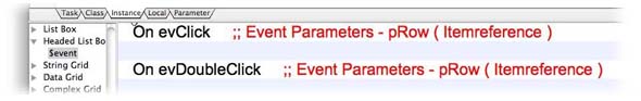
OK, I'm pretty happy with these changes. Notice how there are so many little things that I would otherwise have to change nearly every time I add one of these fields to a window. Sure, I will still have adjustments to make, but I have cut down on that work dramatically by adjusting the default values of these properties. You may find even more of them to configure this component for your specific style! Customizing Default Component Object Methods There are also some coding additions that I like to make to the default copy of this component while I'm here. By default, this field contains only a $event method and that method only has two initial lines of code - one placeholder for detecting a click event for the field and another placeholder for detecting a double click event:
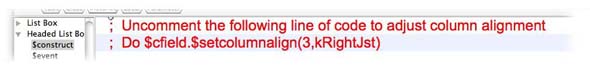
These are a good start, but I could place some additional code within each of those blocks to further define the default process each one indicates (according to my own programming style). I can also add other events that I commonly want to detect and react to for this field type in that same method - and I might even want to introduce other methods for purposes I have added to my programming repertoire over the years so that I don't have to copy and paste them from previously built Headed List Box fields. Here are some of the more common code additions I would supply for this field type: Column Alignment Adjustments We can't set the alignment of specific columns at design time for a Headed List Box - we can only set the overall alignment for all the columns. We must use the special $setcolumnalign runtime method to set column-by-column deviations from the default. I prefer to do this in a $construct method of the field itself. Adding this method to the field in the Design Objects collection encapsulates this process so that I can just quickly adjust (or disable) it when designing a specific window. In fact, I generally include a commented line of code that sets the third column to right justified (my most common configuration in practice) in this $construct field method - with an additional comment that reminds me to uncomment it and set the column number and alignment type appropriately if I need an exception. In use, I can also duplicate this line of code if more than one column needs a non-default alignment, since we must execute this public method separately for each column whose alignment needs adjusting.
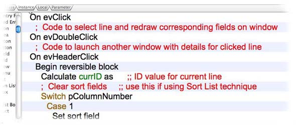
Event Code Additions The $event method that comes with the default component setup contains On commands for two events, as we saw above: evClick and evDoubleClick . These are fine for starters, as I will often want to detect one or both of these events. I will, however, remove the useless comments on each of those lines, since they are only a legacy from early Omnis Studio days before the Catalog window offered the Event Parameters option in its Variables pane. (In fact, I remove such useless comments from all the field types - just a personal preference!) But there are other events that I commonly want to trap and react to as well, so I add those - along with appropriately generic or commented-out code - to the $event method for the field as well. For example, I usually want to react to a header click, which is why I set the enableheader property value to kTrue above. But to detect the header click, I must also include an On command in the $event method that detects the evHeaderClick event. Since I know that I will need some additional code to determine which columns header was clicked, I add a Switch/Case block based on the pColumnNumber event parameter and put in generic code with my most commonly used reaction: sorting that column on appropriate criteria. I may even want to use the $setsortcolumn method of the field to control the sort direction arrow for the column whose header was clicked.
Reset Current Line The sort operation mentioned above will most likely move the content of the current line of the associated list variable to a different line, but sorting a list does not affect the $line setting of that list. So for consistency from the user's point of view, we should also have a method for resetting the current line of the list, which we can call any time we perform an operation that could change the content of the current line. In this method, we can seek the line with that content before redrawing the Headed List Box field. I call this method $update . We pass the ID value from the current line before the operation (which we held in a local variable before performing the operation that might change the current lines content, in case we needed to make this call - as shown in the code above) and then use that to find the line that contains that value in the appropriate column. By the way, that column may possibly not be visible in the Headed List Box, but we always want to include some kind of unique line ID column in any list variable, whether we display that column or not. I have found that having such a method for any list display field is useful, so I will also copy this method and paste it into the other list display fields here in the _Field Components window as well. Column Property Transfer Code Finally, I may want to be able to print, as precisely and consistently as possible, the contents of this list display field to a report for many of the windows where such a field might be placed. So why not add the code for doing this to the default field in the Component Library as well? The basic premise is that we create a generic report class that uses a Report Data Grid field that we configure in the $construct method of the report using a list of configuration data that we pass as a parameter to the report. The Report Data Grid field contains a built-in property of List data type that can be updated to adjust many features of the layout of that field. The $getcolprops method that I put into the list display field on a window generates such a list value, based upon corresponding features of the list display field on the window, as its return value. Then, to fully encapsulate this process into the list display field, we could add a $printlistvalue method into this field as well (which I have not done in the example shown here).
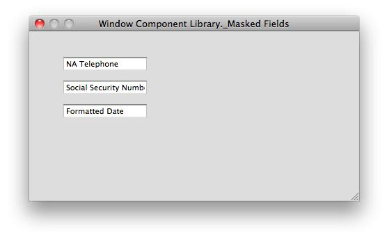
Whew! So the result of all of this is that the default Headed List Box component now contains four (and, possibly, five) methods, each with quite a bit of code in them, as well as a number of properties with more appropriate default values - at least for the way that I personally tend to use this field type. Of course, my class on Modifying the Component Library goes into a lot more detail on all of this - and adds a number of additional features to this and other field types - but this should get your own creative juices flowing! Further SuggestionsWe can do similar things for the components of other GUI class types as well. There are just different classes in the Component Library to house those default Design Component collections. For remote forms, we look for a remote form class named ?Remote Form Components. (Oh yes, and when we can again do iPhone development in Omnis Studio, there will be another remote form class named $iPhone Form Components .) For reports, we look for report classes named _Report Components and _Report Background Components (and ?Report External Components ). And for toolbars, we look for a toolbar class named _Toolbar Components . There is also a window class named $External Window Components that is worth a look, although many of the external window components are not included there (which doesn't preclude us from pasting them in after copying them from a window in another library...). The properties for each component we find in these Component Library classes can be set to whatever values we see fit - and those components that can contain code can be given any methods or method code we want that component type to have by default as well. In the class I give on this subject, we go into many more examples of additional methods and specific property values that I use for my own set of default components for windows, remote forms, reports and toolbars. But this isn't the end of this story. Remember at the beginning of this article when I said that there was a "very pleasant surprise" at the end of the article? Here it is: We can also create additional collections of specialized custom components for each of these GUI class types! Creating New Design Object CollectionsThe component collections we have discussed so far can only have one component of each type available through the Component Store window. (We can create additional components of the same type in those classes, but the additional ones will not be accessible using the Component Store window when the Component Library is closed.) But suppose that we wanted to have available a number of more specialized components of the same type, such as custom masked fields, custom entry fields, custom pushbuttons, etc. We can create additional classes of the Design Component collection type, which will show up as additional sections in the Component Store window when we are back to business as usual designing classes in our own libraries! Yes, we could deal with collections of property setting using field styles to which we have added custom properties, but this technique gives us more flexibility in some ways. With field styles, the affected properties are entirely overridden. So if we want to make a slight adjustment to one of those property values, we must remove the fieldstyle setting, which will drop all the other property settings as a side effect! Let me demonstrate this quickly. Suppose I want to have various specialized Masked Entry Field components - perhaps one for North American telephone number formatting, one already set up for date formatting (I could even have a number of these for commonly used formats) and one for a special ID number we often use in the US: the Social Security number. I would create a new window class in the Component Library named _Masked Fields and begin to add those additional components to it. The name property value that I assign to each of them is the name that will appear for that specialized component in the Component Store. The NA Telephone and Social Security Number fields will have similar properties, since they are both designed to apply display formatting to a string of numerals and to allow only numerals on input. So both of them will have both an inputmask and a formatstring value and both will have a formatmode value of kFormatCharacter . The Formatted Date field will have an empty inputmask value, but an appropriate value for formatstring and a formatmode value of kFormatDate . And if you had read my first Omnis Reference Library book, " Variables and Fields", you would be familiar with the $event method I detailed in the "Tips and Techniques" chapter (Chapter 8) that intercepts keystroke events for "t", "+", "-", "]" and "[" to generate today's date, next date (from what is currently displayed), previous date, increase by month and decrease by month respectively. This can make data entry of date values easier for end users of an application. I have also added this functionality to my Formatted Date field to make it smarter right out of the Component Store!
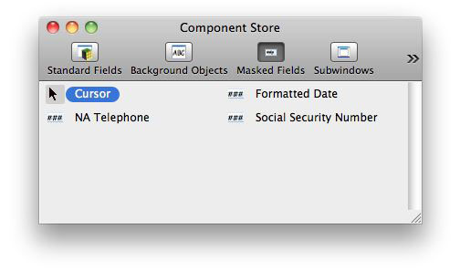
If I use such fields as these a lot in my work (which I do), having them set up in advance and available through the Component Store can be a tremendous timesaver over the tedious task of always having to adjust those property values for these specific uses. We can either add many other field types to this collection or we can create additional windows for collections of other field types with specialized functionality. Since I have developed so many specialized fields, I choose the latter technique. We can do the same thing for specialized remote form, report and toolbar components. There is just a little more to know to make this all work really nicely... Finishing TouchesNow that we have a small collection of design objects - for window classes in this case - it's time to consider how we want to access the collection once we have closed the Component Library. The first requirement is that we must set the Component Store Type for the window class to be Design Objects collection, of course, but there are a couple of other important details to attend to. The name value that we to assign class containing the design objects will be the name by which the pane of the Component Store window is called. However, if that name begins with an underscore ("_") or a question mark ("?"), that leading character will not appear in the label for the Component Store pane. In very early versions of Omnis Studio, the underscore at the beginning of the name was the indicator that the class was a design objects collection, but that was before that Component Store Type existed, I believe. Today, this is not required, but remains as a tradition. However, if we put an underscore in the middle of the class name, that underscore will be displayed as part of the name for the pane in the Component Store window, so using a space in a multi-word label may be a better option. Another thing we can do to further indicate what is in that pane of the Component Store is to assign an icon to the class. We do this using the componenticon property of that class in the Component Library. In my case, I want to indicate that this is a collection of Masked Entry Fields. So besides naming the class _Masked Fields , I will also assign icon number 1834 , which is the same icon used in the IDE to represent a Masked Entry Field in the Standard Fields pane of the Component Store for a window class, to the componenticon property. This icon will then be used as the "button" part of the toolbar for the Component Store for a window class once I have closed access to the Component Library and gone back to designing windows.
In the Component Store, the new collection of custom Masked Entry Fields looks like this:
As with the default components, we cover many more examples of auxiliary design objects collections in my course on Customizing the Component Library. But this brief introduction should give you a few ideas of what could be done. In the Next Issue...I hope this article helps open your mind to the possibilities for Component Store configuration that we can set up for Omnis Studio. The Mitford House engineers spent a lot of time giving us these features, so it seems only fair that we consider their use in our work! In the next issue of Omnis Tech News, we will wrap up this little series with a discussion of the relative merits of Component Library templates and wizards. Each of these is intended to give us the ability to have fully outfitted classes available for extraction from the Component Library, but there are different reasons we would want to use one versus the other. Let me train you in using Omnis Studio...A few times in this article, I alluded to classes that I offer. These are generally given online these days, so that they are accessible by any Omnis Studio developer no matter where in the world they happen to be based. I can also more easily offer classes that are one day - or even only a few hours - in duration, rather than having to offer lengthy classes to make travel to a specific location more cost effective for me. As you know, in my classes I focus on help you understand concepts and broad techniques and feature sets of Omnis Studio, which will make working out specific problems easier for you. I hope you will find these to be worthwhile and valuable.
|
|
| ©
2013 Omnis Software Ltd. Copyright of the text and images herein
remains with the respective author. No part of this newsletter may
be reproduced, transmitted, stored in a retrieval system or translated
into any language in any form by any means without the written permission
of the author or Omnis Software. |


 Please logon or create a free account to download this file.
