Tech News Back Issues Issue: 070210
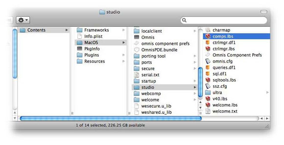
Component Library BasicsBy David Swain Way back in the early days of Omnis Tech News, I wrote a couple of articles on manipulating the contents of the Component Store (15 October and 14 November, 2001). This was so early in our publishing history that we weren't even publishing in HTML format - just plain text! Over the next many months, I will be revising such articles, adding illustrations to make them more understandable and revising or expanding them as needed. (Of course, there will be many articles on new topics mixed in with these as well!) But this is such a fundamental and important feature in the creative use of Omnis Studio that I felt it would be a good place to start the cleanup. I have mentioned the idea of adding custom components to the Component Library many times since these early articles and I always cover the basic technique in my Studio 101 sessions at conferences, such as the EurOmnis conference (and in general Omnis Studio classes even earlier than that - back to the beginning of Omnis Studio itself!). But I, apparently mistakenly, just assumed that everyone had read the early articles and knew what I was talking about. I have recently learned that the opposite is true and that many people who use Omnis Studio do not even know this feature exists! So let's go back to basics and learn some really great features of Omnis Studio that may have escaped the notice of many developers. The Component StoreAs we all know (is this too big an assumption?), the Component Store is represented as a window that appears whenever we are working in Design Mode on a GUI class of some sort. This window is one of the core tools of the Omnis Studio Integrated Development Environment (IDE). In the "old days", we even used to create new classes by dragging a Default Class or a Class Template from the Component Store onto the Class Browser. But the more recently introduced integrated Studio Browser window now offers us hyperlinks for creating a "New Class" while we are browsing the contents of a Library instead. Still, the Default Classes, Class Templates and Class Wizards all remain features of the Component Store - even if we no longer use the Component Store window to access them. The contents that we do see in the Component Store window, plus those I mentioned above, are all contained in a separate Omnis Studio library called the Component Library. This library is located in our Omnis Studio installation inside the studio subdirectory. (Mac OS X users must perform the Show Package Contents operation on Omnis Studio in the Finder and then navigate to Contents>MacOS>studio to find this directory.) Its name is comps.lbs and it is just one of many support libraries and data files found in the studio directory.
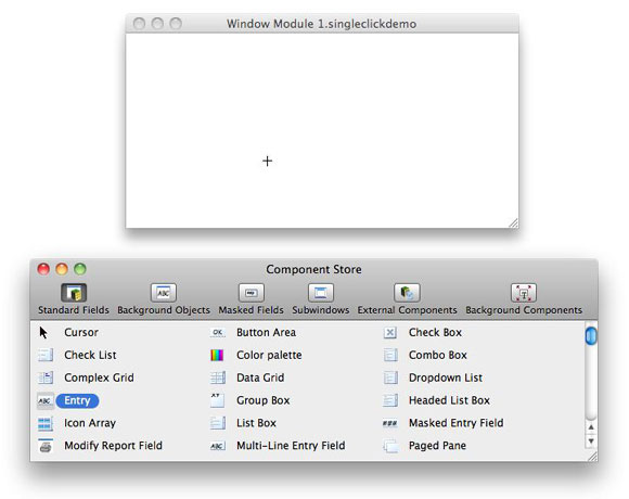
(Although we won't be doing anything that should create any problems for Omnis Studio in modifying the Component Library, it is always a good practice to back up comps.lbs before making changes to it. That way, you'll always have a pristine copy of it to revert to, if necessary.) While the Component Store window is a nice, convenient way to add new components onto a GUI class (instead of having to always use Notation - and needing to remember all the parameters of the $add() method for each of the component types), we can do a lot more with it once we know how to truly take advantage of it. The creators of Omnis Studio have deliberately given us (nearly) unfettered access to the source of these components in an effort to encourage us to modify them to conform to our own coding style and personal preferences! Those basic components have been given some default property settings and methods, but we can remove or modify those that come "out of the box" and add other methods of our own devising as we see fit! So not only is the Omnis Studio IDE written in Omnis Studio, at least this part of it is also provided as open code ! There are great possibilities here for the savvy Omnis developer. But First, Let's Learn Some ShortcutsWhile we're discussing the Component Store window, I have also learned (from feedback in classes and conference sessions) that many Omnis Studio users are also unaware of a few useful shortcuts available for the Component Store window itself. So let's quickly go over them for the sake of completeness. The move we probably all know for using the Component Store is that we can drag a component icon from the Component Store window onto our GUI class (Window, Remote Form, Toolbar or Report) and an object of that type appears on the face of that class where we have dropped it. A component added in this manner will take on the default size of that item from the source in the Component Library. But what if we wanted to determine the size of that item at the same time that we add it to our class? There is a slightly different technique that allows us to do just that. If we single-click a component in Component Store window, we have selected that component type as a single-use tool . This is similar to selecting a tool from the Tool Palette in a program like Photoshop or some drawing program, if you are familiar with that. When we move the mouse pointer over the class on which we are working, the mouse pointer icon becomes the crosshair icon. We can then draw the component onto the GUI class at the position and to the size that we desire - and then the mouse pointer icon reverts back to the arrow automatically.
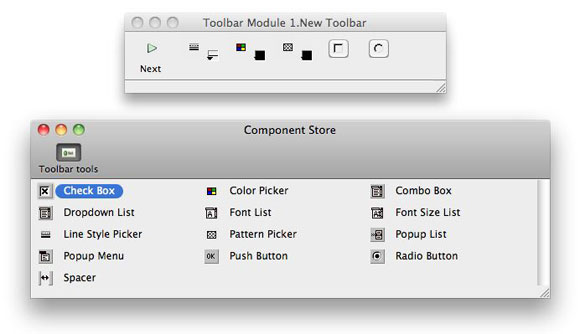
If after clicking the component icon we decide that we do not want to draw that component onto our class after all, we can deselect that tool by clicking on the Cursor (arrow) icon in the Component Store window. (Bet you always wondered what that was for!) By the way, this technique works for all the GUI class types except for Toolbars. For this reason, the Component Store window for a Toolbar class does not have the Cursor (arrow) component option.
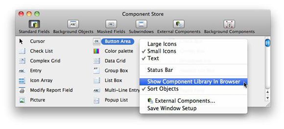
If we want to add a large number of components to a class quickly, either of the same type or of different types, we can do so by repeatedly double-clicking the component icon(s) we desire on the Component Store window. The active class will receive a new component at its default size for each double-click action. For most of the GUI classes, these components will simply stack on top of one another in the middle of the class layout in the order they are added. We then move them with the mouse (or by nudging the currently selected one(s) with the arrow keys) to put them into the appropriate positions. But for a Toolbar class, which cannot have its components stacked on top of one another, the next component will be placed to the right of the currently selected component. This will push any components on the right further to the right. A field so placed will itself become the selected component, so another immediate double-click will add a component to its right. So Toolbar components will "follow" each other as they are added in this manner. If no component is initially selected, the first double-click will place its component at the far left end of the Toolbar class - and all existing components on that Toolbar will move to the right. There is one more technique we can use for placing a limited number of component types onto a GUI class: We can drag variable names from the Catalog window onto the class layout for Window, Report and Remote Form classes. Character, Number and Date variables will drag an Entry field, Boolean variables will drag a Checkbox field, List variables will drag a Listbox field and Picture variables will drag a Picture field. Unlike the other techniques given here where the resulting fields dataname property remains empty, fields added in this manner will retain the name of the variable dragged from the Catalog window as the dataname value. (There are other shortcuts that involve dragging variable names from the Catalog window in other contexts, but we will have to leave those for another time.) And even this may not be an exhaustive list of Component Store shortcuts, but they are the only ones that come to mind now. Opening the Component LibraryTo begin exploring the source of the Component Store, we must open the Component Library. There are a couple of ways to do this. The creators of Omnis Studio wanted to be sure that we would have easy access to make modifications or additions whenever we feel the need. The first technique for opening the Component Library is available any time we are using the Component Store window. If we perform a context-click (right-click on Windows, either right-click or control-click on Mac OS X) anywhere on the Component Store window, a context menu appears. We simply select the "Show Component Library in Browser" option:
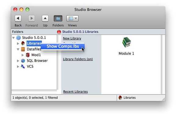
The other technique is available from the main Browser window, but only if the Folders tree list is open. A context-click on the Libraries item in that tree list displays a single-line context menu with an item that says "Show Comps.lbs". Selecting this item will also open the Component Library:
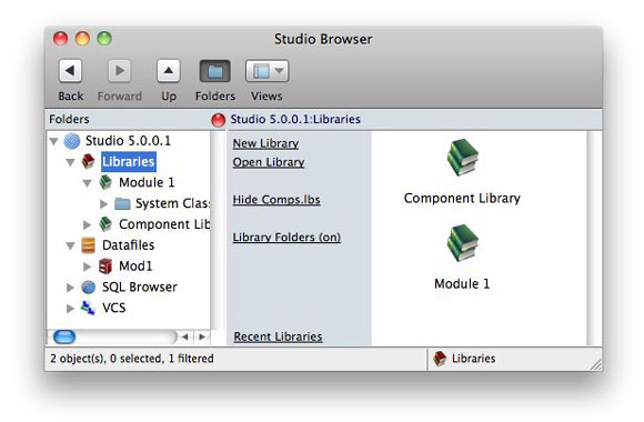
However we choose to do it, the Component Library will appear in the Studio Browser once we have done it:
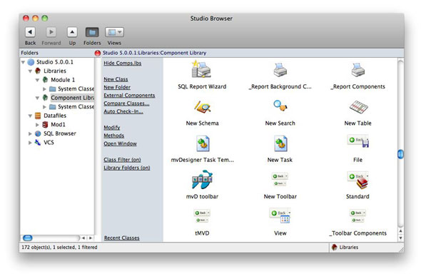
While we are here, when we want to stop working with the Component Library, we again have two choices. We can either click the Hide Comps.lbs link in the Libraries or Component Library view in the Browser or we can deselect the Show Component Library in Browser item from the Component Store window context menu. Note that we are not "closing" this library, so the context menu for the Component Library in the Libraries view of the Studio Browser does not offer a Close Library option. The Component Library must be open for the Component Store to function - we just can't see it unless we perform one of the "show" operations detailed here. And we will want to hide it for normal design work because the Component Store window does not function quite the same while the Component Library is showing. But we'll get to that a bit later... Touring the Component LibraryOnce we have the Component Library open, the Studio Browser will show us a marvelous array of classes!
At first glance, there appears to be a large number of class types because there are so many new and interesting icons used to identify them. But close inspection shows that the Component Library contains only the same kinds of classes we are used to. Still, we notice that there appear to be some conventions in naming these classes, because some of those names begin with unusual characters like "?" and "_". And there are further signs that we are not in a "normal" library anymore! All these classes must have some purpose, so let's begin to examine some of them... Component Store Type PropertyIf we context-click on one of these classes, we will notice a new context menu item toward the bottom labeled "Component Store Type...".
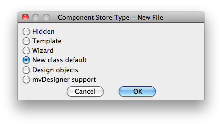
This item does not appear in the context menu for a class in a normal library. But it will give us insight into the ways in which various classes here might be used. If we select that menu item, we will see the Component Store Type dialog for the object of our context click:
In this case, the Component Store Type for the New File class is "New class default". What we have here is the very class that would be copied to our working library if we were to add a new File class! Hmmmm... This might be worth looking into further... Here is a bit more detail about the various Component Store Types we see listed in this dialog:
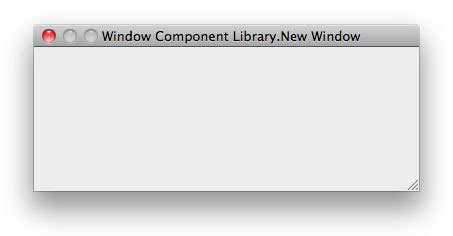
For those classes we find in the Component Library by default, it is best to leave the Component Store Type settings as they are. But we will be using this dialog for setting the Component Store Type for those classes that we add to our Component Library as we spend more time learning how to take advantage of its existence and features. The Opportunity at HandSo now that we're here, what can we do that might be considered useful or productive? Well, think about your past experiences in using Omnis Studio to create applications. Have there ever been times when you've found yourself adding the same code to certain new classes or GUI objects over and over again? We will all develop our own personal (or group) programming styles and workflows. Having access to the Component Library allows us to modify the base components we work with for creating applications to better conform to our personal workflows and design preferences to save us time in the future from performing those repetitive changes! This was the original intent of the creators of Omnis Studio (I have confirmation on that!) - we just have to know what we can do here! So in this article, let's focus on some of the simpler changes we can make. I will provide a few suggestions here, but i'm sure you will find your own useful and meaningful ways of customizing Omnis Studio for your own use. Default ClassesOne of the easiest changes to make is to add new content to the New class default classes. Each class type has one class designated as the New class default . This is the class that is copied from the Component Library into our working library when we say we want to create a new class of that type - for example, a new Window class. Let's see what we get when we ask for this. The class in our Component Library that is used as a new window is a Window class named, not surprisingly, New Window . Here is what the New Window class looks like:
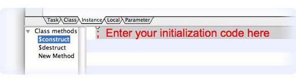
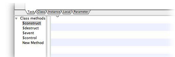
And here is the code that is included by default:
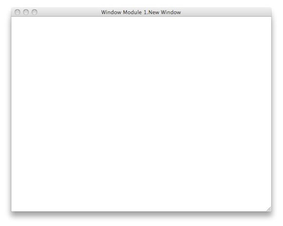
Now I don't know about you, but I rarely, if ever, want a window of that size (384 pixels wide by 143 pixels high). I might also want to not use the kBGThemeWindow background theme, which yields a window with a light grey background by default, but prefer a different color scheme. I might also want to anticipate the use of window-level event management by including a $event and a $control method - and I might even want to get rid of those pesky comments in the $construct and $destruct methods, since I have known for quite a while what kind of code should go into them! We can do all of these things, here and now, and save ourselves a lot of future effort!! So let's make those changes to this class! We can only test our results if the Component Library is hidden again, so let's close it once we have made and saved the changes to New Window and see whether we now get a more useful result when we request a new Window class. Here is what we should now get after performing that operation for our working library:
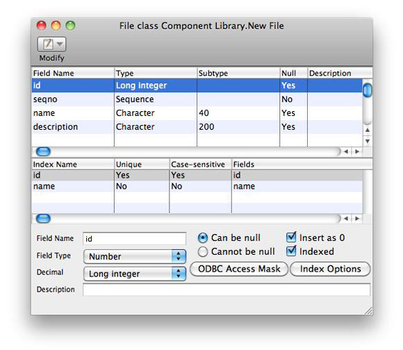
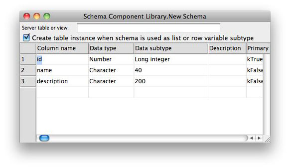
We could even have put initial On commands in the $event and $control methods if we felt that would help speed up our work. In addition, we could have included a status bar, a menu bar and/or a toolbar by default on the default window if those are commonly used in our work. Of course, we may have different types of Window classes that we create, such as entry windows, dialog windows, list display windows, etc., and we will learn how to provide these as well when we discuss Templates and Wizards in the third article in this series. So the default window is looking pretty good - how about our data classes? Whether we use File classes or Schema classes, these are both completely empty by default. But in my work, I have standardized on beginning nearly every File or table with a specific set of columns: id , name and description . For a File class, I would use id , seqno , name and description . Why not have the default class already contain these to save the time in the future creating those columns for each new File or table?
Now whenever I ask for a new File or Schema class, these basic columns will already be in place! Your needs might well be different, but now you know how to set up basic default classes in the Component Library to make at least one part of Omnis programming life easier. System ClassesIt is really important to not overlook these. Since the Component Library is, after all, an Omnis Studio library, it has a full set of System Classes as well. One of these, in particular, is very handy right out of the box - the #STYLES class. The reason this is so useful is that it already contains default cross-platform style definitions for every component that comes in the Component Store for any GUI class! Why is this helpful? I'm not sure whether you've noticed, but in a completely new library, the #STYLES class is entirely empty . But each time we add a component to a GUI class from the Component Store, we also add the fieldstyle associated with that component from the Component Library if a fieldstyle of that name does not already exist in our design library (assuming that the Component Library is not currently open in the Studio Browser - in that case, no fieldstyle is included). But for those of us who do a lot of custom work, creating new libraries frequently, this can become a major headache because we never know what styles are in which libraries without looking - and then they show up in different orders in different libraries! So for these people, a useful technique could be to do all the style customization within the Component Library itself. Then when a new library is first created, open the Component Library and simply drag #STYLES from it to the new working library. Yes, we can transfer classes to and from the Component Library just that easily! More on this in the next two articles. In fact, why stop there? We may also have created our own standard custom input and display masks for the use of Masked Entry fields, so why not treat #BFORMS, #DFORMS, #NFORMS, #TFORMS AND #MASKS in the same way? Still using font tables? Try this with those! Using custom icons or color swatches? Set up standard #ICONS and #COLORS tables in your Component Library and use them like all the rest. None of these System Classes transfer their contents to the working library on their own, so we have to do the job manually. But it is well worth the effort for the consistency and control we get in return for that effort! Setting Up Team StandardsTaking the above a bit further, if we are working in a team situation, this becomes even more important. Everyone should be using the same Component Library contents in their individual copies of Omnis Studio. Changes to the Component Library should be determined by committee and immediately distributed to everyone in those rare cases where changes are required. This only makes sense, but I had to mention it for the sake of completeness. Dealing with Version UpdatesThe contents of the Component Library rarely change from one release of Omnis Studio to the next, but we want to guard against missing out on any changes that do occur. So we have an extra use for that backup copy of the "as shipped" Component Library that we keep for each version. We can compare that to the "as shipped" Component Library of the new release we are preparing to use to check whether there are, indeed, changes that we should be picking up. We can do this with either one of the "library difference" applications that are available or the more tedious side-by-side comparison technique of opening a copy of each one (after renaming those copies so we can keep straight on which is which!), checking modification dates of each class and then checking class details when those differ between the two libraries. We should also maintain a log of which classes we have modified ourselves in our working copy and which we have added. If it does become necessary to pick up a change that originated at Mitford House, it might still be best to move all of our customized classes into a copy of the new library rather than just bringing the changes into our old one - just in case we might have overlooked something. What we want to avoid is rebuilding all of our changes into the new Component Library! It is easy to swap one comps.lbs for another, so we look for the easiest upgrade path, compose a new comps.lbs and place it appropriately in the installation tree for our new copy of Omnis Studio! In the Next IssueThis article serves as a basic introduction to the potential use of the Component Library, but there are still a few slightly more complex topics to discuss. In the next issue of Omnis Tech News, we will delve into the subject of Design Object Collections, which directly affects what we can access through the Component Store window and the default features that objects we receive from that window will have. You won't want to miss this one - it will have plenty of examples! The article after that will tackle the subject of Templates and the basics of Wizards. |
|||||||||||
| ©
2013 Omnis Software. Copyright of the text and images herein
remains with the respective author. No part of this newsletter may
be reproduced, transmitted, stored in a retrieval system or translated
into any language in any form by any means without the written permission
of the author or Omnis Software. |
|||||||||||


 Please logon or create a free account to download this file.
