Chapter 11—Window Components
Window classes and Window components are required for developing desktop or thick client applications only, and are therefore hidden in some editions of Omnis Studio, including the Community Edition. To create web or mobile apps, you need to create Remote forms using JavaScript components.
In addition to the Window class components, Menu classes and Toolbar classes are described in this chapter since they relate to desktop apps only. General techniques for managing windows and window instances, used for creating desktop applications, are described in the Window Programming chapter.
Example Apps and Code
Many of the Window Components are included in example apps under the Samples section in the Studio Browser; use the filter to display the ‘Windows’ examples, or use the Search to find a specific component. You can examine the window classes and components in these example apps, and look at the code behind each component: you can double-click on a window component in design mode to see its code methods in the method editor.
Window Class Components
There are over 60 components or controls that you can use in Window Classes, for desktop or thick client applications, including standard Entry fields, Buttons, Lists, Grids, and so on. The following table provides a list of all the window class components in Omnis listed in their respective groups. (Background Objects are described at the end of this chapter.) Xcomp indicates an External component that is loaded automatically.
Some external components have been deprecated and have been moved the 'Deprecated Components' group in the Component Store. See Deprecated Components.
There are also a number of 'Internal' window components that should not be used for new applications, including HelpMethods and Icon Edit; they can be shown using the Exclude Group option, available by right-clicking on the Component Store.
Loading External Components
Most external components are pre-loaded while other may need to be loaded manually to be visible in the Component Store (in the standard or deprecated groups). To load an external component, Right-click/Ctrl-click on the Component Store and select the External Components… option (or double-click the #EXTCOMPLIBS system class in the Studio Browser) to open the External Components dialog. Expand the External Components group (not the JavaScript group), find the component (library) you want to enable and select it.
Change the 'Preload status' for the component to 'Opening [lib-name]' to load the component for the current library, or select 'Starting Omnis' if you want the component to load for all libraries. You only need to load or enable the components you intend to use: loading any components that are not used places an unnecessary load on Omnis.
When loaded manually, the external component is included in the relevant group in the Component Store, e.g. the Accordion component is an external component and is added to the 'Navigation' group, or the external component may be added to the 'Other' group.
Window Class Object Limit
You cannot place an unlimited number of objects on a Window class. The object limit is 8191 for a Window class, including objects on subforms, although in practice the limit is likely to be less due to platform limitations.
Object Properties
All fields and components have General properties that control the overall behavior and appearance of the field which you can view and change in the Property Manager. In addition, each type of field or component has its own set of properties and methods that provide its unique functionality. All fields have a particular size and position, stored in the left, top, width, and height ($left, $top, $width, $height) properties, which are displayed at the top of the Property Manager.
External components have many of the standard properties, together with its own specific properties which are generally shown under the Custom tab in the Property Manager.
Object Names
All window fields have a name ($name) property which is displayed at the top of the Property Manager. When you add a component to a window, Omnis assigns the component a default name with the format ‘classname_comptype_N’ where N is a four digit integer unique to the class. For example, an entry field in a window class might be named ‘wMyWindow_entry_1008’. You can accept the default name assigned to a component or change it to a more descriptive name for your application.
To change the name of an object, click on the name or the pencil icon and change the name. There are no restrictions on the name of an object, although you are advised to use only alphanumeric characters and avoid using spaces. Do not use the same name for multiple objects since this will cause confusion or errors when you refer to the object in the notation. For this reason, you should use unique names for fields and objects within the same class.
The object type is shown below the object name in the Property Manager, e.g. Entry or Pushbutton. You cannot change the type of an object. The $objtype property is displayed in Advanced mode in the Property Manager, e.g. kEntry or kPushbutton, but it cannot be changed.
Object datanames
All data-bound fields and components have a Dataname ($dataname) property, which is displayed in the top panel of the Property Manager. For some list objects, $listname is shown which is the name of the data variable associated with the list-based window object. When you create a class using an Omnis wizard, the $dataname of each field created automatically in the class is assigned a variable of the appropriate type. When you create a window field from the Component Store you need to assign the $dataname property manually.
You can create variables in the Variable panel of the Method Editor (click on Methods in the Design bar at the top of a window to open the Method editor), or you can type the name of a variable into the Dataname field in the Property Manager, press the Return key and define the variable in the 'Create Variable' dialog. See Variables for more information about declaring and naming variables.
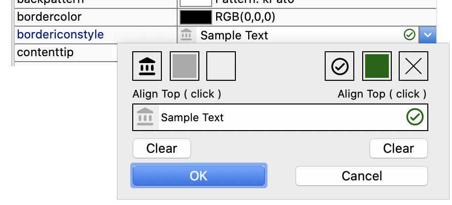
Component Icons
Several of the window class components can use icons to enhance their visual appearance, such as the Pushbutton, Sidebar, and Icon array. These icons are added to a component by specifying the icon name or ID in the $iconid property for the control. The icon size can be specified using a size constant, such as k16x16, k32x32, or k48x48, or you can append +wxh to the icon name or ID to specify a custom size, e.g. help+64x64.
Window component icons can be SVG image files selected from the dialog that opens when you click on the $iconid property in the Property Manager (or for older apps you can use PNG files). The ‘material’ iconset is selected by default when the Select Icon dialog opens, which contains over 100 icons that you can use in your own apps. The icons in the material iconset are sourced from the Google material design set, and they have been themed using the Omnis SVG Themer tool (so they support JS and system themes). The Google icons are issued under the Apache License Version 2.0 (https://fonts.google.com/icons), and you are free to use these in your Omnis applications with the proper attribution in your product licensing.
If you use your own SVG icons, they should be placed in a named iconset folder inside the ‘iconsets’ folder in the Omnis tree. The name of the iconset needs to be assigned to the $iconsets property of the current library. See Selecting an Icon for more details about specifying icons, SVG icons and iconsets.
For legacy apps only, PNG icons can be located in the #ICONS system table in the current library, the Userpic icon datafile, or the Omnispic datafile. You will need to use the Icon Editor to add or edit the icons in #ICONS or an icon data file.
Themed SVG Icons
From Studio 11 onwards, you can use themed SVG icons that have been “themed” using the Omnis SVG Themer tool (available in the Tools>>Add Ons menu). The ‘material’ icon set in Omnis contains themed SVG icons and is available automatically when you edit a Window class.
A themed SVG icon will use the color set in the $textcolor property of the window class control, so it matches the color of the text for the control. For Styled text, a themed SVG is drawn using the current text color for the text run.
Some external components support themed SVG icons. The Multibutton, Round button and Tile external components have the $textcolor property, plus the HTML icon link control has the $::textcolor property. The color specified in these properties will be applied to a themed SVG icon.
Drag Icon background
As a consequence of support for themed SVG icons for window classes, drag icons have a background by default on macOS, to prevent themed SVGs from becoming invisible, and make drag icons more cross-platform. You can turn off this behavior using the dragIconBackground item in the ‘macOS’ section of config.json (default is true, to show the icon background).
Dark and Light Modes
You can specify different SVG icons for Dark and Light modes (this is only intended for running desktop apps on Windows or macOS, since different system color modes do not apply to web and mobile apps running in a web browser).
Each icon set folder can have two sub-folders, named dark and light, into which SVG icon files can be placed to support Dark and Light system color modes.
When you assign an icon to a control you only need to assign a single icon name or ID and the icon for Dark or Light mode will be chosen automatically from the appropriate sub-folder.
Vertically Centered Text
The $vertcentertext property controls whether or not text is centered vertically in the field area. The property makes it easier to produce well aligned text and fields across all the platforms supported in Omnis. Using this property in your windows will allow you to line up the base-line of text labels and the text data contained in fields.
- $vertcentertext
If true, single line text is vertically centered in the height of the field. If false, the text is vertically positioned according to the default positioning for the field. For existing fields the property is set to kFalse.
The $vertcentertext property is available for several window field types, including single line edit fields, combo boxes, droplists, background labels, background text objects, string labels, shape fields (the text part), checkboxes (no border), radio buttons (no border), masked entry fields. The new property also applies to several remote form fields, including single line edit fields, combo boxes, droplists, background labels, string labels, checkboxes (no border), and masked entry fields. Note the property is not available for multi-line fields on windows.
Font Scaling for Fields
You can increase or decrease the font size of the Multi-line Entry field, String grid and Data grid using the key press Ctrl + or Ctrl -.
The $disablefontsizekeys property lets you control font scaling for these controls, together with the standard List, Checkbox list, Headed list and Tree list which already respond to the Ctrl +/- key press to scale the font. The default value of $disablefontsizekeys is kFalse, which means the control will respond to the Ctrl +/- key press to adjust its font size; set the property to kTrue to disable font scaling.
The following window components support font scaling:
- Multi-line Entry field
- String grid
- Data grid
- List
- Checkbox list
- Headed list
- Tree list
On these components, you can increase or decrease the font size using Ctrl + and Ctrl - on Windows, or Cmnd + and Cmnd - on macOS. You can also use zoom gestures, such as pinch to zoom, to adjust the font size.
The $disablefontsizekeys property disables the keyboard shortcuts, and $disablefontsizegesture disables zoom gestures. Set either property to kTrue to turn off that input method. By default, both are kFalse, so the component responds to font scaling shortcuts and gestures.
Event & Control Methods
$sendevent method
Window objects and window instances have the $sendevent method which allows you to test your $event/$control methods for window fields (or window instances).
- $sendevent(iEvent[,eventParameters...])
Sends event iEvent (an ev... constant value) to the object with eventParameters passed as name,value pairs, for example $sendevent(evClick,'pLineNumber',2). Returns kFalse if the event is discarded; generates a debug error if there is a problem with the parameters.
You can also pass #SHIFT, #CTRL/#COMMAND, #ALT/#OPTION as "event parameter" names, to set the value of these variables when the event is being executed.
When entering a $sendevent method, typing Ctrl+Space after the quote lists the event parameter names.
Note that the invoked $event/$control will execute, but if there are requirements of the data associated with the control, you need to separately code for that - $sendevent simply sends the event causing $event or $control to execute appropriately.
Alpha Colors & Transparency
Some of the Window class controls support alpha colors, meaning that you can set the transparency for the color of the control. The color picker in the Property Manager displays an alpha selection slider if a selected control supports alpha colors (the alpha slider is hidden for controls that do not support alpha).
The controls that support alpha colors include the Line, Oval, Rect and RoundRect background objects for windows.
The rgba() function can be used to set the RGB color and alpha setting for controls. The syntax is rgba(red,green,blue,alpha) with each parameter being an integer value in the range 0-255, where an alpha value of 255 means completely transparent. For example, to set the color of a window background object, in this case 50% transparent red:
Calculate $cwind.$bobjs.1016.$forecolor as rgb(255,0,0,127)
In addition, the color selection palette for the controls that support the use of a color palette or a popup color palette, including the colorpalette control, push buttons, and toolbars, include the alpha selection slider.
When assigned a color with no alpha the palette will automatically hide the alpha slider. If the control is assigned an alpha value, the palette will display the alpha slider.
For example, where colorbutton is a push button with $buttonmode set as kBMcolorpicker:
Do $cwind.$objs.colorbutton.$contents.$assign(rgb(255,0,0))
Do $cwind.$objs.colorbutton.$contents.$assign(rgb(255,0,0,127))
Omnis external components can support alpha colors. The Export & Import Library to JSON options also support alpha color values for controls.
Container Fields
Some of the complex field types are described as container fields. A container field is simply a window field that contains other fields. These include tab and paged panes, complex grids, group boxes, scroll boxes, and subwindows. All container fields except subwindows have the $objs and $bobjs object groups containing the fields and background objects within the container field. Therefore, in the notation you access the objects within a container field via these object groups. For example, the notation for a field called MyField inside a paged pane is
$iwindows.WindowName.$objs.PagedPane.$objs.MyField
$container
Every field within a container field has the $container property which is an item reference to the container field to which the object belongs, for example
Set reference iItem to $cobj.$container
You can nest container fields 999 levels deep. Beyond this level, the most deeply nested field or object is not set up when the window is opened and becomes a display field showing an error message.
$container returns the window instance for controls (including subwindows) at the top level: in versions prior to Studio 10 this was not available for window class controls, only JavaScript controls. For example, you can use $cinst.$container() to refer to the outer window instance when executed in a subform window.
If you have a loop in your code that steps through from a window class control up the container hierarchy the final container will be the window, so you will need to test if the container is a window, e.g. If itemref.$container().$ref.$classtype=kWindow, then Break to end of loop.
$objlink
The $objlink property is an integer that contains information about the container of the object. You can assign $objlink in your code using class notation, provided that the design window is not open. So for example, you can move an existing control in a window class into a Group Box in the same window class using code.
Object Animation
There is a library and window class control property, $animateui, that allows you to animate some window controls, including the Tree List, plus the Tab Strip has some display types to highlight and animate the tabs when they are selected. The property is defined as:
- $animateui
If the library property $animateui is true, all objects that support $animateui will animate aspects of their interface. Therefore, the object property only applies when the library property is false.
If the $animateui library property is false (shown on the Appearance tab in the Property Manager), the $animateui property for the individual object is used. Therefore, if you only want some of the controls in your library to animate, set the $animateui library property to false, and override at the object level by setting $animateui for the object to kTrue.
Moving Objects
Window instances have the methods $beginanimations() and $commitanimations() which allow you to animate changes to certain properties of some window components including the $alpha property: other properties supported are $left, $top, $width and $height.
$beginanimations(iDuration[,iCurve=kAnimationCurveEaseInOut])
after calling this, assignments to some properties are animated by $commitanimations() for iDuration (in milliseconds) and using the specified animation curve (kAnimationCurveEaseInOut is the default)
$commitanimations()
animates the relevant property changes that have occurred after the matching call to $beginanimations()
For example, you could move a component into view by animating a change to its position via its $left and/or $top properties.
Do $cinst.$beginanimations(1000, kAnimationCurveLinear)
Calculate $cinst.$objs.button.$left as currentposition
Do $cinst.$commitanimations()
If you set the same property for an object more than once, the first property change is animated, and then the last property change is animated when the first completes, while property changes between the first and last are ignored.
The iCurve can be one of the following animation “easing” curves:
kAnimationCurveEaseIn
The animation begins slowly and then speeds up as it progresses.
kAnimationCurveEaseInBack
The animation is similar to kAnimationCurveEaseIn but first moves in the opposite direction before easing begins.
kAnimationCurveEaseInOut
The animation begins slowly, accelerates through the middle of its duration, and then slows again before completing.
kAnimationCurveEaseOut
The animation begins quickly and then slows down as it progresses.
kAnimationCurveEaseOutBack
The animation is similar to kAnimationCurveEaseOut but moves beyond the final point before easing back to the final location.
kAnimationCurveEaseOutBounce
The animation starts slowly and then bounces on its final location.
kAnimationCurveEaseOutElastic
The animation starts fast and springs to a stop around its final location.
kAnimationCurveLinear
The animation occurs evenly over its duration.
The evAnimationsComplete event is generated after the last property change has completed, which allows you initiate a further animation or another action, or reverse the changes you have made.
Rounded Borders
You can apply rounded borders to most Window class UI controls by setting the $borderradius property.
In general, $borderradius only applies when $effect is kBorderPlain, kBorderCtrlEdit or kBorderCtrlList. For Pushbuttons, Radio buttons, and Check boxes, $borderradius only applies when $buttonstyle is set to kUserButton.
Object Transparency
Most window components have the $alpha property which means you can set the transparency of the component (an integer from 0 to 255, with 0 being completely transparent and 255 opaque). The $alpha property for a component can be manipulated using the $beginanimations() and $commitanimations() methods so you could “fade in” and “fade out” objects by setting the alpha from 0 to 255 using animation.
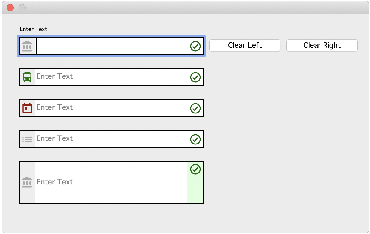
Tooltips are short messages that pop up when the end user passes the pointer over a field or control to provide some help or information about the object. The tooltip text is entered in the $tooltip property for the object. Entry fields can also have Content tips.
You can control the background and text colors, the justification of text and the position of the tooltip relative to the component. The toolip properties are in the ‘tooltip’ section of ‘appearance.json’, as follows:
systemstyle
If true (the default), tooltips in the system style are drawn using colorinfobk and colorinfotext; if false, Omnis style tooltips are drawn using tooltipbackgroundcolor and tooltiptextcolor
Omnis style tooltips have rounded corners and (unless it is not relevant for the particular tooltip) a small pointer
tooltipbackgroundcolor
The background color used for Omnis style tooltips
tooltiptextcolor
The text color used for Omnis style tooltips
defaultjustification
The default justification of the tooltip rectangle relative to the active area of the component: 0 left (the default), 1 right, 2 center; ignored by certain controls if applying the default does not make sense
The $tooltippos property controls the position of the tooltip relative to the control:
- $tooltippos
A kTooltipPos... constant that specifies where $tooltip appears relative to the window control
| kTooltipPosMouse |
$tooltip appears relative to the mouse pointer (this is the default and corresponds to 10.1 behavior) |
| kTooltipPosRight |
$tooltip appears to the right of the window object |
| kTooltipPosBottom |
$tooltip appears below the window object |
| kTooltipPosLeft |
$tooltip appears to the left of the window object |
| kTooltipPosTop |
$tooltip appears above the window object |
HTML Components for Desktop Applications
You can add your own custom HTML components to your window classes, which are used in the thick client, that is, for desktop based applications. (Note this feature does not relate to the JavaScript components for creating web and mobile apps – this feature refers to using HTML based controls on window classes.)
By adding HTML controls to your window classes you can enhance the UI in your desktop applications and accelerate your development projects – you can obtain many different types of ready-made HTML based components from third-party sources, from simple data controls, to date selectors, to full gantt charts, with the richness and interactivity you would expect to see in web-based applications.
Omnis HTML controls can be thought of as thick client external components implemented using HTML, JavaScript and CSS – in effect, you can use any browser based technology to implement this type of HTML controls. To add an HTML based control to a window class you need to use the OBrowser window control, which can, in this case, be used to display a single HTML based control in a window class (the OBrowser object can also act as a regular browser for displaying web pages, which is described under OBrowser). The OBrowser object is in the Media group in the Component Store.
The Omnis HTML controls themselves are located in the ‘htmlcontrols’ folder in the main Omnis Studio program folder. Each control has its own sub-folder in the htmlcontrols folder, and the name of this folder is used as the name of the control, e.g. the files for a control named List would be placed in a folder called List. The Omnis tree contains some example HTML controls which you can use for testing, or as a basis for creating your own custom controls. These examples, such as the Quill component which provides a basic text editor, are not supported controls in their own right, so we don't recommend using them as-is in your applications.
To add an HTML control to a window class, you need to add the OBrowser object to the window, which is available in the Media group in the Component Store, and set its $urlorcontrolname property to the name of the control – this property displays a droplist containing the names of all the available controls installed into the htmlcontrols folder in your Omnis development tree, including any you have added. Having added the control to your window you can set its properties in the same as way as any other Omnis component. See the Adding HTML controls to your window later in this section.
Using HTTP for controls
The $htmlcontrolsusehttp property controls whether html controls are served using a file:// URL (when set to kFalse), or using the built-in HTTP server (kTrue). File URLs are not deemed secure, so some web APIs in HTML controls may not be available. Therefore, it is recommended that you set $htmlcontrolsusehttp to true. When true, html controls are loaded from the 'html/htmlcontrols' folder in Omnis.
The config options "htmlcontrolsFolder" and "defaultHtmlcontrolsFolderInDataFolder" only apply when $htmlcontrolsusehttp is false.
Third-party HTML controls
As well as creating your own controls using HTML, JavaScript, and CSS, you can obtain many ready-made controls from third-party sources, either on an open source or paid-for basis. The HTML code for a control needs to be embedded into the Omnis compatible HTML template which is required to load a control into the OBrowser object in Omnis. You can find many very useful HTML or JavaScript based controls on GitHub (https://github.com/), plus there are a number of example HTML controls in the Omnis Studio GitHub repository: https://github.com/OmnisStudio/
JavaScript Client Bridge
The JavaScript Client Bridge (JSCBridge) is an HTML control that allows you to run the Omnis JavaScript Client within OBrowser in a standard Window Class, which means you can open a Remote Form in the desktop (fat client) version of Omnis Studio, passing data between the form and Omnis.
The source code and documentation for the JSCBridge control are available on the Omnis Studio GitHub repository: https://github.com/OmnisStudio/Omnis-JSCBridge
Creating Omnis HTML Controls
Each Omnis HTML control can be comprised of a number of files which are placed in a folder in the ‘htmlcontrols’ folder in the Omnis program folder. The main file for each control is an HTML file which is named <control name>.htm. For example, if you want to create a control called “quill” you need to create an HTML file called ‘quill.htm’ which is placed in a folder named ‘quill’ within the ‘htmlcontrols’ folder. The .htm file is the file loaded into the browser control (set using $urlorcontrolname) when the control is used on your window.
In addition, there may be a JSON file named <control name>.json in the control’s folder which defines the htmlcontroloptions row. Plus, the control folder can contain other resources needed as part of the control implementation, such as JavaScript files, CSS files, image files, and so on. The control .htm file typically has links to these other resources.
When you have added the correct files to the relevant folder the control will be ready to use and add to the window classes in your application. To deploy your application, you will need to add the same files and folder structure to the Omnis runtime tree.
<control name>.htm
The .htm file for a control defines a jOmnis object, its various callbacks, and the HTML content for the control itself, embedded at the place marked “…control-specific contents…” in the HTML code. The file has the following structure:
<html>

  <head>

    <title></title>

    <meta http-equiv="Content-Type" content="text/html; charset=utf-8">

    <script type="text/javascript" src="../omnishtmlcontrol.js"></script>

    <script>

      jOmnis.callbackObject = {

        omnisOnLoad: function () {},

        omnisSetOptions: function(options){},

        omnisCssChanged:function(){},

        omnisSetData: function (value) {},

        omnisGetData: function () {},

        omnisGetCurrentLine: function(){},

        omnisGetSelection: function(){},

        omnisSetFocus: function () {},

        omnisTab: function() {},

        omnisGetDraggedData: function (event) {},

        omnisDropHilite: function (hiliteLine, destinationId) {},

        omnisDropUnhilite: function () {},

        omnisGetDropLine: function (mouseX, mouseY) {},

        omnisDoScroll: function(scrollDirection, scrollAmount){},

        omnisOnWebSocketOpened: function() {},

        omnisOnWebSocketClosed:function() {}

      };

    </script>

  </head>

  <body style=“margin:0;" class=“omnishtml”>

    …control-specific contents…

  </body>

</html>
Note that the omnishtml class could be applied to another element rather than the body.
The omnishtmlcontrol.js JavaScript file is used at the start of the page, and provides an interface to various objects in Omnis, including:
Provides the interface between JavaScript and the OBrowser component.
Provides an object that allows you to manipulate an Omnis list represented in JSON.
Ensures that HTML controls can use Date variables as their $dataname.
Existing users should note that pre-Studio 10.2 versions had 3 JS files that are now combined into 1 file: the omn_list_base.js and omn_date.js files have been bundled with omnishtmlcontrol.js so you only need to reference that one file. Existing HTML controls should work as the bundle is named omnishtmlcontrol.js, which is also now minified.
<control name>.json
The JSON <control name>.json file defines the options and properties of your HTML control. The control’s JSON document has the following structure:
{

  "data": "multi",

  "options": {

    "selectedcolor": 255,

    "margin": 0,

    "mainiconid": 1710,

    “title": “The title”,

  },

  "optionsDescriptions": {

    "selectedcolor": "Description for selectedcolor option",

    "margin": "Description for margin option",

    "mainiconid": "Description for main icon id",

    "title": "Description for title"

  }

}
The top-level object has members as follows:
| data |
This member indicates how data is exchanged between OBrowser and the JavaScript running in the HTML control. It can have three possible values:
all: This means that when OBrowser wants to get the current value of the control from JavaScript, it will retrieve all of the data. NOTE that all is the default data handling mechanism if the control does not have a .json file.
single: Applicable to controls for which $dataname is a list. When OBrowser wants to get the current value of the control from JavaScript, it will retrieve just the current line. This is useful for single select lists that do not modify the data.
multi: Applicable to controls for which $dataname is a list. When OBrowser wants to get the current value of the control from JavaScript, it will retrieve the current selection state and the current line. This is useful for multiple select lists that do not modify the data.
single and multi provide optimized data handling for lists that do not modify the data. |
| option |
Each member of options is an option that can be used to modify the behaviour of the control. The options object defines the members and their default values. Each member must be a simple type (number, boolean or string).
The initial value of $htmlcontroloptions for a new control is the value of this object. If you edit the json file to include new options, OBrowser should detect them and update $htmlcontroloptions.
When OBrowser sends the options to JavaScript it sends the current value of $htmlcontroloptions.
If the option name ends in “color” then the value stored in the options object is an integer RGB value. When OBrowser sends this to JavaScript it converts it to a CSS color value.
If the option name ends in “iconid” then the value stored in the options object is a valid icon id from an iconset. When OBrowser sends this to JavaScript it converts it to a file URL. When using an icon from #ICONS, the file URL uses the same PNG file as that used for the JavaScript client. You will need to manually delete the PNG in the html/icons folder if you edit the icon, to allow Omnis to re-generate the file. |
| optionsDescriptions |
There should be a member in this object for each member of options. The values are used as tooltips when editing $htmlcontroloptions using the property manager. |
The Callback Object
omnishtmlcontrol.js creates an instance of an omnishtmlcontrol object called jOmnis. Your page sets the callbackObject member of jOmnis, to allow the omnishtmlcontrol object to communicate with your control implementation.
Your callback object can contain its own members, but do not use ‘omnis’ as the prefix of a member name, since we use omnis to identify methods provided by the callback object that may be called by omnishtmlcontrol.
Methods called using $callmethod are members of the callback object.
The following table describes the omnis-prefixed methods you need to provide in a callback object. Each member is marked as mandatory or optional to indicate if you must provide an implementation.
| omnisOnLoad |
Mandatory. Called when the browser onLoad event occurs. Use this to perform initialization. |
| omnisSetOptions |
Optional. Called to set the options for the control. It has a single argument, which is a JavaScript object containing the members defined in the control .json file.
When first loading the control, omnisSetOptions is called before CSS is applied and before set data. Once the control is loaded, omnisSetOptions can be called again if the application assigns $htmlcontroloptions. |
| omnisCssChanged |
Optional. Called after the CSS in the omnishtml class has been added to the page, or updated. When first loading the control, omnisCssChanged occurs after omnisSetOptions, but before set data. Once the control is loaded, omnisCssChanged can be called whenever a property that contributes to the omnishtml class is changed. |
| omnisSetData |
Mandatory. Called to set the data for the control. One parameter, the data.
If the data is a row variable, then the parameter is a JavaScript object with a member for each row column; the data types of the members must be simple types (character, boolean, integer, number). If the data is a list, then the parameter is an instance of omnis_list.
Otherwise, the data is a value of a simple type. Note that for character data, OBrowser converts Omnis line endings (\r) to suitable line endings for the HTML control (\n) before calling omnisSetData. |
| omnisGetData |
Mandatory for controls which have a data mode of “all”. Called to get the data from the control. Returns the data for the control.
If the data is a row variable, returns a JavaScript object. It must have the same definition as the originally set row. If the data is a list, the return value must be an instance of omnis_list.
Otherwise the return value must be a simple type. Note that for character data, OBrowser converts browser line endings (\n) to Omnis line endings (\r) in the returned data. |
| omnisGetCurrentLine |
Mandatory for controls which have a data mode of “single” or “multi”. Returns the current list line. |
| omnisGetSelection |
Mandatory for controls which have a data mode of “multi”.
Called to get the list selection from the control. Returns an array of integers, with a member for each list line. A member is zero if the line is not selected, one if the line is selected. The array entry for line 1 is at array index zero. |
| omnisSetFocus |
Optional. Called when the control receives the focus. You may need to focus an element when this method is called e.g. this.elem.focus(). |
| omnisTab |
Optional. Passed a single parameter, the JavaScript keydown event. Called when a tab occurs. This gives the control the opportunity to tell Omnis to tab out of the control.
omnishtmlcontrol provides default behaviour based on HTML tabindexes - you can override the default by providing omnisTab. To tell Omnis to tab out of the control, omnisTab calls jOmnis.tabOutOfControl with a single Boolean argument which is true to perform a shift tab. |
| omnisGetDraggedData |
Optional. If your control supports drag data, you provide this callback to let Omnis obtain the data being dragged. The return value is the dragged data, or null if nothing can be dragged.
You can either return text, or a list, or a row.
There are helper methods in jOmnis: makeDraggedDataList and makeDraggedDataRow to assist with the latter two return types. |
| omnisDropHilite |
Optional. Called to highlight the control when it is a possible drop destination during drag and drop.
Two parameters: hiliteLine, destinationId
hiliteLine is Boolean, true if the $hiliteline property is set for the control.
destinationId is the drop destination id, typically a line number returned by omnisGetDropLine if highlighting lines is supported.
There is a helper method in jOmnis, that can be used to highlight the entire control. For example:
jOmnis.appendDefaultHiliteDiv(document.body);
appendDefaultHiliteDiv returns the appended div, so you can remove it from the DOM when unhighlighting.
|
| omnisDropUnhilite |
Optional. Called to remove drop highlighting from the control. No parameters. |
| omnisGetDropLine |
Optional. Called when $hiliteline is true, to determine the line over which the pointer is positioned. The return value is the line number (destination id).
It takes 2 arguments: mouseX, mouseY
These are the current pixel coordinates of the pointer. |
| omnisDoScroll |
Optional. Called to scroll the control while the pointer is over its edges during drag and drop of data.
It takes 2 arguments: scrollDirection, scrollAmount
scrollDirection is an eScrollDirections value (see omnishtmlcontrol.js) that identifies the direction to scroll.
scrollAmount is the maximum number of pixels by which to scroll. Scroll by this amount, if scrolling is desired. |
| omnisOnWebSocketOpened |
Optional, and not normally needed. Called when the socket between OBrowser and the HTML control opens. From Studio 8.1.6 the method receives the Web Socket port as a parameter. |
| omnisOnWebSocketClosed |
Optional, and not normally needed. Called when the socket between OBrowser and the HTML control closes. |
Sending Events
jOmnis contains APIs that allow you to send events to $event:
| sendClickEvent |
jOmnis.sendClickEvent(lineNumber)
Generates evClick with pLineNumber set to lineNumber. |
| sendDoubleClickEvent |
jOmnis.sendDoubleClickEvent(lineNumber)
Generates evDoubleClick with pLineNumber set to lineNumber. |
| sendControlEvent |
jOmnis.sendControlEvent(infoObject)
Generates evControlEvent with pInfo set to the row corresponding to infoObject. |
HTML controls can pass dates when calling sendControlEvent(), either directly, or as a column in a row/JS object. However, due to issues sending messages to Omnis including Omnis dates inside lists/rows, any object members whose names begin "__" (double underscore) are stripped out before sending to Omnis.
In addition, HTML controls can pass nested rows/JS objects with sendControlEvent().
Development Mode
If you need to alter the behavior of your HTML control in some way in development mode, you can check the value of jOmnis.mDesign which will be true in development mode.
Debugging
To debug your control, you may need to increase the "messageTimeout" value in config.json. In the config.json file, find the "messageTimeout" item in "obrowser" group and change its value to a high number, such as 60000. If the value is too low, debugging will fail with a message "Control did not reply to message".
On Windows, once you have set a remote debugging port, open Chrome and navigate to http://127.0.0.1:nnnn where nnnn is the remote debugging port.
On macOS, right click on the control and select inspect element. Note that the web inspector window that opens does not work that well with our window ordering.
Drag Object Support
Due to the way pointer events work with the control, when you enable drag object or drag duplicate, Omnis displays a small bar at the top of the control to enable it to be dragged. There is a property, $dragobjectbarcolor that you can use to set the color of this bar.
Reloading HTML Controls
You can use the $reload() method with an Omnis HTML control to reset it to its initial state. $reload() also automatically redraws the control, so its data will also be set. Using $reload like this is useful when debugging your JavaScript.
The tooltip property for an Omnis HTML control is applied once when the control is created, and it is not re-evaluated. If you want to change the tooltip after creation, you must use $callmethod to provide an interface to change a title attribute in the HTML.
Adding HTML controls to your window
Having created or obtained an HTML control and placed it in the htmlcontrols folder, you can use it in a window class in your library. There are also a number of example controls for you to use as well, such a simple List and Quill, a basic text editing control. Once the control is placed on your window it can be used and updated in the same way as any other control.
Locate the OBrowser object in the Media group in the Components Store and add one to your window class. Open the Property Manager and set the $urlorcontrolname property to the name of the control – the droplist for this property contains the names of all the available controls installed into the htmlcontrols folder.
For HTML controls located in the 'html/htmlcontrols' folder in Omnis, you will need to set the $htmlcontrolsusehttp OBrowser property to kTrue, after which the HTML controls will be listed in the $urlorcontrolname property.
There is a version of the JS Markdown Object that is implemented as an HTML control which you can use in a window class; see Markdown Object.
Html Control Properties
When you select a control its properties will be displayed in the Property Manager, including the following properties.
$dataname
An Omnis HTML control can be data bound. The dataname can be a list, a row, a date, or any other simple non-binary type. This makes the control behave like any other data bound control, with one small exception that improves performance. Omnis does not redraw the control when it gets the focus. The only real consequence of this is that you need to explicitly call $redraw in order to update the control.
The underlying browser has its own context menus e.g. a TEXTAREA with spell checking enabled has clipboard menu items, as well as spelling suggestions etc. The underlying browser menu is considered the default context menu, and you can disable this using the $disabledefaultcontextmenu property.
$htmlcontroloptions
An Omnis HTML control may have a row of options that can be used to configure its behavior. You can consider these to be custom properties. The Property Manager has a droplist button for this property, which opens the editor for these options. Options with names ending in color or iconid are edited using the color picker or select icon dialog respectively. The fixed column at the left of the editor has tooltips that display descriptions for the members of the options row.
If the control does not have any options, this property is read-only.
$applycss and $cssextra
You can optionally apply a CSS class named omnishtml to the Omnis HTML control (note that the control needs to explicitly use omnishtml - if it does not, then apply CSS will not have any affect). Set $applycss to kTrue if you want to use the omnishtml class.
The omnishtml class contains entries for various other properties of the browser object (OBrowser): $backcolor, $backalpha, $textcolor, $align, $fontsize, $fontstyle, $font. $font uses the JavaScript client font table entry corresponding to the window font.
In addition, OBrowser also concatenates the value of $cssextra to the end of the omnishtml class e.g. you could set $cssextra to “text-decoration:line-through;text-transform: uppercase;”.
$dragmode
You can set $dragmode to kDragData to enable drag from the control. This only works if the particular control has been designed to support drag data. Drag and drop uses the standard Omnis drag and drop messages.
$hiliteline
List controls that accept dropped data can be configured to highlight individual lines during drag and drop. You can set this property to true, to indicate that you want highlight line behavior, but you will only get that behavior if the Omnis HTML control currently being used supports it.
In addition, when evDrop occurs for a control with $hiliteline set to true, the pDropId event parameter identifies the area of the control over which the drop is to occur, either a line number or ident (when $hiliteline is true), or zero if the control is not list-based (or $hiliteline is false).
$callmethod()
Omnis HTML controls can have methods. You can use the $callmethod() method to call a method within a control or one of the standard callbacks.
- $callmethod(cName,vParam)
Calls method cName in the control object, passing parameter vParam; returns a unique id for this call. The method runs asynchronously and sends the evCallMethodDone event to the control on completion (see Events below)
Do $cinst.$objs.quill.$callmethod('omnisGetData') Returns iID
On evCallMethodDone
If pUniqueId=iID
Calculate iData as pReturn
End If
Markdown Object
There is a version of the JS Markdown Object that you can use in a window class as an HTML control (the source files for the control are located in the ‘html\htmlcontrols’ folder); see the Markdown Object JS component for more details about creating markdown content and setting its properties.
To use the Markdown Object in a window class, add an OBrowser control to your window, set its $htmlcontrolsusehttp property to kTrue, then select ‘markdown’ in the $urlorcontrolname property.
The markdown content can be built up in the same way as for the JS control and assigned to an instance variable specified in $dataname of the Markdown HTML control.
The color settings and so on for the markdown can be set in the $htmlcontroloptions property, for example, textcolor and imagemaxwidth, which are equivalent to the properties for the JS control.
The color settings and so on for the markdown can be set in the $htmlcontroloptions property, for example, textcolor and imagemaxwidth, which are equivalent to the properties for the JS control. For the scrolltoposition property, negative number values indicate scrolling to top, positive numbers to bottom and zero maintains the current scroll position.
A sendControlEvent is fired when a link within the parsed markdown is clicked. The event carries two properties on the pInfo parameter: linkUrl, which holds the url of the clicked link; and linkText, which holds the text associated with the link. For example, the value of linkUrl is obtained as follows: pInfo.linkUrl.
Ports
The OBrowser component operates on the same port as the Omnis Server which is either assigned dynamically or via the Omnis-server property. For debugging HTML controls, OBrowser opens another port for WebSocket communications between htmlcontrols and Omnis. This is $serverport + 1, or 6912 if $serverport not set. This can be overridden by setting "obrowser > htmlControlPort" in config.json.
If debugging in OBrowser is enabled (if the canDebug item in the ‘obrowser’ section of config.json is true), OBrowser opens another port to allow remote debugging of the web content. By default this is port 5989, but can be overridden by setting the remoteDebuggingPort item in the ‘obrowser’ section of config.json.
Events
Omnis HTML controls have some basic events, such as single and double click, but they can have custom events.
evCallMethodDone
The evCallMethodDone event is triggered when a $callmethod() is completed: it has three parameters in addition to pEventCode:
| pUniqueId |
The unique id that was returned by $callmethod(). This associates this event with the original call. |
| pReturn |
The return value of the control method. NULL if an error occurred - see pErrorText for details. |
| pErrorText |
Text describing the error. |
evClick and evDoubleClick
Omnis HTML controls can generate standard click and double click events, with the pLineNumber event parameter.
evControlEvent
Omnis HTML controls can generate custom events. Each custom event sends evControlEvent. This has one parameter in addition to pEventCode:
| pInfo |
A row containing information about the event. If the control generates more than one type of control event, a column in this row can identify the event type |
A Menu class defines a pulldown menu that can be installed on the main Omnis menu in desktop apps (not web or mobile apps). A menu class can also define a Popup menu control that can be displayed on a window class. You can create a new Menu class from the Studio Browser using the New Class>>Menu or Class Wizard>>Menu… option.
Menus let end users perform standard operations in your desktop application, such as open a window for data entry or print a report. The definition for a standard menu is stored in a menu class. You can create your own custom menus and install them on the main application menu bar using the Install menu command, typically in the Startup_Task. You can install a menu on the menu bar of a window, or open it as a popup or context menu on a window class. You can create hierarchical menus that drop down off another menu, and you can incorporate standard Omnis menus such as File and Edit into your application.
The types of menu classes you can create are:
Standard dropdown menus
you can install any menu class on the main menu bar; you can add shortcut keys and control access to menus using user levels, you can check and uncheck individual menu lines and enable/disable them.
Hierarchical menus
you create a hierarchical menu as a separate menu class and add it to another menu line; when the user selects the line a menu drops down
Popup menus
this type of window field pops up a standard menu when you click on it
Window menus
you can install any standard or custom menu on the menu bar in a window class
Context menus
you can define a context menu that pops up when you Right-click on a field or window
You can add up to 500 lines or menu items to a menu class, but in practice you will only need the first twenty-or-so for most types of menus. You can add a keyboard alternative, or shortcut key, to each menu line when you create the class.
Methods do the real work behind the menu. You can add methods to the class itself and each menu line. The class methods can initialize the menu when it is installed, and the line methods could do anything from open a window, print a report or series of labels, or insert a row into your database. When you select a line in the installed menu, Omnis runs the method behind that menu line.
You can create a menu using one of the wizards or templates available in the Studio Browser.
To create a new menu using a wizard
Select your library in the Studio Browser
Click on the Class Wizard option, then click on the Menu option
Under the Wizards option, select Menu Wizard and click on the Create button, or under the Templates option, select File Menu to create a standard File menu
Follow the instructions on screen
The following wizards and templates are available:
Menu Wizard
creates a menu containing menu lines to open window classes and print report classes; can also contain hierarchical menus
File Menu Template
creates a menu that you can use to replace the standard File menu; you can edit this menu class and add your own menu lines
You can also create a new menu class using the New Class>>Menu option in the Studio Browser. Having created the menu class, add the title or name of the menu in the $title property. To add a line, right-click on the menu title and select Add Line. Add the text for the menu line in the $text property for the line. To add a second line, right-click on the first menu line option and select Add Line.
Menu lines and methods
You can create a menu class and add each menu line, but to make your menu properly function you need to add some programming behind your menu. If you build a menu class from scratch you will have to add methods to the menu yourself, but if you built your menu using the menu wizard then Omnis will have added the appropriate methods to your menu automatically.
You can add class methods to the menu itself to control the menu when it is installed. And you can add line methods to each line in your menu by double-clicking on the menu line to open the method editor: a line method is executed when the corresponding menu line is selected in the installed menu.
Many of the standard functions of a menu, such as enabling or disabling a menu line, adding shortcut keys, or setting passwords for each menu option, are properties of each menu line. You can edit the properties of a menu or menu line using the Property Manager.
Your own custom menus can have icons for each menu line. Menu lines have the $iconid property in which you can specify the id of an SVG file or a 16x16 PNG icon for the menu line; larger icons are not available for menu lines. If the property is empty (the default) the menu line does not have an icon.
The icons can be SVG files from an iconset (or PNGs from an iconset, the #ICONS system table, or the OmnisPIC or USERPIC icon data file in legacy apps only). See Selecting an Icon for more details about specifying icons, SVG icons and iconsets.
The $iconcolor property for a menu line (or toolbar button) sets the icon color when using a themed SVG icon. The $defaulticoncolor property for a menu class (or toolbar) sets the icon color when using themed SVG icons and the $iconcolor property of the item is kColorDefault. If $defaulticoncolor is also kColorDefault, then themed icons use the text color.
You can specify a shortcut key or keyboard alternative for each line in your menu. When the end-user presses the specified key combination the menu line is activated. Under Windows, you can add Ctrl and Alt key combinations to menu lines. Under macOS you can add Cmnd and Option key alternatives. You can further modify keyboard alternatives with the Shift key under any OS. You enter these keys in the Property Manager for the menu line, or by pressing the required key combination when the appropriate menu line is selected in the menu editor.
The menu editor context menu has the option Accept All Key Strokes. When checked (the default) the menu editor accepts all keystrokes, including shortcut keys, and enters them into the current menu line. When this option is unchecked, you cannot enter menu lines directly from the keyboard, in this case you have to enter the text and shortcut key for each menu line in the Property Manager.
To add a shortcut key in the menu editor
For example, select the menu line and press Ctrl or Cmnd and the number key “5” to add the Ctrl/Cmnd-5 shortcut key, or press Ctrl or Cmnd and the letter “A” to add the Ctrl/Cmnd-A shortcut key to the current menu line. Whichever platform you are using, the appropriate shortcut key is entered for all platforms automatically.
Certain shortcut keys cannot be inserted in this way, because they have functionality that is detected and intercepted by Omnis or the operating system. They are Ctrl/Cmnd-T and Ctrl/Cmnd-S on all platforms, plus Cmnd-Q and Cmnd-W under macOS.
You can specify menu shortcut keys for a menu line in the Property Manager by assigning a value to the $winshortcutkey or $macshortcutkey.
You should avoid using standard key combinations that appear in Omnis or the operating system. macOS function keys on extended keyboards activate the menu option with the corresponding Cmnd-number combination. Thus, F1 is the same as Cmnd-1. You cannot use the Shift-Cmnd-n options, where n is a digit from 0-9, because macOS uses these options.
Furthermore, you should make sure that no two menu items in a menu have the same shortcut key and that no two menus installed at the same time have the same shortcut key. Duplicates will be unpredictable depending on which menus are installed at the time or the order in which they appear on the main menu bar.
The “useFnInMenuShortcuts” item in the “macOS” section of the config.json file controls how Function keys on macOS are interpreted. When set to true (the default), the Function+number menu short cuts display as Fn, or if false they display as +n. (ST/MC/264)
Alt Shortcuts Keys under Windows
Under Windows you can add Alt key equivalents to menu lines and to the menu title itself. You specify the key by including an ampersand ("&") before the character in the menu line or menu title. For example, if you want your users to open a menu called Travel with the Alt-T key combination, add an ampersand before the T in the menu title. In this case, the text for the menu title should be “&Travel”. Likewise, you can add an Alt shortcut key to any letter in a menu line. For example, to add the Alt-S shortcut key to a “Customers” menu line, the text for the menu line should be “Cu&stomers”. To display an ampersand ("&") as literal text in a menu title or menu line, you need to insert two ampersands, for example, “Profit && Loss” to display “Profit & Loss”.
You can include the ampersand in the appropriate menu line or title when you enter the item in the menu class editor, or you can add it to the text or title property for the item in the Property Manager. Usually, you add shortcut keys as an afterthought, in which case it is easier to do it in the Property Manager. Note you cannot select the menu title or line and press the required Alt-key combination to assign this type of shortcut key: you must enter it directly into the menu editor when you enter the line or using the Property Manager.
A hierarchical menu or submenu is a menu that drops down from another menu line when you select the option. You can create a hierarchical menu using any previously defined menu class. To add any previously defined menu to a menu line, to create a submenu, you add the name of the menu class to the $cascade property for the menu line in your main menu.
When you add a hierarchical menu to a menu line, Omnis places an arrow against the menu line in the menu editor. This also appears in the installed menu indicating there is a hierarchical menu attached to this menu line. When you select the option in the installed menu the hierarchical menu drops down.
You can cascade menus up to five levels deep under macOS, and up to eight levels under Windows. You should avoid cascading a menu off itself, or creating a chain of menus that cascade off each other recursively.
Each time you add a line to a menu instance, delete a line from a menu instance, or change the $cascade property at runtime, Omnis rebuilds the menu, and as part of the rebuild process it destroys and recreates instances for cascading menus. You can manage the rebuilding of a menu instance by assigning kTrue to $disablerebuild, and then setting it back to kFalse after updating the menu, so that the menu rebuild only occurs once.
$menuinst for a Cascading menu object (and a Popup menu) will appear in the Notation Inspector. This allows you to select $menuinst and see the properties of the instance, and also drill down further to see $objs, etc. Note that $menuinst only appears in the Notation Inspector when the parent object has an associated instance.
A window menu is a menu installed on the menu bar of a window. A window menu bar is a property of the window class itself. To show the menu bar for a window you must enable the $hasmenus property. Having enabled the menu bar for a window, you can drag menus from the Studio Browser and drop them onto a window menu bar.
When you enable the window menu bar all the objects on your window including fields and background objects will move down. You can add any type of menu to a window menu bar, including your own custom menus or the standard Omnis menus, such as File or Edit: you add a standard menu by right-clicking on the window menu bar and selecting the menu you require.
A popup menu is a type of window field that opens a menu when you click on the field. You can create a popup menu using any previously defined menu class and you can add any of the standard Omnis menus such as File and Edit to your window as popup menus. When you create a popup menu field you enter the name of the menu class in the field’s $menuname property.
You can use the constant kDefaultBorder for the $effect property to ensure the menu has the default border style for the current operating system.
A context menu is a menu that pops up when you Right-click on the background of an open window or a field; under macOS you Ctrl-click to popup a context menu. Context menus appear throughout the Omnis design environment to help you access methods and so on, but you can add context menus to any of the windows in your application. To create a context menu, you enter the name of a previously defined menu class in the $contextmenu property for the window class or field.
Security and menu access
You can restrict access to certain parts of your library, including menu items, by setting up a secure system of passwords. You can define varying degrees of access for up to eight groups of users (each type of user or group is assigned a separate password), plus a master password. Several different users can use the same password: you are not limited to literally eight users. You can use the passwords set up in your library to control access to the menus in your library.
Access to menus or menu lines is set in the $users property for the menu item and utilizes the user numbers and passwords set up in your library. The default is to allow access to all the menu items in your library for all users or passwords, that is, passwords 1 to 8. The master password has access to all menus at all times. The users property contains the string “12345678”. To restrict access to a menu or menu line, you delete the user number from the users property. For example, to restrict access for user 4, delete the number 4, which leaves the string “1235678”. To allow access to a menu item, you include the user number in the users property for the menu or menu line. For example, to allow access for user 4 only, delete the default string and enter the number 4 only.
You can add short help messages to menus and menu items that display on the window status bar or the main Omnis help bar. You enter the message in the $helptext property for the menu title or menu line. The $hasstatusbar window property enables the status bar for a window class, and the $helpbaron Omnis preference enables the main Omnis help bar. You can change the font and point size for the main Omnis help bar with the $helpfont property. Under macOS Classic you can display the menu help text in Help balloons by enabling the $balloonson property.
A Toolbar class defines a custom toolbar that can be installed onto the main Omnis toolbar in desktop apps only (not web or mobile apps). A toolbar can float inside the application window, or can be added to a window class. You can create a new Toolbar class from the Studio Browser using the New Class>>Toolbar or Class Wizard>>Toolbar… option.
You can create your own toolbars that contain buttons and other controls that lets the user access common options and functions in your application. You can install your own custom toolbars in the top, left, right, or bottom docking area of the main Omnis application window using the Install toolbar command, typically in the Startup_Task or from a custom menu. You can add toolbars to any window class too, but you must create your toolbar class first before you can add it to a window. The toolbar commands, such as Install toolbar, refer to toolbars in the main docking areas, not window toolbars.
Toolbar classes can contain methods and variables. As with menu classes, the methods you place behind each control do the real work in a toolbar. You can add methods to the toolbar class itself and to each control or button. When you click on a control in your toolbar, Omnis runs the $event() method behind the tool.
Under the Class Wizards option in the Studio Browser there are a number of templates that you can use as the basis for your own toolbars. They include a File, Standard, and View template which you can use in a window toolbar: the methods behind the controls in these toolbars call methods in the current window.
To create a new toolbar using a wizard
Select your library in the Studio Browser
Click on the Class Wizard option, then click on the Toolbar option
Select the toolbar template you require and click on the Create button
Follow the instructions on screen
The following toolbar templates are available:
File
toolbar contains buttons to Open and Close
Standard
toolbar contains Save, Revert, Print, Page Setup, and Help buttons
View
toolbar contains buttons to switch between icons and details view
NOTE: all these toolbars are designed to be installed on a window menu bar and not the main Omnis toolbar since each button in the toolbar contains an event method that calls a method which you have to add to the parent window.
You can also create a new toolbar class using the New Class>>Toolbar option in the Studio Browser. Having created the toolbar class, you can drag components from the Component Store and drop them into the toolbar editor.
You can add as many buttons and controls as you like, and you can use the separator control to put space between groups of tools. The following toolbar controls are available:
Check Box
Color Picker
Combo Box
Dropdown list
Font List
Font Size List
Line Style Picker
Pattern Picker
Popup List
Popup Menu
Push Button
Radio Button
Spacer
You can drop a control anywhere within the active area or between existing controls. Once you’ve placed controls in a particular order, you can drag them to the left or to the right to reposition them on your toolbar. Dragging a control from one toolbar class to another copies the control to the destination class.
If you place several radio buttons together, without separators, they behave as a group. That is, when you select one radio button in a group the currently selected one will be deselected. Popup lists and menus look like buttons, but when you click on them in the installed toolbar a list or menu drops down.
Combo boxes
Combo boxes can be used in unified toolbars on macOS. They have the rounded edit field appearance, like the finder toolbar search box.
The $iconid property is available for combo boxes in toolbars, but applies to macOS only. It specifies the icon drawn to the left of the control, where a click opens the menu containing the combo box list.
When set to zero, the icon is the standard macOS search icon
When set to a valid value, the 16x16 icon selected replaces the search icon
When set to an invalid value, the control just shows a down arrow like a combo box
To use a combo box for searching (for example), check for evAfter with the next event of evOK; this is generated when you hit return with the focus in the combo box.
On macOS, if $splitbuttonbars is set to kTrue, a group of radio buttons (of kToolRadioButton type) will be displayed as separate buttons with their respective labels; the default is kFalse where radio buttons are displayed in a compact group. The property only applies to toolbars on macOS, including main toolbars, floating toolbars and for unified window toolbars where kTBOptionmacOSOmnisTopToolbar is true.
Toolbar separators or “spacers” have a property $flexible that can be set to kTrue when $blank is kTrue, as follows:
- If true, and $blank is also true (that is, no dividing line is shown), and the toolbar is on a window, the separator expands in width to use docking area space not occupied by other toolbar objects. If more than one separator is flexible, the unused space is shared equally between them.
A typical use of $flexible is to place a single separator in the toolbar, and set $blank and $flexible to kTrue. The result is that any controls to the right of the separator become right justified.
You can add an icon to most types of controls, all except the list and combo types. You can specify an icon for a control in its $iconid property. The icons can be SVG files from an iconset (or PNGs from an iconset, the #ICONS system table, or the OmnisPIC or USERPIC icon data file in legacy apps only). See Selecting an Icon for more details about specifying icons, SVG icons and iconsets.
Controls that you can check or uncheck, such as radio buttons and check boxes, display different icons for the different checked and unchecked states. You can create icons for all these states using the standard naming for icons in an Icon set (in legacy apps, all possible states for these controls are stored in the OmnisPIC icon data file).
The $iconcolor property for a toolbar button (or menu line) sets the icon color when using a themed SVG icon. The $defaulticoncolor property for a toolbar class (or menu) sets the icon color when using themed SVG icons and the $iconcolor property of the item is kColorDefault. If $defaulticoncolor is also kColorDefault, then themed icons use the text color.
You can add tooltips to individual toolbar controls in the $tooltip property for the control. To hide and show tooltips for the toolbars in Omnis and your libraries you can set the $showtoolbartips Omnis preference.
Combo boxes can have a content tip when there is no text label drawn in the toolbar; the content tip uses the value of the text property.
You can add Class methods to the toolbar class itself to control the toolbar when it is opened, and you can add Tool methods to the controls in your toolbar: a tool method is executed when the corresponding tool or control is clicked on in the installed toolbar.
You can add up to 501 methods to each tool or control in your toolbar, and a further 501 methods to your toolbar class. You enter the methods for tools (buttons) and toolbar classes using the method editor, by double-clicking on the control or the background of the toolbar editor.
Toolbar classes contain a $construct() and a $destruct() method by default. You can add code to these methods that control the installing and closing of the toolbar. In addition, all controls except spacers have an $event() method in which you add the code you want to run when the tool or control is clicked on. For example, you could use the Open window instance command in a tool method to open a window, or you could use the Print report command to print a report to the current destination.
You can install a toolbar class at any time from the toolbar editor itself; this is useful if you want to see how the toolbar looks while you’re designing it. However, in your finished application you can use the Install toolbar command or the notation to install a toolbar. You can also add any toolbar class to the docking area of a window using the $toolbarpos property.
The $initialdockingarea property of a toolbar class determines which docking area the toolbar is installed into. Toolbars install into the top docking area of the main Omnis application window by default.
If you have enabled the $allowdrag property for toolbar class, you can drag the installed toolbar out of the docking area; the toolbar is now floating. If you have enabled the $allowresize property in the toolbar class, you can resize the floating toolbar.
You can Right-click on a docking area and select the Show Text option from the context menu to show the text for each toolbar control.
Docking Areas
You can install a toolbar into the top, bottom, left, or right docking area in the main Omnis application window. Note that most list-type controls, such as the Dropdown list and Combo box types, are not displayed in a toolbar if it is installed into the left or right docking area. They display as expected when the toolbar is at the top or bottom, or is floating.
You can right-click on a docking area to open its context menu which lets you show and hide the text labels for any installed toolbars. You can show text for the IDE toolbars as well as your own custom menus.
You can view and change the properties of the main docking areas using the Notation Inspector and the Property Manager.
To view the docking areas in the Notation Inspector
Press F4/Cmnd-4 to open the Notation Inspector
In the Notation Inspector, expand $root and the $prefs group
Expand the $dockingareas group
The library preference $windowsizeexcludesdockingarea allows you to ignore the height of the toolbar docking area when specifying the position of a window. If true (the default in new libraries), the width and height of a window exclude the relevant dimension of the toolbar docking area (this does not affect windows under macOS with a standard macOS top toolbar since they are excluded from the docking area automatically).
A Toolbar class can be added to a window class, rather than the main application window. On Windows it is added to the window docking area (top. Left, right, or bottom), whereas on macOS the toolbar is added to the title bar of the window. There are a number of window class properties that control toolbars:
| $enablemenuandtoolbars |
If true, all main toolbars and menus are enabled when this window is on top |
| $toolbarnames |
The names of the toolbar classes used in the window docking area |
| $toolbaroptions |
Set of toolbar options; see below. Note that you can only assign this property when $toolbarpos is set, that is, not kDockingAreaNone. Also note that kTBOptionmacOSOmnisTopToolbar can only be toggled when designing a window |
| $toolbarpos |
The position of the toolbar in the window; this can be any of the kDockingArea... constants: kDockingAreaBottom, kDockingAreaLeft, kDockingAreaNone, kDockingAreaRight, kDockingAreaTop (that is, except kDockingAreaFloating) |
The $toolbaroptions property affects the appearance and style of the window toolbars. The following constants are available, which can be selected in the Property Manager in design mode:
| kTBOptionDefault |
Use settings stored in Omnis config file |
| kTBOptionLargeIcons |
Show large icons |
| kTBOptionmacOSCompressed |
Any macOS title bar toolbar which is using the unified style will automatically minimize the space between toolbar items; see below |
| kTBOptionmacOSExpanded |
Any macOS title bar toolbar will appear below the window title and the window title will be centered; see below |
| kTBOptionmacOSOmnisTopToolbar |
On macOS, for window styles that support macOS style top toolbars, use Omnis style rather than macOS style for the top toolbar; this option is only applied when opening the window; see below |
| kTBOptionNone |
Small Icons, no text |
| kTBOptionShowText |
Show text |
| kTBOptionVarTextWidth |
Button width depends on text width |
The Omnis configuration item useToolbarStyleExpanded in the 'macOS' section of the cofig.json file enables the legacy expanded toolbar style instead of the default toolbar style (typically unified). This only applies to macOS 11 and later, but when set to true the window toolbar style will use the legacy expanded style, i.e. toolbars sit under the window title. By default, this is false and toolbars will use the new automatic style on macOS 11 and later, i.e. toolbars are unified and to the right of the window title.
kTBOptionmacOSExpanded
When selected kTBOptionmacOSExpanded will place any toolbar displayed in the title bar of a window on macOS Big Sur or later below the title with the title centered as with previous versions of macOS. This setting is overriden by the global configuration file ‘useToolbarStyleExpanded item in the ‘macOS’ group in config.json (added in Studio 10.2). When set to true all windows on macOS will use the expanded style. By default on macOS Big Sur and later a toolbar in the title bar will appear unified and be positioned next to the title.
kTBOptionmacOSCompressed
When selected kTBOptionmacOSCompressed will minimize the space between toolbar items for a macOS unified toolbar, i.e. where the toolbar title appears to the left of the toolbar items. The text label for items are also hidden. This option only has effect where the unified toolbar is supported (macOS Big Sur and later). For this option to be active the kTBOptionmacOSExpanded or kTBOptionmacOSOmnisTopToolbar option cannot be set. Space can be added between toolbar items by using a blank kToolSpacer toolbar component.
When the window style supports it, window toolbars default to being standard operating system toolbars that are part of the window title bar. All toolbar controls are supported under Mac OS X 10.5 apart from the combo box toolbar controls (which cannot be supported due to focus issues).
You can access the old toolbar styles using the kTBOptionOSXOmnisTopToolbar option in the $toolbaroptions property of the window class. If true, the $toolbarbutton property adds a button in the title bar of the window to hide and show the toolbar (Mac OS X only, this only applies when the window has a Mac OS X style top toolbar).
The method $toolbarbuttonclick() sends a click to the toolbar button on the window instance (Mac OS X only, this only applies when the window has a Mac OS X style top toolbar).
Accordion Control
| Navigation |
 |
Accordion Control (Xcomp) |
List of expandable options |
The Accordion control presents a list of hyperlink options, each of which has a header link that, when clicked, expands to show more information to the end user. In addition, each option in the list can include a further link option or an icon which users can click on. You can control how the options in the list expand and collapse, creating a very interactive selection tool for end users.
Populating the Accordion
The contents for the Accordion control is provided by a list variable specified in its $dataname property. The list should have at least two columns to specify the Heading text and the expanded content or text, while you can add a third column for the additional Link text or icon. You can set the $headingcolumn, $contentcolumn, and $headinglinkcolumn properties, to specify which list columns are used for the Heading text, Text content, and Link text, respectively.
For example, the following method defines a list with three columns to contain the Heading text, the content text, and the link text. You would typically add multiple lines in the list, which could be static data or loaded from a database.
Do iAccList.$define(iAccHeading,iAccText,iAccLink)
Do iAccList.$add(
"Heading 1",con("Some Text",chr(13),"over multiple lines ",
style(kEscColor,kRed),"with word wrap",chr(13),
"and some more lines",chr(13),"and some more"),"Action 1")
The column specified in $headinglinkcolumn can be a Character or Long Integer to either represent some hyperlink text or an icon id. In addition, when $headinglinkcolumn specifies an icon id, you can include another column in the list to add a tooltip for each icon. The column containing the tooltips is specified in $icontooltipcolumn.
For example, the following method is very similar to the previous example, but this time the link column is defined as a Long integer and icon IDs are added to the list contents.
Do iAccList2.$define(iAccHeading,iAccText,iAccIconId)
For lNum from 1 to 100 step 1
Do iAccList2.$add("Heading A",con("Text ",lNum,chr(13),"over multiple lines ",style(kEscColor,kRed),"with word wrap"),1701+k16x16)
The icons can be added to the #ICONS system table in your library, or stored in an icon set.
Note in the example above, that your content column can contain styled text, assuming the $styledtext property for the control is set to kTrue. The content column can also contain multiple lines of wrapping text, using a carriage return (chr(13)) as the line delimiter.
Expand mode and Animation
The $expandmode property specifies what happens when the user expands or closes an entry in the Accordion control. The property is a constant as follows:
| kACCexpandModeZeroOrOne |
Zero entries or one entry must be open; when you open an option, any previous option will collapse automatically |
| kACCexpandModeOne |
One entry must be open; the first option will open by default, then when you open another option, the previous option will collapse automatically |
| kACCexpandModeZeroOrMore |
Zero or more entries can be open; options must be opened and closed manually |
| kACCexpandModeOneOrMore |
One or more entries must be open; the first option will open by default, then further options can be opened and closed manually |
If kTrue, the property $fadetext forces the text to fade in or out when the entry is opened or closed, while the $animationsteps property specifies the number of steps used to animate the opening or closing of an entry in the list (in the range 1-64).
Accordion Events
When the user clicks on the hyperlink (present if hyperlink column is present) the control generates evClick, with pLineNumber set to the clicked line number. Like many other list types, you could trap the line selected in the $event() method for the control, and return the value of the heading text, the option text or some other value in another column in the list to make a selection in subsequent code.
Breadcrumb Control
| Navigation |
 |
Breadcrumb Control |
Displays “location” within the hierarchy of an application |
The Breadcrumb control can be used to display the end user’s “location” within the hierarchy of an application, as well as allowing the end user to navigate back up the system by clicking on one of the “crumbs” or the “Home” crumb. A breadcrumb control is often seen in the context of a website, as secondary navigation, but it can used to enhance the UI for many types of desktop applications, such as consoles and dashboards.
There is an example app to demonstrate the Breadcrumb window control in the Samples section in the Studio Browser, and on the Omnis GitHub repo at: https://github.com/OmnisStudio. Search for Omnis-Breadcrumb.
The Breadcrumb control can be displayed in different styles: Rounded rectangle, Arrow (as above), or plain Text, which is set in the $crumbstyle property. The following is the rounded style, showing the third crumb highlighted when the pointer is over it.
The following shows the plain text style, showing the fourth crumb highlighted when the pointer is over it.
Properties
The content for the other crumbs in the control are taken from a list assigned to its $dataname property. The list has three columns: crumb_text (Character), crumb_id (integer), crumb_icon_id (Character) – the icon ID is the name of an icon in an icon set assigned to the library. The first crumb in the control is referred to as the “Home” crumb and is always visible; its text and icon are defined in the $homecrumbtext and $homecrumbiconid properties. The first line in the data list is the first animated crumb to pop out from the Home crumb, with subsequent list lines being successive crumbs in the control.
The Breadcrumb control has the following properties:
| $homecrumbiconid |
The icons id used for the home crumb |
| $homecrumbtext |
The text shown on the home crumb. |
| $crumbstyle |
The drawing style of the breadcrumb, a constant: kCrumbStyleText kCrumbStyleRoundRect kCrumbStyleArrow |
| $textcolor |
The crumb text color |
| $crumboutlinecolor |
The outline color of breadcrumbs |
| $crumbcolor |
The color of a breadcrumb |
| $activecrumbcolor |
The color of the active breadcrumb |
| $activecrumbtextcolor |
The text color of the active breadcrumb |
| $showactivecrumb |
If kTrue the active crumb (the final crumb on the path) is shown in the active color |
Events
The Breadcrumb control reports the evBreadCrumbPathChanging event which is sent when the user selected a crumb in the path, with the event parameters pBreadCrumbID, which is the id of the crumb (column 2 in the crumb list definition), and pNewBreadCrumbList the proposed new path list.
This event can be discarded with Quit Event (Discard Event) which will prevent the default action which is to shrink the path based on the crumb selected.
Example
The following code will create a breadcrumb as shown in the examples above.
Do br.$define(crumb_text,crumb_id,crumb_icon_id)
Do br.$add("Clothing",1,"")
Do br.$add("T-Shirts",2,"")
Do br.$add("Red-T-Shirts",3,"")
Redraw br
| Buttons |
 |
Button Area |
Invisable area that responds to user clicks |
A Button Area is in essence an invisible button and behaves exactly like a pushbutton. See Pushbutton for details about button areas.
Calendar Control
| Other |
 |
Calendar Control (Xcomp) |
Presents dates in a standard calendar format |
The Calendar control presents the current month and today’s date in a standard calendar format. The component has many useful properties that let you control the overall appearance of the calendar, such as fonts, colors, and the display style for days and headers. To display today’s date in runtime, you need to set the $currday property. For example, to set the current day of the calendar component to today’s date you could use:
Do $cinst.$objs.calendar.$currday.$assign(iCurrentDate)
Modern UI Style
From Studio 11 onwards, the UI in the Calendar external component has been enhanced to display dates using a modern interface. The $uistyle property must be set to kCalUIstyleModern to enable the new UI; the kCalUIstyleClassic setting maintains the existing drawing style (which is the default). The following properties are only available when $uistyle is set to kCalUIstyleModern:
| $navcolor |
The color used for the navigation bar |
| $navfont |
The font used for the navigation bar |
| $navfontsize |
The fontsize used for the navigation bar |
| $navtextcolor |
The color of the text in the navigation section |
| $showmonthnav |
If true, if the navigator bar is shown |
| $weeknumbercolor |
The color for the background of week numbers if shown |
| $weeknumbertextcolor |
The text color for week numbers if shown |
| $showweeknumber |
If true, the week number column is shown |
| $setdayicon |
Sets the day icon |
The following existing properties are ignored if $uistyle is set to kCalUIstyleModern: $daymode, $currdaymode, $headingmode, $otherdaymode.
Navigation bar
When the $showmonthnav property is set to kTrue the navigation bar is shown. Clicking on the right or left arrow in the navigation bar will change the month view.
If you click on the month displayed in the navigation bar the month selector is shown in the main calendar, and likewise selecting the year in the navigation bar the year selector is shown in the main calendar. Selecting a cell from any selector returns the calendar to the previous selector and eventually to the default mode.
If $allowchange is set to false, the left and right navigation buttons are removed and various navigation selectors unavailable.
If $showweeknumbers is set to kTrue, week numbers are displayed down the left side of the calendar; the color of the week number text and background is controlled using the $weeknumbertextcolor and $weeknumbercolor properties, respectively.
Calendar Events
The Calendar component reports two events: evDateChange, sent when the date changes, and evDateDClick, sent when the user double-clicks on a date cell. Both these events pass the pCurrentDate event parameter. You can detect these events in the $event() method of the component; assuming you’re using a variable iCurrentDate as above you could do:
On evDateChange
Calculate iCurrentDate as pCurrentDate
Calendar Example
The following example uses the calendar component, and provides lists to set the month and year, and buttons to display the next or previous months.
The following methods initialize the calendar window and format the display of the calendar component.
Calculate iCurrentDate as #D
Do method $setdroplists
Do iMonthList.$define(iMonth)
Calculate assignloop as dpart(kMonth,iCurrentDate)
For loop from 1 to 12 step 1
Calculate tmp as con("1 ",loop," 90")
Do iMonthList.$add(dname(kMonth,tmp)) Returns line
If assignloop=loop
Do iMonthList.$line.$assign(iMonthList.$linecount)
Calculate tmp as dadd(kMonth,-1,tmp)
Do $cinst.$objs.back.$text.$assign(
con("< ",dname(kMonth,tmp)))
Calculate tmp as dadd(kMonth,2,tmp)
Do $cinst.$objs.next.$text.$assign(
con(dname(kMonth,tmp)," >"))
End If
End For
Do iYearList.$define(iYear)
Calculate assignloop as dpart(kYear,iCurrentDate)
For loop from 1970 to 2030 step 1
Do iYearList.$add(loop) Returns line
If assignloop=loop
Do iYearList.$line.$assign(iYearList.$linecount)
End If
End For
Do $cinst.$objs.calendar.$currday.$assign(iCurrentDate)
The calendar example window has a list for selecting a month and one for the year. The methods for these two lists are as follows:
On evClick
Do iMonthList.$line.$assign(pLineNumber)
Do iMonthList.$loadcols()
Calculate iCurrentDate as con(dpart(kDay,iCurrentDate),
' ',iMonth,dpart(kYear,iCurrentDate))
Do method $setdroplists
Do $cinst.$objs.month.$redraw()
Do $cinst.$objs.year.$redraw()
On evClick
Do iYearList.$line.$assign(pLineNumber)
Do iYearList.$loadcols()
Calculate iCurrentDate as con(dpart(kDay,iCurrentDate),
' ',dpart(kMonth,iCurrentDate),' ',iYear)
Do method $setdroplists
Do $cinst.$objs.month.$redraw()
Do $cinst.$objs.year.$redraw()
In addition, the calendar example window has pushbuttons for showing the Next and Previous months. The $event() method for the Previous button is as follows:
On evClick
Calculate iCurrentDate as dadd(kMonth,-1,iCurrentDate)
Do method $setdroplists
Do $cinst.$objs.month.$redraw()
Do $cinst.$objs.year.$redraw()
Check Box
| Buttons |
 |
Check Box |
Displays On or Off choices with a check mark (also Yes or No, and 1 or 0 values) |
The Check box can represent boolean data, that is, they can display On or Off choices, Yes or No, and 1 or 0 values. There is an example app called Checkboxes and Radio Buttons to demonstrate the Check Box control in the Studio Browser, and on the Omnis GitHub repo at: https://github.com/OmnisStudio, search for Omnis-CheckRadio.
The field you associate with the check box by setting its $dataname should be a Number or Boolean field. Checking a check box sets the value of the field to one; ‘unchecking’ or clearing the check box sets the value to zero. You enter the text to display to the right of the check box in the $text property for the object. Omnis calls the field method for a check box when the user clicks on the field.
The images for the check box on and off states (i.e. the box checked and not checked) are stored in the Omnispic icon data file in the ‘Multistate 2’ page (Multistate 3 for macOS Classic).
Check boxes report the evClick event, but no parameters are passed. You can detect the evClick event in the $event() method for the object.
For example, in a login screen the user can enter a username and password, with the option to store their details by checking a check box. The check box is associated with the iRemember variable which is a Boolean. When the user checks the box, the variable is set to true and this value is used in the methods that set up the user account; specifically, if the check box is set, the user information could be stored on the client machine using a cookie component. Here is the method that could handle this:
If iRemember
Calculate $cinst.$objs.cookie.$userdata as con(iUserName,"@:@",iPassword)
End If
Horizontal Mode
The Check Box has a “horizontal” mode which makes the check box look and behave like a slider switch, which animates between the on/off state. The $buttonmode setting kCheckBoxHorizonal enables the horizontal behavior.
The existing appearance properties $textcolor, $forecolor and $iconid specify the text color, forecolor, and icon for the selected state, and $backcolor is the background of the switch, while the properties $secondaryforecolor, $secondarytextcolor, and $secondaryiconid specify the appearance for the off state of the control.
The horizontal check box animates by default but this can be disabled by setting $animateui to kFalse. The animation is disabled when the horizontal check box is used in a complex grid.
When button mode is kCheckBoxHorizonal the $text property is a comma separated list allowing you to specify the text for the off and on states of the control. For example, $text = “PERSONAL,BUSINESS”, or $text = “OFF,ON” will display the check box as follows:
There are a number of new theme colors to control the appearance of the horizontal check box; by default the theme colors are set to kColorDefault.
| horizontalcheckbox |
the appearance group name for this control. |
| background |
background color of the control. |
| switchon |
background color of the switch in the ‘on' state |
| switchontextcolor |
text color of the switch in the ‘on' state |
| switchoff |
background color of the switch in the ‘off' state |
| switchofftextcolor |
text color of the switch in the ‘off' state |
There is an example app to demonstrate the Check Box window control, including the horizontal mode, in the Samples section in the Studio Browser, and on the Omnis GitHub repo at: https://github.com/OmnisStudio. Search for Omnis-CheckRadio.
Round Check Boxes
The $buttonstyle property can be set to kCheckBoxRound to create a round check box. The style will create the maximum possible circle within the control's rectangle taking into account its height and width. The style animates the fore color of the circle when switching between true and false values (this can be turned off via $animateui).
The kCheckBoxRound button style supports a fill pattern or a transparent pattern set using $backpattern. If filled, the circle takes the colors from $forecolor and $secondaryforecolor for the checked (true) or unchecked (false) values, respectively. If transparent, the circle is not drawn and only the icon for the checked or unchecked state is displayed.
The round style uses $iconid and $secondaryiconid to control the icon displayed within the circle for the checked (true) or unchecked (false) values, respectively. Furthermore, when using themed SVG icons, you can use the $textcolor and $secondarytextcolor (for the checked and unchecked values, respectively) to set the color of the icons, which is white by default. For example, you could specify a green check icon when the checkbox is true and a red cross icon when the checkbox is false.
The default values for fore colors and text colors are inherited from the OS, for example, on macOS a round circle with nuanced blue is shown for true and a gray circle for false values alongside white icons.
Check List
| Lists |
 |
Check List |
List with check box line selection |
The Check list displays a check box against each row in the list field. The user can select a line by checking the check box for a line. They are most suited to single columns of data or values in which the user can check multiple values or choices. If a check box is checked the corresponding line in the underlying list variable is selected.
There is an example app called List Boxes that includes the Check List control in the Samples section in the Studio Browser.
To create a check list, enter the name of your list variable in $dataname, and enter the $calculation for the list, or a variable name for a single column list.
Clock Control
| Other |
 |
Clock Control (Xcomp) |
Clock face showing the current time |
The Clock control lets you show the current time in the current time zone on the client. There are many properties, most of them self-explanatory, that let you control the appearance. For example, you can specify whether the clock face is analog or digital using $digital and display it in 24 hour mode using $24hour, you can change the colors of the hour, minute, and second hands and the background color, you can set the time zone to be displayed using $timezone and $timezoneadj, and you can add an icon to the face using $iconface, $iconid, and $scaleicon.
The clock component passes 3 events detected in the $event() method for the object: evHoursChange, evMinutesChange, and evSecondChange which in turn pass the parameters pHours, pMinutes, and pSeconds respectively.
The analog and digital clock face let you show or hide the hours, minutes, and seconds. The $construct() method of the window is as follows:
Calculate iShowHours as kTrue
Calculate iShowMins as kTrue
Calculate iShowSecs as kFalse
Do method $setprops
Calculate $cinst.$objs.clock.$showhours as iShowHours
Calculate $cinst.$objs.clock.$showminutes as iShowMins
Calculate $cinst.$objs.clock.$showseconds as iShowSecs
Calculate $cinst.$objs.digiclock.$showhours as iShowHours
Calculate $cinst.$objs.digiclock.$showminutes as iShowMins
Calculate $cinst.$objs.digiclock.$showseconds as iShowSecs
Each of the check box options on the window has the following $event() method:
On evClick
  Do method $setprops
Color Palette
| Other |
 |
Color Palette |
Color picker allowing color selection |
The Color Palette control, or Color Picker, allows the user to select a color. The type of palettes or color picker is specified in design mode using the $palusermodes property. The control has two methods:
$setpalmode()
$setpalmode(iMode) sets the mode of the palette; iMode can be an integer in the range 1 – 5, or an Omnis constants: kStandardPal=1, kRGBPal=2, kBrightnessPal=3, kDropperPa=4l, kUserPal=5
$colorind()
$colorind(iIndex,iMode[,iColor,bRedraw=kFalse]) sets or returns color selected in the palette; parameter iIndex is an integer 0-255, or -1 to get current color (you must use -1 if color not in 256 colors); iMode is 0 to get color, 1 to set color, or 2 to get current color index; iColor is color to set at index
The different values for iMode for $colorind() are:
| 0 |
(iIndex, iMode) gets the color (from the current color if iIndex==-1 or the color at index position iIndex) |
| 1 |
(iIndex, iMode, iColor, bRedraw) sets the color (from the current color if iIndex==-1 or at index position iIndex) to iColor (and RGB) and redraws the control if (bRedraw) |
| 2 |
(iIndex, iMode, iCnt, StartColor, EndColor, bRedraw) sets a gradient color range starting from iIndex, for iCnt iterations, using the colors StartColor ending at EndColor with optional redraw bRedraw |
| 3 |
(iIndex, iMode) iIndex ignored, simply returns the currently selected cell index |
| 4 |
(iIndex, iMode, iAppRef) if iIndex==0 it copies the control color table into the app iAppRef, else it copies the iAppref color table into the control |
| 5 |
(iIndex, iMode, bIsAlpha) copies the default Omnis color table into the control, if bIsAlpha is set the color table will support alpha |
| 6 |
(iIndex, iMode, bIsAlpha) copies the default Omnis color table into the control, if bIsAlpha is set the color table will support alpha: the color table will show the substitute transparent color option (small green T) |
| 7 |
deprecated: embedded system colors are no longer supported |
| 8 |
deprecated: embedded system colors are no longer supported |
| 9 |
(iIndex, iMode, iNewIndex) sets the controls current index to iNewIndex |
| 10 |
(iIndex, iMode, findColor) given the RGB color findColor, this search the colour table and sets the current table index if the color can be found |
| 11 |
(iIndex, iMode, iColor) sets the initial color of the palette to iColor, rather than using kDefaultcolor; parameter 1 is unused and should be passed as 0 |
When the palette opens in RGB mode, the entry field has the focus, and selects all of the text. As you type, the color value updates. You can press return in one of the entry fields to set the color property, or Escape to close the color picker. In addition, when the focus is on one of the normal selection arrays, pressing an arrow key removes the mouse capture, so you can navigate using the arrow keys.
Combo Box
| Lists |
 |
Combo Box |
Combined dropdown list and entry field |
A Combo Box is a combination of dropdown list and an entry field. When viewed on an open window, you can choose an item from the list or type anything you want into the entry box. You might therefore put the salutations Mr, Mrs, Ms, Miss in the list, and leave the end user free to enter Dr or any other entry when needed. You can open a combo by clicking on the drop arrow, or tabbing to the field and pressing Alt plus the down arrow key; pressing just the down arrow key cycles through the choices in the dropdown list. Selecting a line with the mouse or pressing the Tab or Esc key closes the list.
There is an example app called List Boxes that includes the Combo Box control in the Samples section in the Studio Browser.
When you create a combo box you must specify the name of the data field in the $dataname property and the name of your list variable in the $listname property. Enter a $calculation to format the list for display. The $contenttip property lets you add text to the field to help the end user understand what content should be entered into the entry part of the field. Combo boxes support $keyevents which means you can detect what character or function keys are typed into the entry part.
When using data from a list variable you should leave the $defaultlines property empty. Some of the properties of a combo box refer to the entry field part or the list part. For example, on the Appearance tab you can specify the number of lines displayed when your combo box drops down by setting the $listheight property.
The $bordericonstyle property allows you to add an icon to the left side of the field part of a Combo box; note that border icons cannot be shown on right side due to the drop arrow icon in the list (the $studioide property must be set to kTrue to display border icons).
The $contentpadding property allows you to add padding around the content inside the control.
You can add an icon to a Combo box by setting the $iconid for the list – the icon is shown on the right side of the list button and overrides the drop icon. This can only be applied to a Combo box when $studioide is kTrue.
Disabling the Automatic Search
By default, the content of the Combo box list is used to populate the edit field based on the content of the edit field when the dropdown list is opened. However, if the $disablesearchonopen property is set to true, the automatic search is disabled.
This property also applies to toolbar Combo boxes. For Data Grids, this property is used for columns with $columntype kDataGridComboPicker.
Setting the focus
You can use $ctarget.$assign() to set the focus on a Combo box in a window toolbar. In versions prior to Studio 11, you could not programmatically set the focus on a toolbar combo box, but you can using $assign() and the following code to set the focus:
Do $ctarget.$assign($cinst.$toolbars.tCombo.$objs.combo)
Do $ctarget.$assign($itoolbars.tCombo.$objs.combo)
In addition, $ctarget.$assign() works when the window has no current field, but this does not work during $construct for any field. Therefore, you can use Queue set current field for toolbar combo boxes (and on Windows, toolbar droplists). To do this, use the code
Queue set current field $cinst.$toolbars.t1.$objs.combo
which does work when executed during the window $construct.
Background theme on macOS
When the $backgroundtheme property is set to kBGThemeControl Combo boxes look and behave as they should on macOS.
Complex Grid
| Lists |
 |
Complex Grid |
Grid that can contain other fields and controls |
A Complex Grid can display multiple rows and columns of data taken from a list variable, but also allows data entry. To create a complex grid, you place a Complex Grid control on your window and drag other fields, including standard Entry fields, Droplists, or Check boxes, into the row and header sections of the complex grid field.
There is an example app called Grids that includes the Complex Grid control in the Samples section in the Studio Browser.
A Complex grid is a container field having its own $objs and $bobjs object groups which contain the foreground and background objects inside the grid field. In addition, the $dividers group contains the dividers for the grid field.
Significant properties of complex grid fields, excluding the various header and border style/color properties, include:
$canclickvertheader
If true, the vertical header of the grid will accept clicks and highlight selected lines, provided that the $enterable property of the grid is kFalse
$canresizecolumns
If true, the user can use the mouse to resize the columns of the object
$canresizeheader
If true, the header on the complex grid can be resized
$canresizerows
One of the kResize... constants indicating how the user can use the mouse to resize the rows of the object
$enterable
If true, the grid is enterable
$extendable
If true, the grid automatically extends to allow the user to enter more lines
$firstsel
The number of the first selected character or line in the current contents; only when the grid is not enterable
$firstvis
The number of the first visible character or line in the contents
$lastsel
The number of the final selected character or line in the current contents; only when the grid is not enterable
$lastvis
The number of the final visible character or line in the contents
$multipleselect
If true, the complex grid allows the user to select more than one line
$showheader
If true, the grid has a header
$showhorzheader
If true, the grid has a scrollable horizontal header
$showvertheader
If true, the grid has a scrollable vertical header
$hiliteline
the grid lines highlight during drag and drop
$dropbetweenlines
the complex grid highlights between lines during drag and drop
$extendedgridlines
If kTrue, the grid lines of the final row extend to the base of the grid
Grid row focus alpha
When Complex grid rows receive the focus they are highlighted with an alpha version of the selection color. The amount of alpha used when hilighting the row is controlled using the appearance properties $gridfocusedrowalpha and $gridunfocusedrowalpha.
The highlight method used in versions prior to Studio 10.22 can be reinstated by setting the item newSelectedRowDrawing in the ‘complexgrid’ section of the config.json file to false.
Objects in a Complex Grid
Every field or object in a complex grid has the $gridsection property which tells you the section the object is in, and $gridcolumn which tells you its column. The fixed left-most column is column zero: the other columns are numbered from one and are separated by the dividers. Every field in the header is in column zero. The $top and $left properties of an object is relative to the top left-hand corner of its grid section.
Every field or object contained in a complex grid has the $container property which returns, in this case, the name of the grid field the object belongs to.
To insert a field in a complex grid from a method you use the notation
Do MyGrid.$objs.$add(section,column,type,top,left,height,width) Returns NewFieldRef
The "mingridpos" item in the "complexgrid" section of the config.json file specifies how close grid lines in a complex grid can be to one another. Zero allows them to overlay each other, giving the appearance of hidden columns. A positive value allows them to be further apart. A negative value is treated as zero.
Resizing Rows
The end user can change the height of the rows in a complex grid by dragging the row dividers. By default, dragging a row divider without pressing the Shift key resizes the single row above the row divider. To make all rows have the new row height, press the Shift key while dragging a row divider. This is the default behavior when the "shiftRequiredToResizeAllRows" item in the "complexgrid" section of config.json is set to true. If the item is set to false, the behavior is reversed; press the Shift key while dragging a row divider in order to resize the single row above the row divider. Dragging a row divider without pressing the Shift key gives all rows the new row height.
The $getrowheight([irow]) method returns the height of the specified row. If iRow is not specified, the height of the current row is returned.
Events for Complex Grids
Each contained field receives its normal event messages such as evClick, evBefore, evAfter, and the field event handler can pass these events to the $control() method contained in the complex grid.
Complex grids receive the events evRowChanged and evExtend which you can handle in the $event() method for the grid field. The evRowChanged event is sent whenever the user clicks in a different row and when the window is opened. The evExtend event is sent whenever a row is added to a grid with the $extendable property set. These events return the pRow event parameter which holds a reference to the row changed or the new row. Thus pRow.$line gives you the row number and pRow.ListColName returns the value of the cell. Note the events evCellChanging and evCellChanged are available for string and data grids only, not complex grids. The event evClipChangedData is sent to the field when the clipboard has changed the data in the grid.
The evColumnDividerMoved event is sent to a Complex Grid when a column divider has been dragged. The event has two parameters: pDivider, the divider column number (same ID as in $dividers), and pDividerMoveBy, the number of pixels the divider was moved by; note this can be negative. You can discard the event to stop the grid divider being moved.
Grid Field Exceptions
Generally, the properties of a complex grid apply to the whole grid or to a single row or column. However, you can set the properties of a single cell in the window instance by setting an exception for the grid cell. To do this you use the notation
Do MyGrid.$objs.fieldname.row.property.$assign(value)
For example, if you wanted to show cells in Grid1 column cBal in red if the value is negative, you could use the following code which runs when the user tabs out of the cell
On evAfter
  Calculate row as pRow.$line
  If cList.[row].cBal < 0
    Do $cinst.$objs.Grid.$objs.fBal.[row].$backcolor.$assign(kRed)
    Redraw {Grid}
You could use this event handler for the cBal field in the grid, but the interior fields could pass the events up to the $control() method in the complex grid field.
On evAfter
  Calculate row as pRow.$line
  If $cobj.$name = 'fBal' & cList.[row].cBal < 0
    Do $cobj.[row].$backcolor.$assign(kRed)
    Redraw {Grid}
You can clear exceptions using the $clearexceptions() method which acts on a cell, row, column or the whole grid, as follows
Do $cinst.$objs.GridName.$clearexceptions()
Do $cinst.$objs.GridName.$clearexceptions(RowNum)
Do $cinst.$objs.GridName.$objs.FieldName.$clearexceptions()
Do $cinst.$objs.GridName.$objs.FieldName.RowNum.$clearexceptions()
You can attempt to set an exception for any property, although in practice this may not be satisfactory for some properties. Appearance properties, and button text for example should however all work as expected. For example, exceptions can be imposed for $width and $height for grid objects referenced via $obj and $bobj, however in this case, support for objects in $obj is limited to non-enterable tables only.
Sliding Columns
Complex grids can have Left or Right sliding columns. The $hasslideoutcolumn property controls the sliding columns on the complex grid, taking one of the following constants: kTableColumnsNormal, kTableColumnsLeftSlide, kTableColumnsRightSlide, or kTableColumnsLeftRightSlide.
The method $slideoutcolumn(kTableSlideDirection..., iRow=-1, kTableColumn...) sets iRow: if iRow=-1 the current row is hidden/shown/toggled, while kTableColumn... controls if the row’s left or right column slides out. The kTableSlideDirection... constants are: kTableSlideDirectionToggle, kTableSlideDirectionHide, or kTableSlideDirectionShow.
Complex grids support mouseover(kMHorzCell) returning the column clicked allowing you to detect clicks in slide out columns.
There is an example app to demonstrate Sliding Columns in complex grids in the Samples section in the Studio Browser, and on the Omnis GitHub repo at: https://github.com/OmnisStudio. Search for Omnis-ComplexGridSlide.
Data Grid
| Lists |
 |
Data Grid |
Grid to display text and numerical data |
The Data Grid component allows you to display text and numerical data and is very similar to the String grid: see String grid.
Data grids support point-based scrolling, which allows grid content to be positioned at any pixel offset within row and column boundaries. Previously, data grids could only scroll in discrete steps, snapping from one whole row or column to the next. With point-based scrolling enabled, content scrolls smoothly and continuously, giving a more native behavior for grids.
The property $usepointscrolling can be used to enable point scrolling. If true, scrolling is not fixed to content boundaries, e.g. grid row or column edges. When false (the default), grid scrolling behavior is unchanged from previous revisions.
Scroll tip tooltips (thumb-track position indicators) are not displayed when $usepointscrolling is true, as the scrollbar position represents a pixel offset rather than a row number.
The scroll-to-view behavior that automatically adjusts the scroll position when clicking a partially visible row is disabled when $usepointscrolling is true. Partially visible rows are clickable by design in this mode.
Droplist
| Lists |
 |
Droplist |
Single column dropdown list |
A Droplist (or Dropdown list) can contain a single column of data only. Most types of list can contain a single column, but some types such as list boxes, dropdown lists, combo boxes, or check box lists are best suited for displaying short single columns of data or are restricted to single column lists. The data inside a short list can come from your database loaded into a list variable, or you can include a number of lines that always appear in the list by default.
There is an example app called List Boxes that includes the Droplist control in the Samples section in the Studio Browser.
To create a Droplist list with default lines, add a Droplist control to your window and specify a list of values in the $defaultlines property. When you click on the droplist the default lines will appear. You can add default lines for dropdown, combo box, and tree list fields. Alternatively, you can assign a list variable to the $dataname property of the list field.
You can add an icon to a Droplist by setting the $iconid for the list – the icon is shown on the right side of the list button and overrides the drop icon. This can only be applied to a Droplist when $studioide is kTrue.
Droplists report the evClick event which you can detect in the $event() method for the control. This event returns the parameter pLineNumber containing the line number of the list row clicked.
The following example method is from a banking example; a droplist lets you select the account on the Transaction pane. The method behind the droplist loads the Account Id according to the selected line, assigns the stored values to the variables in the window instance, and redraws the fields on the client.
On evClick
Single file find on fAccounts.id (Exact match) {iAccountList2.[pLineNumber].2}
Calculate iAccountName as fAccounts.type
Calculate iTransactions as fAccounts.transactions
Calculate iFinalBalance as fAccounts.balance
Do $cinst.$senddata(iTransactions,iAccountName,iFinalBalance)
Do $cinst.$objs.transaction.$redraw()
Do $cinst.$objs.accounts.$redraw()
Do $cinst.$objs.view_accname.$redraw()
Do $cinst.$objs.final_balance.$redraw()
Background Theme
MacOS
The $backgroundtheme property controls how dropdown lists look and behave on macOS, as follows:
If the theme is kBGThemeControl, and provided the list has <= 1000 lines, the dropdown list looks and behaves as a popup menu (the standard type of dropdown list on macOS).
If the theme is kBGThemeWindow, the dropdown list behaves like a normal dropdown list, and has a standard themed macOS appearance. In the case where the list has 1001 lines or more, and theme kBGThemeControl, the look and behavior becomes that of kBGThemeWindow.
Windows
The color and fill pattern of a Droplist on Windows respects the $backgroundtheme property and only defaults to Windows system colors when the theme is set to kBGThemeControl. For other background themes it uses the appropriate colors and fill pattern, and for kBGThemeNone, it uses the foreground and background colors and fill pattern.
FishEye Control
| Navigation |
 |
FishEye Control (Xcomp) |
Displays a row or column of clickable icons |
The FishEye control presents a row or column of icons to allow the end user to select an option by moving the mouse over the control and clicking on an icon. When the end user’s mouse moves over the control, individual icons are enlarged and a text label is displayed for each icon.
Populating the FishEye
The contents for the FishEye control is provided by a list variable specified in its $dataname property. The list should have at least two columns, one for the ID of the icons to be displayed in the control, the other column for the text labels for the icons. You can set the $iconcolumn and $textcolumn properties to specify which columns are used for the icons and text, respectively. $iconcolumn is set to column 1 by default, so your text labels could be in column 2.
The icons can be added to the #ICONS system table in your library. To achieve the best magnification effect in the FishEye control, you should include the 48x48 version of each of the icons you wish to use.
The following method defines the list for a FishEye control and adds some lines; you would normally add multiple lines, which could be static data or loaded from a database.
Do iFishList.$define(iFishIcon,iFishText)
Do iFishList.$add(1704+k48x48,"Window")
Do iFishList.$add(1719+k48x48,"Form")
Do iFishList.$add(1712+k48x48,"Object")
Position and Expand direction
The $position property determines how the icons and text in the control expand when the mouse hovers over the control, and together with the $edgefloat property you can position the FishEye and set the direction in which it expands. $position can be set to one of the kFisheyePos… constants, and $edgefloat can be set to a kEFposn… constant. For example, with $position set to kFisheyePosBottom, and $edgefloat set to kEFposnLeftBottom, the FishEye control is positioned at the bottom of the window and the icons and text will expand upwards (as shown). You should experiment with the different $position and $edgefloat settings to achieve the effect and positioning you want.
Magnification and Stepping
The $magnification property specifies the factor by which the FishEye control increases the size of the icon under the mouse; it should be set to a real number between 1.0 and 16.0. The greater the number, the greater the magnification.
The number of icons that expand to the left and to the right of the icon under the mouse is specified by $steps; it should be an integer between 0 and 16. Therefore a low number, such as 0 or 1, will appear to make individual icons “popup” and you pass the mouse over the control, whereas a larger number will display a more gradual stepping effect. Again, you need to experiment with the $magnification and $steps properties.
The $magnifyall property controls whether or not all the icons are expanded; it is set to kFalse by default which produces its characteristic gradual stepping effect as the mouse moves over the control. If true, the items are only displayed when the mouse is over the control, and they all have a fixed square size ($magnification*$height for horizontal positions or $magnification*$width for vertical positions) and $steps is ignored.
Clipping and Scrolling Content
When set to kTrue, the $cliptosize property ensures that content is shown only within the dimensions of the window containing the control. The default is kFalse, which means large content areas could potentially be displayed beyond the window or screen border.
Content can be scrolled to bring items into view. You can use the standard scroll gesture with a trackpad, use the left mouse button to click and drag with a mouse, or use the mouse wheel. You can set the $usewheeldelta property to kTrue to increase granularity of mouse wheel scrolling (defaults to false). If using a mouse with a wheel on Windows then enable $usewheeldelta to make the content scroll according to the wheel delta, which will improve the granularity of the scrolling.
In addition, content will be visible and scrollable if not tracking when $magnifyall and the property $magnifyallscroll are true. When $resetonresize is set to false, the position of scrolled content is preserved when the field is resized.
Text Labels
You can specify the color of the text in $textforecolor. You can set the color and pattern for the background of the labels in $textbackcolor and $textpattern. In addition, you can specify the transparency of the label background by setting the $textalpha property; this is a numeric value in the range 0-255, where 0 is completely transparent and 255 is opaque.
FishEye Events
Clicking on an icon in the FishEye control generates an evClick event with pLineNumber set to the line number of the clicked entry. You could return the value of the label or some other value in another column in the list based on the line selected.
Drag scrolling is supported in the FishEye control, assuming Gesture events are enabled. See Gesture Events.
If true, $dragtoscroll will allow the FishEye to be scrolled using a left mouse drag. This is kFalse by default and will only be applied if $dragmode is kNoDragging.
Graph2 Control
| Graphs |
 |
Graph2 |
Graph component with multiple chart types |
The Graph2 component is described in detail in Omnis Graphs chapter in the Extending Omnis manual.
| Containers |
 |
Group Box |
Groups other fields on your window |
A Group box and Scroll box let you group other fields on your window. You can create a Group box or Scroll box from the Component Store and drag other fields within their borders; so they do not contain or display data themselves, but they can contain other data fields and controls.
You can edit the label for a Group box in its $text property. Group and Scroll boxes can contain methods including a $event() method to detect events. Group and Scroll boxes are container fields so you can access the fields inside the box in your code using notation: see Container Fields.
You can apply a background or border color, or add a gradient pattern to scroll box fields. If you want to make entry fields within the scroll box appear to be transparent, you can apply a gradient to the scroll box, place the fields within the scroll box and set their background theme to parent.
A Group box or Scroll box can act as a side panel: see Side Panels under Page pane.
Headed List Box
| Lists |
 |
Headed List Box |
List with cells and button style headers |
A Headed List Box displays data from a list variable in a table format. You can add button style headers to each column of the list which the user can click on to sort the data. You can also make the columns sizeable, and set other properties that control its appearance. A headed list can have a non-scrollable footer row, which could contain column totals, for example.
There is an example app called List Boxes that includes the Headed List Box control in the Samples section in the Studio Browser.
In addition to the general list box properties, such as $multipleselect, the headed list has the following properties
$dataname
the name of the list variable
$calculation
the calculation to format the columns for the list; you can use the con() function to concatenate multiple columns separated by the kTab character
$maxeditchars
the maximum size of the edit field for editing a column, or 0 if columns cannot be edited
$enableheader
if true the column headings act like buttons
$canresizeheader
if true the columns can be sized at runtime
$boldheader
if true the headings are bold
$showcolumnlines
if true, lines are drawn between the columns of the list at runtime
- $showcolumnlinesifempty
if true, column lines are shown when the list is empty; this only applies when $showcolumnlines is also kTrue
$designcols
the number of columns, maximum of 30 columns; you must set this property to the required number of columns before being able to set the $calculation and $columnnames with the appropriate column
$columnnames
a comma-separated list of heading text for the columns; you can set the column names in the dialog that opens when you click the property dropdown
$align
allows you to determine column alignment
$columnalignmode
provides runtime alignment control
$headerfillcolor
the color of the header; defaults to kColor3DFace
$headertextcolor
the color of the text in the header; defaults to kColorDefault, that is, the text color of the list
$colcount
a runtime only property, which is the number of columns in the headed list
$columnwidths
a runtime only property, allowing the column width to be set in a quoted comma-separated list of pixels values
$showheaderlines
If true (the default), header separator lines are drawn in the header
$hidefooter
If true, the footer row is hidden; set this to false to show the footer and set the contents using the $footer runtime property
The property $headerfontsize specifies the font size for the text in the header; if this is zero, the header text font size is the same as $fontsize. This means that Omnis can use a small font size for the header, like the Mac Finder.
You can use the style() function to style the text in the header button for each column specified in $columnnames. Note the styled text in $columnnames has to be assigned in $columnnames at runtime.
Entering the Calculation
The $calculation property for headed lists can be edited via a droplist button, which opens a dialog containing two tabs. The first tab has a grid allowing you to enter the variable name or calculation for each column. The second tab allows you to enter the long form of the calculation in the form con(var1,sep,var2,sep,...), where sep is either kTab or chr(9). You can use the Notation Helper or Catalog to enter variable names into this dialog.
Setting Column Widths
You can set the column widths for Headed lists (and string and data grids) using the runtime only property $columnwidths. This property returns a comma separated list of column widths in pixels. When you use the $assign() method to assign to this property, you must put the comma separated list in quotes. For example
Do HeadedListRef.$columnwidths returns HeadedCols
Do HeadedListRef.$columnwidths.$assign('20,30,40')
In order to display a 16x16 icon in the header in a Headed List, you need to set a minimum column width of 21 pixels, to allow for the width of the icon and the padding Omnis adds to a column.
The $resizecolumn property specifies the column that is resized appropriately when the width of the control changes, such as when using $edgefloat properties to resize the list when the window size changes. A value of zero means no column is resized, but the last column extends if necessary.
The $autosizecolumn(iColumn) method can be used to resize the specified column in the headed list, based on the maximum width of the data in the column.
Text Alignment
The $align text property lets you set the alignment of all the columns in the list. At runtime, you can override the alignment for individual columns using the method
- $setcolumnalign()
$setcolumnalign(columnNumber, alignment) sets the alignment to kLeftJst, kRightJst, or kCenterJst, and returns kTrue for success
and you can return the current alignment for a column using
- $getcolumnalign()
$getcolumnalign(columnNumber) returns the alignment of the specified column
Note that headed list boxes do not support the style() function with type parameters kEscLTab, kEscCTab and kEscRTab.
The property $columnalignmode provides additional runtime control over $setcolumnalign(), and can have the following values: kAlignModeHeading, kAlignModeBody, kAlignModeAll and kAlignModeNone. These determine whether the heading, body, both or neither are affected by calls to $setcolumnalign(). Note that the call to $setcolumnalign() always stores the new alignment value in the list; $columnalignmode determines if the stored value is used. When the stored value is not used, $align determines the alignment.
When you create a headed list, you must set the $dataname property to the name of a list variable, and if necessary, enter the formatting expression in $calculation. You setup the column header text in the $columnnames property. You can specify the number of columns in the design object in $designcols. You can set the column widths by dragging columns with your mouse; shift-drag resizes the column to the right of the mouse pointer so you can use this for the last column. You can set $maxeditchars if the columns are to be editable.
You do not need a $calculation if the columns in the headed list are an exact mapping of the columns in the data list. If not, use the $calculation to format the columns in the headed list box. They must contain column names from your list and special column delimiters. You can use the con() function to format the calculation, and insert column delimiters using chr(9), the tab character. For example, to format three columns the calculation could be
con(Col1,chr(9),Col2,chr(9),Col3)
You can also use the style() function to change the style and color of specific columns. For example, to give Col1 a blue spot icon, make Col2 red and right-justified, and Col3 italic you would enter the following calculation
con(style(kEscBmp,1756),Col1,chr(9), style(kEscColor,kRed),Col2,chr(9), style(kEscStyle,kItalic),Col3)
Sorting Columns
The method $setsortcolumn(iColumnNumber,bDescending) specifies the current sort column and direction. This controls the drawing of the sort arrow in the heading.
Progress Bar
You can display a Progress Bar in a column inside a Headed List box control, for example, to indicate a percentage value. To enable a progress bar to be displayed, you can use the style() function and the kEscBar text style. When enabled, a progress bar with 1 or 2 segments is drawn across the whole column width, so no other content is allowed in the column.
kEscBar can take 3 or 5 parameters: the background color, segment 1 width (%), segment 1 color, then optionally segment 2 width (%), and segment 2 color.
For example, you can use the following in the calculation for a headed list column to draw a red segment of width iPercent % of the column width over a gray bar sized to the column width:
style(kEscBar,kGray,iPercent,kRed)
In this example, iPercent is a column value in the data list for the headed list.
Displaying Ellipses
Ellipses are shown when there is not enough space to display all the content in a headed list cell (also in the text for a tree list node); this applies for headed lists with more than one column. The $disableellipsis property allows you to disable ellipses for individual list fields, if required. This is in addition to the existing $clib.$prefs.$disableellipsis library preference which allows you to disable ellipses for all Headed Lists (and Tree Lists).
The length of text in tooltips for Headed list boxes is unlimited (note in versions prior to Studio 11, the length was limited to 255 characters). Although there is no limit imposed on the tooltip length, in practice the absolute maximum would be 32000, and the longest reasonable size to use would be around 2k.
Headed List events
The $event() method for a Headed List receives specific event messages. In addition to the general entry field events evClick, evDoubleClick, evAfter, evBefore, and the drag and drop events, there are specific events to report clicks on the column headers and when the list data is edited.
Column Headers
When the header is enabled by setting $enableheader, user clicks on the header buttons generate the evHeaderClick event with the column number held in pColumnNumber. evHeadedListHeadResize is generated immediately after a column has been resized.
Editing the List
When text editing is enabled by $maxeditchars, a headed list box receives three events in a specific order, together with parameters containing the list line, column number and new text entered.
evHeadedListEditStarting
with parameters pLineNumber, pColumnNumber, is sent on the first click in the selected cell which puts the cell into edit mode; discarding the event prevents editing
evHeadedListEditFinishing
with parameters pLineNumber, pColumnNumber, pNewText, is sent if the user enters a new value by hitting return or clicking away from the edit field; discarding the event leaves the field in edit mode, for example if pNewText is invalid. Note that you must store the new valid text in the list at this point: Omnis cannot do this since the data is a calculated expression
evHeadedListEditFinished
with parameters pLineNumber, pColumnNumber, is sent when the edit is completed
You could use the following event handlers for these events
On evHeadedListEditStarting
If pColumnNumber=2
OK message (Icon,Sound bell ) {Cannot edit this column}
Quit event handler (Discard event)
End If
On evHeadedListEditFinishing
If pNewText=''
Quit event handler (Discard event)
Else
Calculate cList.pLineNumber.pColumnNumber as pNewText
End If
On evHeadedListEditFinished
Display Order Events
There is an event, evHeadedListDisplayOrderChanged, with an event parameter pDisplayOrder (containing the $displayorder, see below), which the headed list box receives when the display order has been changed using drag and drop.
Even after changing $displayorder, column numbers in all properties and events related to the headed list box are the original column number specified in the library in design mode. This means that changing $displayorder does not require changes to the methods that manipulate the headed list box.
Mouse Events
You can detect which column the mouse is over in a headed list. The function mouseover(kMHorzCell) returns the column number of the headed list if the mouse is over the headed list.
Editable text
You can allow the user to edit the text in a headed list box field. The $edittext(column number) method puts the field into text edit mode if there is a currently selected line, and the field is the current field. Editing is enabled by $maxeditchars.
Cell Scaling
When the ‘scaleListAndGridCells’ configuration item in the ‘prefs’ group is set to True (the default), and the $screencoordinates library preference is kTrue, cells in Headed List boxes scale with $hscale and $vscale. (This also applies to Tree List, Data grid, and String grid components.)
When cell scaling is enabled, list and grid column widths and row heights scale with the library’s screen coordinates, so cells remain visually consistent with the scaled field. When cell scaling is disabled, the fields scale, but cell dimensions stay at their design size.
The corresponding Omnis preference, $root.$prefs.$scalelistandgridcells, mirrors the ‘scaleListAndGridCells’ configuration item’s value.
Dynamic Column Headers
End users can reorder the columns in headed lists by clicking and dragging the column headers, as appropriate.
The headed list field has a runtime property called $displayorder which is a comma-separated list of column numbers, indicating the order in which columns are displayed by the headed list. Initially, $displayorder is set to 1,2,..., up to and including the value of $colcount, that is, the number of columns in the list. This is reset to the initial value whenever you change the number of columns. You can set this property using the notation, to reorder the columns.
In addition, headed lists have a property called $candragdisplayorder. If true, and $enableheader is also true, the user can drag and drop a column in the header to reorder the columns in the headed list.
When the user changes the order of the column headers, the column order stored in $displayorder is changed accordingly. If you allow the user to drag and drop in the column heading, you can then use $displayorder to save and restore the order the user has selected.
A headed list can have a footer row, which could contain column totals, for example, or any other data or text. Set the $hidefooter property to false to show a footer row at the bottom of the headed list (true/hidden by default); this is displayed in a fixed, non-scrollable bar under the scrollable part of the headed list.
The footer bar content is controlled using the $footer runtime property, which can be assigned a row variable. For example:
Do iList.$define(iCol1,iCol2)
Do iList.$add(1,2)
Do iList.$add(2,4)
Do iRow.$define(iCol1,iCol2)
Do iRow.$assigncols(iList.$totc(iCol1),iList.$totc(iCol2))
Do $cinst.$objs.List.$footer.$assign(iRow)
HelpMethods
The HelpMethods library contains various functions to implement a built-in Help system for your desktop applications.
Hyperlink Control
| Navigation |
 |
Hyperlink Control (Xcomp) |
List of hyperlink options |
The Hyperlink control (or hyplinks) allows you to present a list of options to the end user, where each option in the list is a web-style hyperlink. The control is used in the Studio Browser, but you can use it in your own applications.
The options presented in the hyperlink control list are based on the contents of a list variable, which must be defined with three columns in the following format:
| Group (Number) |
Command (Number) |
Name (Character) |
The following method will construct a list for displaying in the hyperlink control.
Do hyperlist.$define(group,cmd,nam)
Do hyperlist.$add(1,1,"first entry - group 1")
Do hyperlist.$add(1,2,"second entry - group 1")
Do hyperlist.$add(1,3,"third entry - group 1")
Do hyperlist.$add(0,0,"")
Do hyperlist.$add(2,1,"first entry - group 2")
Do hyperlist.$add(2,2,"second entry - group 2")
Do hyperlist.$add(2,3,"third entry - group 2")
When the hyperlink control is clicked, the evLinkClicked event is generated with the pLinkgroup and pLinkid parameters. When the mouse enters or leaves the control the evMousePos event is generated with the pEntered parameter. The $event() method for the control can contain a method to respond to the selected link, for example:
On evLinkClicked
Switch pLinkgroup
Case 1
Switch pLinkid
Case 1
Case 2
Case 3
End Switch
Case 2
Switch pLinkid
Case 1
Case 2
Case 3
End Switch
End Switch
The hyperlink control has the following properties.
$topmargin and $leftmargin
Number of pixels from top or left of control before links are shown
$showarrows
If true the scroll arrows are shown if the list of options/links extends beyond the border of the control
$iconid
iconid of image that can be used as a background skin for the control; if $scale is kTrue the icon is scaled to fit the control
$hilitecolor
Color of the text for the link under the mouse
$extraspace
Extra number of pixels used to separate links in the list
$canceltimer
(Runtime only) Releases mouse capture if the control is tracking the mouse. Sometimes needed on evLinkClicked, e.g. Do $cobj.$canceltimer.$assign(kTrue)
$vertical
if kTrue the links are shown in a vertical format (the default); when kFalse, the control displays a horizontal scrolling list of options
Separator Line
You can add a separator line in the list of options in the Hyperlink control; this only applies when $vertical is kTrue. To include a separator line, set the text in the $dataname list to a single - (hyphen) character; the line draws across the width of the control, inset by the left margin. The group id (in column 1) contains the color of the line; kColorDefault means use the IDE line color (as defined in appearance.json). For example:
Do ihlkSubList.$add(kColorDefault,0,-)
Icon Array
| Lists |
 |
Icon Array |
Displays list of items as clickable icons |
The Icon Array allows you to display a list of items where each item in the list is identified by a single icon displayed in a grid. These choices are displayed as large or small icons which the user can click on or drag to select a number of items. Each icon also has a short text description which the user can edit, and you can add a button background. There is an example app called Icon Arrays in the Samples section in the Studio Browser.
The data for an icon array is supplied from a list variable specified in $dataname which contains the icon id and text label for each icon. The Studio Browser uses an icon array to display its large icon view.
There is a Standard field called 'Icon Array' as well as an External component (in the Deprecated group: see Deprecated Components). They behave in a similar way and have many properties in common. The standard built-in component is described here.
In addition to the general list field properties such as $multipleselect, the icon array has the following properties
$dataname
the list variable with at least two columns
$maxeditchars
the maximum size of the edit field, or 0 if the text cannot be edited
$smallicons
true for 16x16 icons, false for 48x48
$showtext
displays text labels
$buttonbackground
if true shows the icons on buttons
$smalltextwidth
the width in pixels of the text in small icon mode; must be at least 20
$hiliteline
if true lines highlight in single selection lists during drag and drop
$autoarrange
adjusts the number of icon columns when the field size changes
$enabledeletekey
allows the Delete key to delete the currently selected icons
$largetextwidth
the width in pixels of the text, when displaying large icons; to use the default width, set this property to zero
$extraspacing
the extra spacing in pixels added to each icon
Programming Icon Arrays
You must set up a list variable containing the data for your icon array. You can write event handling methods to respond to user clicks, and drag and drop in the field.
Setting up the List
You must define the list variable for an icon array with at least two columns, the first column for the icon id and the second column for the text label. You can use icons from the OmnisPIC.df1 or USERPIC.df1 data files, or #ICONS in your library. You can see the id numbers in the Icon Editor, which you can also use to add your own icons to USERPIC.df1 or #ICONS. You can define and build the list in the window $construct() method.
Do IconList.$define{IconId,IconName}
Do IconList.$add(605,'Trash can')
Do IconList.$add(603,'Back arrow')
Do IconList.$add(601,'Pin')
As a further refinement, you can set the $smallicons property to true and adjust the $smalltextwidth property to limit the length on the node text.
Editing in the Array
In addition to the general entry field events evClick, evDoubleClick, evAfter, evBefore, as well as the drag and drop events, there are specific events for editing an icon array list and for deleting selected lines if the delete key is enabled.
When text editing is enabled by $maxeditchars, the field receives three events in order, together with parameters holding the list line and the new text entered.
evIconEditStarting
with the parameter pLineNumber, is sent on the first click in the selected cell which puts the cell into edit mode; discarding the event prevents editing
evIconEditFinishing
with parameters pLineNumber and pNewText, is sent if the user enters a new value by hitting return or clicking away from the edit field; discarding the event leaves the field in edit mode, for example if pNewText is invalid
evIconEditFinished
with the parameter pLineNumber, is sent when the edit is completed
Handlers for these events might be as follows
On evIconEditStarting
If pLineNumber<10
OK message (Icon,Sound bell ) {Cannot edit these lines}
Quit event handler (Discard event)
End If
On evIconEditFinishing
If pNewText=''
Quit event handler (Discard event)
End If
On evIconEditFinished
If the Delete key is enabled, two events are sent to the field:
evIconDeleteStarting
is sent to the field and Delete is pressed. Discarding the event prevents the delete occurring.
evIconDeleteFinished
is sent if the delete goes ahead, after all selected lines in the list have been deleted.
Editing the text in an Array
Icon arrays have the following method to allow end users to edit the contents of the field:
- $edittext()
puts the field into text edit mode; if there is a currently selected line, the field is the current field, editing is enabled by $maxeditchars and $showtext are true
JPEG Control
| Media |
 |
JPEG Control (Xcomp) |
Displays JPEG images |
The JPEG control lets you store and display JPEG graphics data. The image data is held in an instance variable (or row variable column) of Picture type specified in the $dataname property. The JPEG component reports no special events.
The $noscale property specifies whether or not the image is scaled. When set to kTrue, the true height, width, and proportions of the image are maintained, and when kFalse, the image is scaled to fit the size and shape of the component itself.
The JPEG component has one or two additional properties under the Custom tab in the Property Manager. When set to kTrue, $palette specifies that the image uses the color palette stored with the image.
$imageheight and $imagewidth contain the height and width of the current image data. $fast specifies that faster though less accurate processing of the image occurs. $nosmooth disables smoothing of the image; when set to kFalse, smoothing occurs which smooths hard edges in the image and decreases the file size.
When set to kTrue, the $allowclipboard property lets the user paste an image into the field from the clipboard on the client.
The $jpegborderradius property is an integer value that specifies the border radius of the image inside the JPEG control. You can remove the component border lines by setting the $linestyle property.
Methods
The $writejpeg(cFilename) method writes a JPEG file to the database from the current image data with the filename and path specified in cFilename.
Example
You could use a simple window to display JPEG files chosen from a list. When the window is instantiated, a list of images is built and shown in a heading list. The window contains three instance variables: iImageList (List), iImageName (Char), and iImage (Picture). The window actually contains a large jpeg component and a small one to show a thumbnail image, but both fields are assigned the variable iImage.
Set main file {fImages}
Do iImageList.$define(fImages.Name)
Set current list iImageList
Build list from file
Do iImageList.$redefine(iImageName)
The $construct() method in the window builds the list of images, but the $event() method behind the heading list loads the selected image. The method loads the image from the Omnis database and assigns it to the instance variable; the large image and the thumbnail are then redrawn.
On evClick
Set main file {fImages}
Do iImageList.$loadcols()
Single file find on fImages.Name (Exact match) {iImageName}
If flag true
Calculate iImage as fImages.Image
Do $cinst.$objs.thumb.$redraw()
Do $cinst.$objs.bigimage.$redraw()
End If
Labeled Fields
| Labeled Fields |
 |
Labeled Fields |
Fields and label combined into one object |
The Labeled Entry Field and Labeled Masked Entry Field are compound fields combining the respective standard entry field type with a Label object, suitable for creating an entry form containing multiple fields: see Single Line Entry Field and Masked Entry Field for details about these field types.
List Box
| Lists |
 |
List Box |
Displays list variable contents |
The List box control lets you display a single column list of data or more complex tabular data in a list format. Omnis lists can display up to 400 columns and an unlimited number of rows. For short, single-column lists you can use the $defaultlines property, otherwise the data for a list field would be constructed in a list variable. The List Programming chapter describes in detail how you can build data using Omnis list variables and methods.
There is an example app called List Boxes that includes the List Box control in the Samples section in the Studio Browser.
When you create a list box, you must enter the name of your list variable in the $dataname property of the list box field. You must also enter a string calculation into the $calculation property to format the data into columns. The calculation should be in the format:
jst(column1,width,column2,width,...)
The $calculation for a list box field specifies the column(s) to appear in the field and the width of each column as the number characters, using the jst() function. You can include any number of columns from your list variable in your list field, and in any order.
The calculation for your list field can use the jst() function to set the column names and their widths. For example, you could enter
jst(NAME,10,SALES,5)
This calculation puts the NAME variable in a column 10 characters wide and the SALES variable in a column 5 characters wide.
You can include the X modifier to truncate the data in a particular column. For example
jst(COMPANY, '20X', NAME, '22X')
This calculation puts the COMPANY variable in the first column and truncates any data that is longer than 20 characters. It then puts the NAME variable in the second column and truncates any data that is longer than 22 characters.
You can right justify a column, perhaps one containing numbers. For example
jst(NAME, ‘20X’, TEL, -18)
This expression left justifies the NAME variable in the first column which is 20 characters wide, and right justifies the value of the TEL variable in a column 18 characters wide.
Note that for single-column lists you need only include a single field or variable name in the $calculation property, that is, you don’t need to use the jst() function. If you omit the calculation altogether, no data will appear in your field.
You may need to adjust the column widths or the text properties. For example, you should use a non-proportional font such as Courier if you are using two or more columns in a list box. This ensures the columns line up across the list.
When you select a line in a list box, this normally deselects all other lines, but with the $multipleselect property set, you can select any number of lines. Dragging or shift-clicking selects contiguous lines, while Ctrl/Cmnd-clicking selects non-contiguous lines. You can deselect individual lines with Ctrl/Cmnd-click or all lines by clicking in the white space at the end of the list.
If you open your window and the list or grid field is empty, this probably means that either the list variable behind the field is empty, or you have not entered the $dataname or $calculation property correctly.
Queue Click
The pLineNumber event parameter is set for evClick and evDoubleClick events when generated via Queue click or Queue double click to a list or list sub-class.
Searching Lists
In versions of Omnis prior to Omnis Studio 5, you were able to tab into or click on a list, such as a list box or headed list field, and search the first column of the list by typing a few characters. The focus in the list would jump to the line containing the characters you typed. In this case, Omnis stored the characters you typed into a search buffer, regardless of the delay between each character you typed, and tried to find a match in the list. You could continue to type extra characters and Omnis would add these to the search buffer. In addition, you could use the + and – keys to find the next and previous matches in the list, and you could use * to represent wildcards in your search.
The old list searching behavior is enabled only when $oldlistsearching is set to kTrue (the property is an Omnis root preference). By default, $oldlistsearching is set to kFalse meaning that the old list searching behavior no longer works in the various list fields, including list boxes and headed list fields. You can still search in a list field by typing a few characters, but if there is a delay in your typing the search buffer is reset and you are able to type another string to search the list again. The +, - and * keys (plus, minus, and asterisk) are treated as normal search characters, rather than having a special function.
List Line Colors
The "alternatelinecolorplatforms" color setting in the appearance.json file allows you to enable alternating colors for list lines. This option is an integer that indicates the platforms on which the odd and even list row colors are used for relevant lists with background theme kBGThemeControl. The values are: 0 for no platforms, 1 for macOS (the default), 2 for Windows, 3 for macOS and Windows.
Selected List Line Colors
The $selectiontextcolor and $selectionbackcolor properties specify the color of the text and background of the selected list lines; these properties apply to standard List boxes, as well as Icon arrays, Headed lists, Checkbox lists, Complex grids, and Tree lists.
The $selectionbackcolor property is the back color of selected lines; kColorDefault means use the default color. When not kColorDefault the specified color only applies when the control has the focus. The $selectiontextcolor property is the text color of selected lines; kColorDefault means use the default color. When not kColorDefault applies irrespective of whether the control has the focus.
Line Background Colors
The $linebackgroundcol property specifies the column number in the data list for the control ($dataname) that contains color values that override the default background color of each line; the value zero or kColorDefault in this column means the normal background color for the line is used. (This property is also available Headed Lists and Check box lists.)
Background theme on macOS
Lists with a background theme of kBGThemeControl draw their line background using alternating colors, like the Mac Finder. Lists also display selected lines in the same way as the Mac Finder.
You can add a set of buttons to the left and/or right side of a row in a standard List or Headed List control. The buttons would typically act on the data in the row, such as opening another window to edit the row data, or deleting the row. There is an example app called Row Buttons in the Samples section in the Studio Browser.
The row buttons slide out as the mouse enters the left or right side of the current row in the list, or as the Shift+Control+Left or Right arrow keys are pressed when a line in the list is selected. Selecting a button closes the whole row of buttons, and the name of the selected button is sent to the event method for the list. Row buttons work best with a larger row height (font size for the list), or when $linehtextra is set, which allows you to add extra pixels to the height of each line in a List box (or Headed list).
List controls (and Headed lists) have the $rowbuttons property which stores the definition for the left and right buttons in the list row. When you select the property in the Property Manager in design mode a dialog opens allowing you to specify the buttons for the row. The button definition stored in $rowbuttons will be applied to every row in the list.
In the edit dialog, you can add a left or right button using the left or right + icons. Clicking on a button makes it current (shown underlined) allowing you to change its attributes. You can move a button in the row order using the left and right arrow buttons.
The image icon allows you to add an icon, which is an SVG image from an icon set (PNG is not supported); the name of the icon becomes the name of the button, which is shown in the top-left of the dialog, and used in the notation to reference the button. The pencil icon allows you to set the background color of the button. The check icon allows you to disable the button. You can also add a tooltip for a button.
You can delete a button by selecting it and clicking the trash icon.
The $setrowbuttons method allows you to specify the left or right buttons for a list row at runtime, giving you more control over the buttons for individual list rows; for example, you can call this on the evClick event for the list.
The definition for $setrowbutton is as follows:
- $setrowbutton( bLeftIcon,[ cIcnIDName, iTintColor, bDisabled, cTooltip] ) adds a row button.
bLeftIcon: kTrue for a left button, kFalse for a right button
cIcnIDName: the name of an SVG icon for the button
iTintColor: color of the button background
bDisabled: kTrue if the button is disabled
cTooltip: the tooltip for the button
You can clear the whole row of buttons by sending bLeftIcon as either kTrue or kFalse without any further parameters.
Do $cobj.$setrowbuttons(kTrue)
Do $cobj.$setrowbuttons(kFalse)
The following will add a button:
If $cobj.$line=2
Do $cobj.$setrowbuttons(kTrue,"language",kDarkRed)
End If
Events
The evRowButtonClicked event is sent to the list control when a row button is selected, and pRowButton will contain the icon name of the button clicked.
On evRowButtonClicked
If pRowButton="language"
Quit event handler (Discard event)
End If
Markdown Object
There is a version of the JS Markdown Object that is implemented as an HTML control which you can use in a window class; see Markdown Object under the HTML Components section.
Marquee Control
| Other |
 |
Marquee Control (Xcomp) |
Displays scrolling text |
The Marquee control lets you display continuously scrolling text areas in a window; you could use Marquee for news headlines or stock prices, or anything that needs to grab the user’s attention.
You can enter the text for the marquee object in the $message property. You can use the style() function to embed icons and colors in the scrolling text message.
You can set the text and background color using $textcolor and $backcolor, and set up the font using $font and $fontsize. You can set the $speed of the scrolling message (the lower the value, the slower the scrolling) and you can set the $steps which controls how much the message jumps while scrolling. You can scroll the marquee in the opposite direction by specifying a negative value for $steps.
Masked Entry Field
| Entry Fields |
 |
Masked Entry Field |
Entry field with ‘mask’ to format data |
The Masked Entry Field is the same as a Single Line Entry field except that it has additional properties that control or 'mask' the format of the data entered into the field, as follows:
| $formatstring |
Data entry formatting string for the field |
| $formatmode |
Type of formatting string for the field, either Character, Number, Date, Boolean |
| $inputmask |
Input mask for the field |
| $contenttip |
Help text displayed in the field when it is empty |
There is an example app called Entry Fields in the Samples section in the Studio Browser that includes the Masked Entry Field control.
The $formatstring property stores a set of characters or symbols that formats the data in a masked entry field for display, regardless of how the data is stored. The $inputmask property contains a string that formats data as the user enters it into a field. When a user enters data into a field controlled by an input mask, Omnis rejects any characters that do not conform to the format you’ve specified in the mask.
To enter a format string for a masked entry field, you need to specify the type of data represented in the field by setting its $formatmode property: you can set this to Character, Number, Date, or Boolean. You can enter a format string manually or use one from the dropdown list in the $formatstring property in the Property Manager; the default formats in this dropdown are stored in a range of system tables: #TFORMS, #NFORMS, #DFORMS, #BFORMS. The symbols you can use in $formatstring are described in the Format Strings and Input Masks section in the Window Programming chapter.
Masked Entry fields have the $contenttip property which is a text string displayed in the entry field when it is empty and before the end user has entered any text, to help the user understand what content should be entered. See Content Tips.
You can use '*' in $passwordchar in a Masked Entry Field to replace characters with asterisks to hide the field content (black dots are not supported for masked entry fields).
Modify Report Field
| Reports |
 |
Modify Report Field |
Embeds a report class in a window |
A Modify Report Field lets you display a report class on an open window. This allows end users to change certain aspects of the report class at runtime, including the height of the Record section, the contents of headers and footers, the position and color of graphics on the report, and so on.
There is an example app called Report Fields in the Samples section in the Studio Browser that uses the Modify Report Field control.
When you create a modify report field you specify the name of the report class in the $classname property of the field. Any changes made to the report class in the Modify report field and saved in the class, and similarly, any changes made directly to the report class in your library are visible in the Modify report field when it is next opened.
You can hide or show the outline of the paper and the rulers with $showpaper and $showrulers. You can hide or show the current or all connections for associated report sections with $showcurconns and $showallconns, and you can set the width of the connections shown in the left margin by setting $connswidth. You can show the report sections as narrow lines by enabling the $shownarrowsections property. You can also change these properties at runtime. The $disablesystemfocus property let you disable the system focus indicator in the field.
To make the modify report field fill the entire window you can set its $edgefloat property to kEFposnClient.
Along with the common $redraw() method for a field, an instance of a report modify field has the methods $sortfields() which opens the Omnis Sort fields dialog for the report contained in the field, and $pagesetup() which opens the standard Page Setup dialog.
A modify report field generates an evSelectionChanged event which you can detect in the $event() method for the window field.
To change individual objects inside a modify report field at runtime you need to set its $applyselected property. When the $applyselected property is set to kTrue any property changes you direct at the modify report field, such as font and appearance changes, apply to the currently selected object inside the modify report field. For example, a window could contain a modify report field (its $classname property is set to contain a simple summary style report that lists data from a Customers file), a button, and an instance variable that stores a reference to the modify report field.
The pushbutton contains the following $event() method. Note that the variable iModReportField stores a reference to the modify report field on the open window.
On evClick
Do iModReport.$applyselected.$assign(kTrue)
Do iModReport.$textcolor.$assign(kRed)
Do iModReport.$applyselected.$assign(kFalse)
When you open such a window, select an object inside the modify report field, and click on the pushbutton, the method changes the text color of the currently selected object to red. Note that you have to set the $applyselected property to kFalse when you have finished your changes.
Rather than using pushbuttons to change a Modify Report Field as above, you can create your own set of toolbars and install them in your window containing the report field. The Component Store contains a number of toolbar controls and pickers for setting fonts, lines, and colors that you can use with the modify report field. A further example will demonstrate using toolbars with the modify report field.
You can create a toolbar class containing the appropriate font, line, and color pickers, add suitable icons from the icon data file or #ICONS (or use the default ones), and add it to your window. Each toolbar control would contain a method that applies the current settings from the control to the selected object in the modify report field. The following method is for a font list control on the toolbar.
$iwindows.ModReportFieldWin.$objs.ModReportField
On evClick
Do iModFieldRef.$applyselected.$assign(kTrue)
Do iModFieldRef.$font.$assign($cinst.$objs.FontList.$contents)
Do iModFieldRef.$applyselected.$assign(kFalse)
Note that the toolbar class also contains an instance variable of type Item reference that stores a reference to the modify report field on the open window, and that the method sets $applyselected. The methods behind the other tools on the toolbar are very similar; here’s the method for a color picker:
On evClick
Do iModFieldRef.$applyselected.$assign(kTrue)
Do iModFieldRef.$forecolor.$assign($cobj.$contents)
Do iModFieldRef.$applyselected.$assign(kFalse)
Note that the current selection in a picker control is returned in its $contents property, therefore as the user makes a selection you can use $cobj.$contents to return the value.
At runtime, a modify report field has the $tool property which you can set to allow users to place graphics or background objects on your report; you cannot add fields and other foreground objects to a modify report field. You can create another toolbar that uses the $tool property and add it to your window. The toolbar class can contain various button controls, with suitable icons from the icon data file or #ICONS.
Each button in your toolbar class contains a single method that assigns to the $tool property and switches the cursor to the appropriate tool. For example, a 3D Rectangle button could contain the following method; note that the toolbar class also contains an instance variable of type Item reference that stores a reference to the modify report field on the open window.
Do iModFieldRef.$tool.$assign(kRect3D)
When you open this window, select one of the tools, and move the cursor over the modify report field, the cursor changes to a cross-hair. The user can draw objects on the modify report field which are saved to the underlying report class automatically.
To use the modify report field to its fullest potential you need to build a number of toolbars that allow the user to change every aspect of the report class, including margins, page setup, sort fields, as well as the color and style of objects on the report. The modify report field is used extensively in the Ad hoc report library supplied with Omnis.
| Buttons |
 |
Multibutton Control (Xcomp) |
A round, animated popout button that opens to show a number of additional options |
The Multibutton control provides a round, animated popout button that opens to show a number of additional options, each represented by an icon. The button reports the evButtonClicked event with the pButtonid parameter being the selected button. The following image shows the closed state (left) and open state of a multibutton, in this case opening to the right:
The Multibutton Control is in the Buttons group in the Component Store (it is an External Component but is pre-loaded). The Multibutton Control has the following properties (shown on the Custom tab in the Property Manager):
$buttoncolor
The background color of the control
$buttonopen
kTrue if the control is open
$expanddirection
the direction the control expands, a constant: kMBexpandRight, kMBexpandLeft, or kMBexpandCenter
$iconstr
comma separated list of icon ids that are displayed when the control is opened, the number of icons determines the number of options; you can provide icons with a transparent background so the background color is seen; see below
$openicon
the ID of the icon shown to ‘open’ the control; this is shown in the closed state and can be a different icon as those displayed in the popped out list of buttons
$closeicon
the ID of the icon shown to ‘close’ the control; this replaces the icon specified in $openicon
The multibuton reports the evButtonClicked so you can use this in the $event method for the control and test the value of pButtonID which is the id of the selected button starting at 1 for the first button in the popped out list of buttons.
Specifying Icons
In general, you should use SVG images for button icons to achieve good scaling of icon images. The $iconstr property is a comma separated list of icon ids that are displayed when the Multibutton control is opened, that also specifies the number of button options in the control.
You can use PNG icons for the Multibutton control, and when using $iconstr the icon id for PNG icons can use the form <id>x<size> where size is one of the available standard icon image sizes, that is, 16, 32, or 48. For example, 2033x48 can be used to specify the bitmap icon with ID 2033 and its 48x48 version. If no size is specified, then the default icon size is used.
Multi Line Entry Field
| Entry Fields |
 |
Multi Line Entry Field |
Entry field allowing multiple lines with scroll bars |
The Multi Line Entry Field is the same as a standard, Single Line Entry Field except that it has multiple lines and a scroll bar allowing the end user to enter larger amounts of text. See the description for the Single Line Entry Field for details of entry field properties.
There is an example app called Entry Fields in the Samples section in the Studio Browser that includes the Multi Line Entry Field control.
Limiting Line count
The runtime-only property, $linecount, allows you to limit the number of lines of text/data that can be entered into a multi-line field. For example, setting $linecount to 2 would only allow 2 lines of text to be entered into the field.
The following example code for the $event method of a multi-line edit field shows how you could only allow two lines of text to be entered by setting iMaxLines to 2:
On evClipChangedData,evKey
Process event and continue
If $cobj.$linecount>iMaxLines
Calculate $cobj.$contents as iPrevData
Sound bell
Quit event handler
End If
Calculate iPrevData as $cobj.$contents
| Navigation |
 |
Navigation Menu (Xcomp) |
Cascading menu with images and text options |
The Navigation Menu is an external component that allows you to build interactive cascading menus within your windows, providing a navigation method similar to that found on some websites. The component is available for Window classes and for the JavaScript client, and they are more or less identical, so please refer to the description for the JavaScript Nav Menu Control for details. (Please note that there is an example for window classes for this component in the Navigation Menu app in the JavaScript Component Gallery on the Omnis website.)
OBrowser
| Media |
 |
OBrowser (Xcomp) |
Embed a web page into a window or enables HTML controls |
The OBrowser external component allows you to embed web pages into your thick client windows, as well as providing the ability to add custom HTML controls to window classes. Even though the OBrowser control is a fully featured web browser, it is really only intended for targeted use with specific web pages, rather than use as a general web browser (you should note that there is no sandbox support). You could use it in your application, for example, to present the end user with information in a web-style layout, such as a Help system or FAQ, or you could embed a landing page that is hosted on your website.
OBrowser is available for both Windows and macOS and both platforms use the Chromium Embedded Framework (CEF) as the underlying browser which provides good support for HTML5 and CSS3.
There is an example app called oBrowser in the Samples section in the Studio Browser.
Setting web pages
To navigate to a page in the OBrowser Component, set the property $urlorcontrolname to a full URL with a prefix either http://, https:// or file://, such as ‘https://www.omnis.net’. Note that in design mode, OBrowser will navigate to the page (assuming there is a network connection if required), but the page will not respond to clicks, keyboard input etc.
Once a page is open in a runtime window, the user can interact with the page as would be expected, although an attempt to open a popup window will fail. The value of the $urlorcontrolname property does not change while the user navigates through pages. Instead, the read-only property $currenturl contains the URL of the page currently open.
Two more read-only properties provide more state information:
$cangoforward
If true, you can use $forward() to move to the next URL in the browser back-forward list.
$cangoback
If true, you can use $back() to move to the previous URL in the browser back-forward list.
The $contextmenuremovebackforward property allows you to hide or show the Back and Forward navigation items from the context menu.
Methods
OBrowser has the following methods related to using it as a web browser:
| $forward() |
$forward() navigates forwards to the next URL in the browser back-forward list. Returns a Boolean, true for success |
| $back() |
$back() navigates backwards to the previous URL in the browser back-forward list. Returns a Boolean, true for success |
| $reload() |
$reload() reloads the currently displayed URL. Note that if you want to re-open the assigned $urlorcontrolname, you need to re-assign the original value to $urlorcontrolname. |
| $startdownload() |
$startdownload(iDownloadId,cDestPath) starts the file download with id iDownloadId, storing the file at cDestPath. You must execute either $canceldownload() or$startdownload() in response to the evBrowserStartDownload event. Typically you would prompt for a file path, and then call $startdownload(). |
| $canceldownload() |
$canceldownload(iDownloadId) cancels the file download with the specified iDownloadId. You can call this in response to evBrowserStartDownload, to cancel the attempted download. You can also call this any time between calling $startdownload() and receiving evBrowserFinishedDownload. |
| $setdataurl() |
$setdataurl(vData,cMediaType[,cWidth,cHeight]) assigns a data URL for the supplied data, with the specified media type, to $urlorcontrolname.
vData can be either:
binary - the data represented by the URL
or another type - OBrowser converts the data to character if necessary, and then UTF-8, to become the data represented by the URL.
cMediaType is a MIME type specifying the type of the data e.g. text/plain or image/png.
cWidth and cHeight are optional. They are only relevant if vData is binary, and the data is an image. In this case, the data URL represents an img of the specified cMediaType, sized using the CSS sizes width and height e.g.
$setdataurl(image, “image/png”, “100%”, “100%”) |
The $allowscrollzoom property allows you to toggle the scroll zoom functionality within a browser window inside OBrowser. When set to kTrue (the default), the end user can zoom in and out of the browser content by holding down the Ctrl key while scrolling the mouse wheel. If $allowscrollzoom is set to false, this zoom functionality is disabled. Note that when a browser page is cached, the current zoom size of the content is also cached. This means that the page will be rendered at that scale, even if the zoom functionality was disabled.
Cursor Tracking
When the end user moves their cursor over the OBrowser component there may be conflicts with cursor changes due to the browser content and the Omnis-managed cursor state – this affects macOS only. You can set the $enablecursortracking property to kTrue to allow embedded web content to control cursor updates via system cursor tracking. For example, to allow CSS managed cursor state in the browser. This defaults to kFalse to avoid conflicts with the Omnis-managed cursor state. Once enabled this will affect all cursor tracking within the same window.
Events
OBrowser generates various events, described in the following sections.
evBrowserLoadStateChange
Sent to the control when it starts or ends loading its content. This event has one event parameter in addition to pEventCode:
| pLoading |
If true, the control is loading content. |
evBrowserFrameLoadError
Sent to the control when an error occurs while it is loading a frame. This event has three event parameters in addition to pEventCode:
| pUrl |
The URL being loaded |
| pFrame |
The browser frame. Empty means the main frame |
| pErrorText |
Text describing the error |
evBrowserOpenUrl
As mentioned earlier, an attempt to open a popup window will fail. This event is sent to the control when a navigation action by the user wants to open a URL in a new browser window. This event has one event parameter in addition to pEventCode:
| pUrl |
The URL for which opening a popup will fail |
evBrowserStartDownload
Sent to the control before starting a file download. Your code must respond by calling one of two OBrowser methods described later: $startdownload() or $canceldownload(). This event has four event parameters in addition to pEventCode:
| pDownloadId |
An integer that identifies this download request |
| pSuggestedName |
The suggested name for the file |
| pMIMEType |
The MIME type of the file |
| pUrl |
The URL of the file to be downloaded |
evBrowserDownloadProgress
Sent to the control periodically while a download is in progress. This event has three event parameters in addition to pEventCode:
| pDownloadId |
An integer that identifies this download request |
| pTotalBytesExpected |
The total number of content bytes expected. -1 if the total is unknown |
| pBytesReceived |
The number of content bytes received so far |
evBrowserFinishedDownload
Sent to the control when a download has finished. This event has two event parameters in addition to pEventCode:
| pDownloadId |
An integer that identifies this download request |
| pErrorText |
Either empty, meaning the download completed successfully, or error text describing why the download failed |
Drag and Drop in oBrowser
You can drop the URL content from one OBrowser control to another OBrowser control, as well as drop that content onto a Picture field. In this case, the URL of the OBrowser control is used to populate the destination field.
To allow drag and drop of content in the OBrowser control, you need to set its $dragmode property to kDragContent and set $allowjsdraganddrop to kFalse (which disables JavaScript drag and drop and allows drag and drop in the window class). This will enable an OBrowser control to generate drag events, that is, evDrag, evCanDrop, evWillDrop, evDrop, and evDragFinished which can be handled in your event methods.
On evCanDrop, the drag field parameter will contain the source field and on evWillDrop the drop field will contain the destination field. When dropping onto a field the drag field parameter of evDrop will contain the source control. No drag data is provided, however the current URL for the source drag field will be available via the $urlorcontrolname property.
OBrowser Configuration
The OBrowser object has a section in Omnis configuration file (config.json) named "obrowser". This can be edited in the Configuration Editor available using the Edit configuration option on the Options button in the Studio Browser. The "obrowser" item has the following entries:
| cefSwitches |
An array of character strings. Each string in the array is a switch passed to CEF when initialising CEF, e.g. --disable-logging; see below for examples. |
| clearCacheWhenLoaded |
Boolean. True if the CEF cache is cleared when OBrowser is first loaded. The cache is in a sub-folder of the Omnis data folder:
chromiumembedded\\cache |
| clearLocalStorageWhenClearingCache |
Boolean. True if HTML5 local storage is cleared while clearing the cache. |
| defaultHtmlcontrolsFolderInDataFolder |
macOS only. Boolean. Default is false. If you set this to true, Omnis looks for the htmlcontrols folder in the data folder rather than the program folder (provided that the htmlcontrolsFolder member is absent or empty). This allows you to add your own HTML controls and the Omnis Runtime app to remain code signed. |
| htmlcontrolsFolder |
Character string. By default, the HTML controls are located in the htmlcontrols folder in the Omnis program folder. You can override this by providing a full pathname in this entry. |
| htmlControlPort |
Omnis assigns the port for the OBrowser control dynamically, so it is generally not necessary to set the port for OBrowser |
| locale |
The locale to be used for CEF (the framework used by the obrowser external component to provide its functionality). Defaults to empty, meaning use the locale (as returned by the Omnis locale() function) of the Omnis program. If not empty, it must be a locale string that can be used to set the locale of CEF e.g. it_IT. This affects for example the context menus displayed for HTML pages rendered by obrowser. See below |
| logSeverity |
Integer. CEF log level:
0: Default logging
1: Verbose logging
2: Info logging
3: Warning logging
4: Error logging
99: Logging disabled
When logging is enabled, the log is written a file in a sub-folder of the Omnis data folder:
chromiumembedded\\log\\cef.log |
| messageTimeout |
Integer. The timeout in tics (1/60th second units) for synchronous communication between OBrowser and the HTML control. Not all communication is synchronous, but certain messages (e.g. get data) need to be. This defaults to 60 (a second, which should be more than enough). When you are debugging your control you may want to make this much larger, to give yourself time in the debugger. |
| remoteDebuggingPort |
Integer. The TCP/IP port number on which the debugger listens, set to 5989 by default. Set this to zero to disable debugging. |
| candebug |
macOS only. Boolean. If true, context menus for the control allow you to open the developer tools. |
| useOmnisTraceLogForConsole |
Boolean. Default true. If true, console messages from pages hosted by obrowser are redirected to the Omnis trace log; see below. |
CEF Switches
OBrowser supports the standard CEF configuration settings using the "cefSwitches" item within the config.json file, e.g. these can be set for debugging and other purposes. Values in "cefSwitches" must to entered as a list in the Configuration editor, which is saved as an array in the configuration file.
"obrowser": {

        "cefSwitches": [

            "allow-file-access-from-files",

            "disable-web-security"

        ]

    }
You can define cefSwitches with values. For example, to enable web socket connections from any origin, add the following:
"obrowser": {

        "cefSwitches": [

            "remote-allow-origins=*"

        ]

    }
Debugging code in OBrowser
You can debug code running in the OBrowser component in the Omnis Trace log, rather than in the Debug console in your browser. Console log messages sent from OBrowser go to the Omnis trace log by default. You can prevent this, and use the normal JavaScript console in your browser, by setting the configuration item "useOmnisTraceLogForConsole" in the "obrowser" section of the Omnis configuration file config.json to false.
You can attach the Chrome dev tools to your oBrowser instance, or JS Remote Form design window. To do this, open Chrome and visit chrome://inspect/#devices, make sure "Discover network targets" is enabled, click the "Configure" button and add "localhost:5989" (replacing 5989 with the oBrowser remote debug port if you have changed "remoteDebuggingPort" in config.json). The oBrowser instances will be listed which you can inspect.
Debugging on Windows
To debug code running in the OBrowser component under Windows, you have to set various security settings to allow debug mode. You can set the security settings in the Omnis config.json file, and start Omnis normally (and if you pass the parameters on the Omnis command line, they are ignored).
You can add the following entry to the "obrowser" section of config.json:
"obrowser": {

   "cefSwitches": [

      "allow-file-access-from-files",

      "disable-web-security"

   ]

}
The entry is an array of actual switch values to be passed to the Chromium Embedded Framework.
Chromium Safe Storage Prompt (macOS only)
On macOS, when first running an updated version of Omnis Studio, where a previous version was installed, the user will be presented with a prompt when oBrowser is loaded: "Omnis wants to use your confidential information stored in "Chromium Safe Storage" in your keychain – To allow this, enter the "login" keychain password."
The Chromium Safe Storage keychain item is used to grant access to the shared Chromium encrypted data store for secure storage of cookies. It is recommended that access is granted to allow cookies to be encrypted.
The prompt can be disabled by adding the use-mock-keychain CEF switch to the Omnis configuration. To do this, add the following entry to the "obrowser" section of config.json:
"obrowser": {

   "cefSwitches": [

      "use-mock-keychain"

   ]

}
It is important to note that if this is disabled cookies will NOT be secure.
Setting Locale
The "locale" attribute in the "obrowser" section in config.json allows you to set the client’s locale. For example:
"obrowser": {

   "locale": "it_IT"

}
The locale attribute allows you to specify a language to be used in OBrowser (e.g. in context menu entries), and it can also be used to change the Accept-Language header, which servers can take into account to serve a language-specific page. For example, if the locale is set in config.json to it_IT and the $urlcontrolname property is http://www.google.com, Omnis will load Google's search engine page in Italian. When locale is not specified in config.json, a locale of en-GB is used by default. Note that the Accept-Language is only “for information” for the server, therefore, the server can send back a web page in English even if you requested another language.
In addition, the $acceptlanguagelist property can be set to a comma-delimited ordered list of language codes (ISO-639, without any white space), that is used in the Accept-Language HTTP header. For example, it-IT will try loading a web page in Italian, however the server determines whether the web page it sends back is in the requested language in Accept-Language or not. If $acceptlanguagelist is not specified (the default), then the value of the locale attribute in "obrowser" in the config.json is used. If specified, it will override the value in the attribute.
It is important to note that the $acceptlanguagelist will take effect only upon OBrowser component initialization. This means that you will need to set $acceptlanguagelist, close the window containing OBrowser in order to destroy the OBrowser instance and re-open the window so OBrowser re-initializes and uses the recently set $acceptlanguagelist values.
Certificate Errors
The $ignorecertificateeerrors property handles errors when OBrowser encounters errors with the website certificate. If true, a URL with certificate errors will be allowed to be loaded. If false (the default), an error will be raised and sent via the evBrowserFrameLoadError event. When an error is raised, the message in pErrorText will be "ERR_CERT: The certificate for this server is invalid: <errorcode>". This message can be tested to provide a prompt to the user to allow them to proceed to the insecure page after setting this property to true.
Browser Console Errors
If the $donotredirectconsoletotracelog property is true (the default), browser console messages generated by OBrowser are not redirected to the Omnis trace log. Set this to false if you wish to see console messages in the Omnis trace log (shown in the Studio Browser or via the Tools menu).
$disablepluginsmacos property (macOS)
The pre-Studio 10.x version of OBrowser on macOS had the property $disablepluginsmacos, but this is now obsolete and will not show in the Property Manager. The notation for this property will not cause an error in your code but it has no effect.
localStorage on macOS
OBrowser on macOS overrides the localStorage for file URLs (only). It writes the localStorage keys & values to a file called localStorage.json in the clientserver/client/ folder.
Cookies
The Chromium Embedded Framework used by OBrowser stores cookies in a SQLite database called Cookies, which is located in the user App Data folder, such as on Windows:
C:\Users\<username>\AppData\Local\Omnis Software\OS<version>\chromiumembedded\cache
Or in the /Application Support folder at /chromiumembedded/cache on macOS. This database can be managed using a SQLite DAM session.
Video in OBrowser
The type of videos that you can play embedded into a web page and displayed in OBrowser may be limited by the codec used to encode the videos. The CEF does not support all codec types, such as h264 since this requires royalty payments, and so is disabled in CEF. Supported formats are shown here: https://www.chromium.org/audio-video
The $headerlist property is a runtime-only property allowing you to set the HTTP headers tor the embedded browser in OBrowser. It takes a two-column list of HTTP headers to be added, or removed, for each URL request. Column 1 is the header name (without trailing colon). Column 2 is the header value, which you can set to #NULL to remove the header.
The list is applied in line order, so you can modify an existing header by removing it and then adding it. The list is applied to every request made after assigning $urlorcontrolname to a URL. The referer header cannot be changed using this method.
Adding controls over OBrowser
You can place other controls over OBrowser by disabling the usual component ordering in a window and preventing OBrowser coming to the top when it gets the focus, thereby allowing other controls to stay on top.
When set to kTrue, the $disablecomponentorder property disables any component order changes in the window. Therefore, the OBrowser component will not be brought to the front when it gets the focus, allowing any other components placed over the OBrowser component to stay on top. The property is kFalse by default to maintain the usual component ordering.
OmnisIcn Control
| Media |
 |
OmnisIcn Control (Xcomp) |
Displays an icon from an Omnis icon data file |
The OmnisIcn control lets you display any icon stored in the OmnisPIC or USERPIC icon data files, or the #ICONS system table. Icons can have a transparent background. This control is included for backwards compatibility only, since Omnis image data files and #ICONS can only contain standard resolution icon images, and should therefore not be used for new applications.
Paged Pane
| Containers |
 |
Paged Pane |
Multiple pages or panes containing fields and other controls |
The Paged Pane provide a number of pages or panes which can contain fields and other controls; they are similar to tab panes except that the panes do not have tabs. However, you can switch the current pane or page using a Tab Strip, a set of radio buttons, a pushbutton, or some other field that is linked to the Paged pane. In addition, a Paged pane can act as a Side Panel: see Side Panels.
In design and runtime mode you can set the number of panes in $pagecount, and change the current page using $currentpage; you can select the controls on different panes using the Field List. The $movepage property allows you to move a page pane in design mode, which is useful when adding new panes and you need to reorder existing panes.
To set up a paged pane, set $pagecount to the number of pages you need. You can add the fields and background objects to each page, changing the current page by setting $currentpage. At runtime, you can change panes in a method that sets $currentpage as required. Using a tab strip, you could set the page in a paged pane field to the selected tab, using the following event method on the tab strip:
On evTabSelected
Do $cwind.$objs.PagePaneId.$currentpage.$assign([pTabNumber])
Alternatively, you can design your own Next and Back buttons that cycle through the pages. For example:
Set reference PageRef to $cwind.$objs.PagePaneId
On evClick
Calculate cCurPage as PageRef.$currentpage + 1
If cCurPage > PageRef.$pagecount
Calculate cCurPage as 1
End If
Do PageRef.$currentpage.$assign(cCurPage)
Quit event handler (Discard event)
Paged Pane Buttons
When set to kTrue, the $showpagebuttons property adds a page indicator to a paged pane (at the bottom in the center) to indicate which page is currently shown. The page indicator contains the same number of dots as there are panes in the control. The end user can change the current pane by clicking on the page counter.
When set to kTrue, the $animatui property causes the pages slide to the left or right when the page changes; when set to kFalse, the page pane will change instantly when the page button is clicked.
Listing the objects on panes
The $listobjects([iPaneNumber]) method returns a list of objects contained within the specified pane, including all foreground and background window objects. If iPaneNumber is omitted, the list contains information about the objects on all panes in the Paged pane field. The list has three columns: object name (empty for background objects), ident of the object, and pane number.
If you mark a field or object as “all panes”, it will be included in the list regardless of the pane number specified.
Page names
The $alltabcaptions property contains the values of the $pagename property of the pages.
Side Panels
A Side panel is a common UI element in many dashboard style designs. A Side panel is a vertical panel down the side of a window, containing clickable options, such as a menu of options or other content, that can pop out on the left or right side of a window. A side panel can be shown automatically, when the user hovers the pointer over the left or right edge of the window, or linked to a button or menu option to allow the side panel to be opened or closed manually by the end user. When a side panel is opened it is animated.
There is not a separate Side Panel component, rather a side panel is a property of a window component ($sidepanel, see below), so for example, you can create a Side panel using a Page pane. To create or enable a side panel, you need to set the $edgefloat property of a control to either kEFposnLeftToolbar or kEFposnRightToolbar and the $sidepanel property will become enabled. Any window object that can be marked as a left or right toolbar will have the $sidepanel property and therefore can be enabled as a side panel. However, from a practical point of view, it would normally make sense to use a container type field, such as a Page pane, Scroll box, or Group box as a side panel, since you can then add other controls to the container which the end user can interact with.
The following example window contains a Scroll box on the left, enabled as a side panel, which contains a vertical tab strip containing a number of clickable options; in this case, the small “hamburger” button can be used to hide or show the side panel.
You can also place one container type control inside another container and enable the second control as a side panel; for example, you could place a scroll box inside a page pane and make the scroll box a side panel. Using containers and other controls in this way, you can create some highly interactive interfaces or layouts in your application, such as the following:
Properties
When a window component is marked as a left or right toolbar (via $edgefloat), the $sidepanel property is enabled, and once enabled, you can set the property to kTrue to enable the side panel behavior. You can then set the $sidepanelmode property (the “peek” mode) so the side panel is shown and hidden automatically when the end user hovers their pointer over an area to the left or right of the window. The threshold for the peek area is 20 pixels on the left and right panels.
The $sidepanelmode property can be set to either a “push” or “cover” mode, as follows:
kSidePanelModePush
this mode pops out the panel automatically and pushes or moves the other controls and content on the window either to the right or left.
kSidePanelModeCover
this mode pops out the panel automatically which is placed over the top of the other controls and content on the window.
kSidePanelModeNone
the default mode meaning the side panel will not pop out automatically, when the end user hovers over the window edge, but the $showpanel method can be used to show the side panel
When a Side panel is set to “push” mode, the panel does not push any components in the window off the edge of the screen, rather Omnis will adjust the bounds of the window area, that is, the width, and any components that have their edge floats set will be resized accordingly to fit the available window area.
When set to a mode, moving the mouse to where the side panel is fixed, either the left or right side of a window or a container, the panel will automatically animate or pop out. Moving the mouse out of the panel will autohide the panel.
When a side panel is closed (not visible), the panel is internally disabled for tabs. This prevents Omnis from tabbing to any controls within a hidden panel. When disabled, no events are sent.
Side panels support $dragborder meaning if the panel is opened and the border of the control is dragged, closing and re-opening the panel will open to the new dragged size.
Methods
Having enabled a control to behave as as side panel, by setting $sidepanel to kTrue, you can hide and show the panel manually, in your code, using the $showpanel method. In this case, you can set the $sidepanelmode property to kSidePanelModeNone and show or hide the panel using a button and this method.
- $showpanel( iAction, [iMode] )
performs an action (iAction) such as kSidePanelActionShow on a side panel object. The panel mode (iMode) is optional, is the display mode (as above) such as kSidePanelModeCover and only used when showing a panel
The side panel action constants are:
kSidePanelActionlHide
hides the side panel
kSidePanelActionShow
shows the side panel
kSidePanelActionToggle
either hides or shows the side panel depending on its current state
For example, the following code for a button shows a scroll box name ‘panel’ that is enabled as a side panel:
On evClick
  Do $cinst.$objs.panel.$showpanel(kSidePanelActionToggle,kSidePanelModePush)
Design Mode
In design mode, you can hide or show the side panel(s) using the window context menu, which would allow you to design the remainder of the window without the side panel getting in the way. When you Right-click on a window that has side panels enabled, the Show Panels submenu option allows you to hide or show the Left and/or Right side panels in design mode. If no panels are enabled for the window or container, the menu items are not present. In addition, clicking on a side panel in design mode will show a small semi-transparent button (shown below), which also allows you to hide or show the panel.
Example
There is an example app to demonstrate Side Panels in the Studio Browser, and on the Omnis GitHub repo at: https://github.com/OmnisStudio. Search for Omnis-SidePanels.
Picture Control
| Media |
 |
Picture Control |
Displays image data from a picture variable |
The Picture control lets you display image data retrieved from a server database (or an Omnis data file in legacy apps, which supports true color shared picture mode). The control requires an instance variable (or row variable column) of Picture type specified in the $dataname property. Pictures can have a horizontal and/or vertical scrollbar and scaling is controlled using the $noscale property. If set to kTrue, the $cachepicture property enables the client to store a copy of the image suitable for drawing without conversion, which provides faster drawing on the client, but more memory is used.
Events
In addition to the general field events evBefore and evAfter, pictures respond to evClick and evDoubleClick events which you can detect in the $event() method for the component.
Note that evClick and evDoubleClick are sent to the $event method in a Picture control only in enter data mode, while for some other controls (e.g. Lists, Edit fields) clicks are sent regardless of the enter data mode.
Note that evClick and evDoubleClick are sent to the $event method in a Picture control regardless of enter data mode. You can set $active to kFalse to prevent the events from triggering.
The Pics2 tutorial library (in the welcome/tutorial/final folder) contains the PicsWindow class that uses the Picture control to display images from a SQLite database.
Icon ID and Color
The $iconid property allows you to use an icon from an iconset in the Picture control, for example, to create a background image for a window. The $iconcolor property can be used to specify a color for a themed SVG icon. Setting either $dataname or $calculation takes precedence over $iconid.
Image Interpolation
By default, Omnis interpolates (smooths) an image when rendering it on ultra-high definition displays. The $nointerpolation property allows you to disable interpolation (set it to kTrue), which may not be required for certain types of image, for example, for displaying a bar code (macOS only). $nointerpolation is kFalse by default which means all images will be interpolated.
Image Playground
Support for Image Playground (macOS only) allows you to add AI-assisted image generation into your applications. Apple Intelligence is required and must be enabled to use Image Playground, which is only available on Apple Silicon (M) series computers running macOS Sequoia 15.1 or later.
The $canuseimageplayground Omnis preference ($root.$prefs) returns kTrue if Image Playground is available or kFalse if not. When Apple Intelligence is not supported or is turned off this will return kFalse.
The $getplaygroundimage() method allows you to generate an image using Image Playground and has the following parameters:
- $root.$getplaygroundimage(cDescription,&iImageBinary[,&cFilePathURL])
Displays a standard system interface to generate an image from a description in cDescription. The image is returned as a PNG in iImageBinary with a temporary file URL in cFilePathURL if required.
The returned image could be inserted into a Picture field or stored in a file.
In addition, if Image Playground is available, when you right-click (Cmnd-click) on the background of a design window the Image Playground option will be shown, allowing you to generate an image which is added to the window background.
Zoom Gestures
Zoom gestures are supported in the Picture control, assuming Gesture events are enabled. See Gesture Events.
If true, $zoomenabled will allow the picture content to be zoomed using the standard zoom gesture. Zoom will only be active if the picture has no scroll bars. To move around the zoomed content, use the standard scroll gestures or pan on a touch device. To reset the zoom, use a double tap gesture or a right mouse double-click. On macOS, a picture field will only respond to a zoom gesture when its window is active. On Windows, when using only a mouse with a vertical wheel, a picture can be zoomed by holding the Control key while rolling the wheel. Ensure that $root.$prefs.$usemousewheeldelta is set to kTrue to prevent large zoom deltas. Note that the positive zoom factor is limited to 10 times the original scale.
If true, $dragtoscroll will allow the zoomed picture content to be scrolled or panned using a left mouse drag. This is kFalse by default and will only be applied if $dragmode is kNoDragging.
| Lists |
 |
Popup List |
Single-column list allowing easy user selection |
The Popup list is most suited to short single-column lists from which the user can select a single choice. The user can click on the field to drop down the list.
There is an example app called List Boxes that includes the Popup List control in the Samples section in the Studio Browser.
When you create a popup list you need to enter the name of your list variable in the $dataname property for the field. Enter the name of the variable in your list column in the $calculation property. Use the constant kDefaultBorder for the $effect property to ensure the list has the default border style for the current operating system.
You can add an icon to a Popup list by setting the $iconid for the list – the icon is shown on the right side of the list button and overrides the drop icon. This can only be applied to a Popup list when $effect is not kBorderDefault.
You can open a Popup list with either the Space or Return key. In addition, on macOS, you can close a popup list with the Space key. When a popup list is closed, you can navigate through its values using the Up and Down arrow keys to select a value. In this case, an evClick event will be sent as you navigate up and down (the same as for Combo boxes).
| Menus |
 |
Popup Menu |
Displays a menu class on a window |
A Popup menu is a type of window field that opens a menu when you click on the field. You can create a popup menu using any previously defined menu class, and you can use any of the standard Omnis menus, such as File and Edit, as a popup menu. When you create a popup menu field you enter the name of the menu class in the field’s $menuname property.
You can use the constant kDefaultBorder for the $effect property to ensure the menu has the default border style for the current operating system. All its other properties are the same as any normal window field. You set up the properties of the menu itself in the menu class.
Progress Bar
| Other |
 |
Progress Bar (Xcomp) |
Indicates progress of a counter |
The Progress Bar control lets you display a progress bar in a window. The value of the progress bar is specified in the $val property which is typically linked to the value of a counter in a looping command. You can specify the range for the progress bar in the $min and $max properties. You can specify the $backcolor of the bar as well as the $progresscolor. The current value of the progress bar can be displayed either a series of blocks (when $blocks is kTrue) or a continuous strip. Furthermore, the progress bar can be either vertical or horizontal by setting the $vertical property.
Note that the progress bar control has no events or built-in methods of its own. Rather you control it by assigning to the $val property in your code.
For example, a window could contain four progress bars named prog1 to prog4 and a simple looping method behind the pushbutton to activate the progress bars.
On evClick
For loop from 1 to 100 step 1
Do method $setprog (loop)
End For
For loop from 100 to 1 step -1
Do method $setprog (loop)
End For
The $event() method for the button steps from 1 to 100 and back to 1 sending the current value in the loop parameter to the $setprog class method which in turn assigns the current value to the $val property for each progress bar.
Do $cinst.$objs.prog1.$val.$assign(pValue)
Do $cinst.$objs.prog2.$val.$assign(pValue)
Do $cinst.$objs.prog3.$val.$assign(pValue)
Do $cinst.$objs.prog4.$val.$assign(pValue)
| Buttons |
 |
Push Button |
Button that responds to user clicks |
Pushbuttons are control fields that activate either user-defined methods (or standard Omnis database commands such as Find, Next, and Previous; for desktop apps using the Omnis datafile only). When you click on a user-defined button, Omnis triggers the evClick event and runs its $event() field method.
Button areas behave in exactly the same way as pushbuttons except that they are invisible on an open window (shown with a dotted or gray line in design mode). Button areas let you place an invisible and clickable control area on top of a graphic, or behind the whole window, for example.
There is an example app called Buttons in the Samples section in the Studio Browser that includes the Pushbutton and Button area controls.
You set the text for a pushbutton in the $text property. Under Windows, you can use the "&" character before a letter to specify a key to use with Alt key to push the button from the keyboard instead of with the pointer. For example, if you specify the text "&Cancel Tour", you can use the Alt-C key combination to activate the button.
If you want to display more than one line of text on a pushbutton, use two forward slashes // to separate the lines. For example, setting the $text property to “Hello//World” results in a pushbutton displaying Hello and World on separate lines.
Pushbuttons have the following Action properties.
| $buttonmode |
mode or type of pushbutton or button area; buttons are user-defined by default which means you can add your own method |
| $actedata |
if true the button is active during enter data; note the button will not work if this is set to false, in particular on modeless enter data windows |
| $actnomethod |
if true the button is active when no methods are running; note the button will not work if this is set to false |
| $inactnorec |
if true the pushbutton is inactive when there is no current record (applies to Omnis data files only) |
Pushbuttons have the following Appearance properties.
| $nogray |
if true the button does not gray when inactive |
| $noflash |
if true the button area does not flash when clicked (button areas only) |
| $buttonstyle |
the drawing style of the button |
| $iconid |
id of the icon used for picture buttons |
| $iconcolor |
the icon color when a themed SVG icon is used |
Styled Text
Styled text can be used in the $text property for push buttons (and radio buttons and check boxes) when the $styledtext property is kTrue.
When you create a pushbutton from the Component Store its $buttonmode is set to kBMuser by default, i.e. its mode is user-defined. This means you can enter your own $event() method behind the button which will run when the user clicks on the button.
Most of the button modes are only appropriate to desktop apps using an Omnis data file since they run standard Omnis database commands (such as Insert, Find, Next, and OK). You would have to create your own buttons to insert or next through data in a SQL database, or use one of the wizards to create a SQL window with ready-made buttons. The $buttonmode property is also available for Button Areas, and all modes are supported except for the color, linestyle, and pattern picker modes.
The $buttonstyle property controls the drawing style or appearance of a push button, and can be set to one of the following: kSystemButton (the default style), kUserButton, kNoBorderButton, kHeadingButton, kComboButton, kRoundButton, kLargeRoundButton, or kIDEButton.
For headed lists and tree lists, $buttonstyle is the style of the header button, either kSystemButton or kUserButton.
On macOS, the system pushbutton style, kSystemButton, uses the style of a native system pushbutton with a flexible height. If the height exceeds that of a regular size button the button keeps the same style.
The legacy behavior was to use the square system style when the height was taller than a regular size button. To enable the legacy behavior, set the $squaresystembuttons root preference to kTrue.
The kIDEButton button style is used to style buttons in the Omnis IDE, but you can use the style in your apps if you want. The appearance for the kIDEButton buttonstyle is defined in the “IDEbutton” section in the Appearance configuration file (appearance.json). You can override the border and text colors set in the theme, by setting them to a color other than kColorDefault, but note that a disabled button always uses the disabled text color. Note that any changes you make to this will be reflected in the IDE.
Buttons styled with kIDEButton support hot tracking on both macOS and Windows, which can be controlled via the “hottracking” item in the “IDEbutton” section: 1 means buttons are hot on macOS, 2 means buttons are hot on Windows, 3 means buttons on both macOS and Windows are hot, and zero means hot tracking is not used on any platform.
You can add a timer to a pushbutton using the $timeout property to delay the evClick event. This is a runtime only property, and only assignable when the button has text.
You can assign a positive integer N to start a countdown timer that runs for N seconds, appending the time left to the button text; you can assign zero to stop the timer. When the timer expires, the button receives an evClick event with pTimeout set to kTrue to indicate the timer has finished. When $timeout is active, the text for the button updates once a second.
When sending evClick for the timeout, no evAfter is generated for the current field (this ensures the timeout event is received).
Click behavior on macOS
On macOS (for Studio 8 onwards) pushbuttons flash when they are clicked; this is the default behavior for macOS buttons. You can disable this behavior by setting the “macOSbuttonNewTextDrawingStyle” item in the “macOS” section of config.json to false.
| Buttons |
 |
Radio Button |
Round button that can be either on or off |
| Buttons |
 |
Radio Button Group |
Round buttons that can be either on or off in mutually exclusive group |
The Radio Button Group and Radio Button present a number of mutually exclusive buttons that can be either on or off: selecting one of the radio buttons deselects all other buttons in the group. The Radio Button Group field provides a ready-made group of buttons, whereas Radio Button fields have to be created individually and grouped together by numbering them consecutively (set their $order property to consecutive numbers). In this respect, Radio Button Groups are easier to create and move about the window.
There is an example app called Checkboxes and Radio Buttons to demonstrate the Radio Button window control in the Studio Browser, and on the Omnis GitHub repo at: https://github.com/OmnisStudio, search for Omnis-CheckRadio.
The field you associate with a Radio group or set of Radio buttons should be numeric (when using a number of radio button fields, they should all have the same $dataname). You enter the text to be displayed to the right of each radio button in the $text property for the object; for the radio group this is a comma separated list of text values.
Clicking a radio button sets the value of the field/variable in $dataname to zero for the first button, one for the second button, two for the third button, and so on.
The Radio Group field has the following properties:
$text
Comma separated list of values specifying the text for each button, e.g. Item 1,Item 2,Item 3,Item 4
$buttoncnt
The number of buttons in the group
$columncnt
The number of columns to split the group of buttons, e.g. using values $buttoncnt=4 and $columncnt=2 gives you a group of 2x2 buttons
$horizontal
if kTrue the Radio group will display the controls in a horizontal order; if kFalse the group is displayed vertically
$iconid
0 causes the control to display a default radio button according the current OS; alternatively this can be set to a multistate icon, including a size constant
$iconcolor
the icon color when the icon is a themed SVG icon; default is kColorDefault
An evClick event is sent to the $event method for the field when the control is selected or a value altered using the keyboard (using tab and space bar to select a button). The value of the variable specified in $dataname is updated when a button is selected.
| Buttons |
 |
Round Button (Xcomp) |
Round Button showing progress or individual values |
The Round Button control (RoundButt) provides a graphical & highly configurable button for your windows. You can use the Round Button to show the progress of a process, or to show individual values in a group of data points such as percentages. The Round button control uses transparency so requires a minimum of Windows 8 or higher.
There is an example app called Round Button in the Samples section in the Studio Browser.
The Round button has a number of properties which can be set at runtime to indicate progress.
$centerimage
an optional image which will be clipped inside the circular progress bar, including the amount specified in $progressgap.
$progressalpha
the alpha value of the progress bar: 0-255 with zero being transparent
$progresscolor
the RGB color of the progress bar
$progressgap
the gap between the inside of the progress bar and the center image
$progressstartangle
the starting angle of the progress bar: 0-359 with zero at the top
$progressvalue
the current value of the progress bar as a percentage: 0-100 with 100 being progress complete, that is, the progress bar is a complete full circle
$progresswidth
the width of the progress bar in pixels
As well as these properties to configure the appearance of the control, the control responds to a standard click which you add event processing to.
Screen Report Field
| Reports |
 |
Screen Report Field |
Displays the output of a report |
The Screen Report Field lets you display the output of a report on a window, rather than sending the report to the default Preview screen. There is an example app called Report Fields in the Samples section in the Studio Browser that uses the Screen Report Field control.
You use the Send to a window field command to direct output to a screen report field. The user can copy data from a screen report field instance by dragging the pointer or mouse on the report to select some data.
The screen report field has all the properties of a standard window field in addition to the $showpaper under the Appearance tab in the Property Manager. If you set $showpaper to true, it changes the field to page preview mode.
The current page count is reported in the $pagecount property (read only), while $currentpage is the currently displayed page and is assignable at runtime. When more than one page is visible, the value indicates the page that is most visible.
This type of field does not have a $dataname or $classname, and it does not generate any events of its own apart from the events for a standard field.
You could put the following method behind a pushbutton on your window or a toolbar control to print to your screen report field.
On evClick
  Set report name ReportName
  Send to a window field {ScreenReportFieldName}
  Print report
The screen report field has two methods:
$zoom(bZoomOn=kTrue)
enables zoom mode when the screen report field is in page preview mode
$redirect(bPrompt=kTrue)
redirects the current report by prompting for a different print device, rather than the device specified in default preferences
Printing the report to PDF
You can use the $print() method and the bToPDF and cPDFPath parameters to print the report in a Screen Report field to a PDF file. When bToPDF is kTrue and a path is specified in cPDFPath, a PDF file is created in the specified location. For example:
Do ScreenReportField.$print([bToPDF=kTrue,cPDFPath='<path>'])
If cPDFPath is empty, a prompt is shown allowing the end user to specify a path for the PDF file. If the parameters are omitted or bToPDF is kFalse the method prints the report displayed in a screen report field to the current report destination, e.g. the Screen or Printer.
| Containers |
 |
Scroll Box |
Group other fields in a scrollable area |
The Scroll Box allows you to group fields in a scrollable area, and is similar to the Group box. See Group box.
Shape Field
| Shapes |
 |
Shape Field |
Shape with some field properties; for other shapes see Background Objects |
The Shape field is a graphic object (rectangle, line, or text) that has some general field properties, such as $visible, $active, and $enabled. Therefore, you can hide a shape field, make it inactive, or disable it just like an ordinary field. Shape fields can contain methods including a $event() method to detect events, so you can detect when the mouse enters or leaves the field.
You can specify the $effect, $bordercolor and $linestyle properties to apply border style effects to shape fields.
| Navigation |
 |
Sidebar Control |
Displays a list of options with groups |
The Sidebar Control displays a list of options with groups. It can be built on the fly or loaded from a database as the window is instantiated. The list must contain lines that define the group names and the items in the group, in the following format:
| 1 |
Group 1 name |
| 2 |
Item 1 name, IconID, Value |
| 3 |
Group 2 name |
| 4 |
Item 1 name, IconID, Value |
| 5 |
Item 2 name, IconID, Value |
| 6 |
Group 3 name |
| 7 |
Item 1 name, IconID, Value |
| 8 |
Item 2 name, IconID, Value |
| 9 |
Item 3 name, IconID, Value |
You can create and build the list in the $construct() method of the window using a method similar to the following. The list iSidebarList is an instance variable in the window, along with the column variables iGroup, iIconID, iName, iID. The iID variable is used in other methods in the window to pass which item in the sidebar is chosen.
Do iSidebarList.$define(iGroup,iIconID,iName,iID)
Do iSidebarList.$add("Yellow",0,"")
Do iSidebarList.$add("Yellow",k32x32+1,"Yellow",1)
Do iSidebarList.$add("Red",0,"")
Do iSidebarList.$add("Red",k32x32+2,"Red",2)
Do iSidebarList.$add("Green",0,"")
Do iSidebarList.$add("Green",k32x32+3,"Green",3)
The sidebar component reports the evIconPicked event which passes the pLinenum parameter containing the line number in the list corresponding to the item selected. When considering the value of pLinenum you have to take account of all groups and items in the list. Using the list above pLinenum will be value 2 (ie line 2 in the list) for the first item in the group 1, value 4 for the item in group 2 and value 6 for the item in the third group.
You can detect the evIconPicked event in the $event() method for the sidebar and branch your method according to the item selected. The following method
On evIconPicked
Do iSidebarList.$line.$assign(pLinenum)
Do iSidebarList.$loadcols()
Switch iID
Case 1
Do something..
Case 2
Do something..
Case 3
Do something..
End Switch
Single Line Entry Field
| Entry Fields |
 |
Single Line Entry Field |
Field into which users can insert data or view existing data |
A Single Line Entry Field (or Edit field) is a type of window field into which users can insert data or view existing data. For window classes, there are three types of entry fields available, which are separate controls: the Single Line Entry Field, the Multi Line Entry Field, and Masked Entry field. You can modify a window entry field to create a display or local field that you can use to display data.
There is an example app called Entry Fields in the Samples section in the Studio Browser that includes all the entry field types.
Entry Field Properties
Entry fields have the following properties, in addition to the standard properties, such as $active, $enabled, and $dataname (see below):
| $allowcopy |
If true, when the field is active and disabled,the user can set focus to the field, select text with mouse or select all, and copy to clipboard. Note that the field does not generate click events when it is active, disabled and $allowcopy is kTrue |
| $animateui |
If the library preference $animateui is true, all objects that support $animateui will animate aspects of their interface. The object property only applies when the library preference is false. |
| $autocorrectspelling |
If true, and the user types a separator (e.g. space or comma) when no text is selected, the control replaces a misspelt word immediately before the selection with a correctly spelt word |
| $autofind |
If true, the field is an automatic find field |
| $autotablen |
The number of characters entered before automatically tabbing out of the field |
| $bordericonstyle |
The style applied to plain border styles. You can set border integrated icons, icon colors and tints |
| $borderradius |
Radius for rounded border corners. 1 to 4 pixel values separated by -, in order topleft,topright,bottomright,bottomleft. If bottomleft is omitted it is topright. If bottomright is omitted it is topleft. If topright is omitted it is topleft |
| $calculated |
If true, the field is calculated |
| $contentpadding |
Padding inside a border. 1 to 4 pixel values separated by -, in order left,top,right,bottom. If bottom is omitted it is top. If right is omitted it is left. If top is omitted it is left |
| $contenttip |
Text which is displayed in the field when it is empty, to help the user understand what content should be entered |
| $disabledefaultcontextmenu |
If true, the default context menu for the object will not be generated in response to a context click. $disabledefaultcontextmenu for $clib and $cobj must both be false for the menu to be generated |
| $disablediacriticalpopup |
If true, long holding a character will not show a popup if diacritical character alternatives are configured for the character |
| $fadewhendisabled |
If true, the field fades its content when $enabled is kFalse |
| $fieldstylefocused |
The style in system class #STYLES assigned to this field in addition to $fieldstyle when the control has focus |
| $gridsection |
The type of the complex grid section containing the object. One of the kGrid... constants |
| $negallowed |
Only applies when the dataname is a numeric type. If true, the entry field allows negative values |
| $passwordchar |
If set, the object draws this instead of each value in the data, allowing private entry of passwords; if set, the data length cannot exceed 255 characters. Using * (asterisk) on macOS or Windows with themes enabled, draws a solid circle |
| $righttoleft |
If true, the edit field edits text with a right-to-left reading direction; the edit field is then suitable for languages such as Arabic |
| $showellipsis |
If true, show an ellipsis if the text is too long (only applies when the control is read-only, $horzscroll and $righttoleft are both kFalse, $align is kLeftJst and $passwordchar is not set) |
| $shownulls |
If true, the field displays null values using the text 'NULL' |
| $showspellingerrors |
If true, the control underlines spelling errors using a dotted line |
| $stripspaces |
If true, the control strips leading and trailing spaces from the data before storing it in the dataname |
| $stripthousandonpaste |
If true and a number field, thousand characters will be stripped from clipboard content on paste |
| $text |
The text or calculation stored with the object |
| $tooltippos |
A kTooltipPos... constant that specifies where $tooltip appears relative to the control: kTooltipPosBottom, kTooltipPosLeft, kTooltipPosMouse, kTooltipPosRight, or kTooltipPosTop |
| $unqindex |
If true, the field corresponds to a unique index |
| $uppercase |
If true, the entry field is upper case only |
| $vertcentertext |
If true, single line text (or any text in a kText background object) is vertically centered in the height of the field. If false, the text is vertically positioned according to the rules of Omnis Studio 5 |
| $zeroempty |
If true, the field shows a value of zero as an empty string |
$dataname for Windows Controls
The variable specified in the $dataname property of a window control must be an instance variable, or in some cases a column in a row instance variable in the form VarName.ColumnName. You can click into the $dataname property in the Property Manager and type the first letter or few letters of a variable and then select its name from the list that drops down. For example, to select an instance variable in the window class, type “i” to display a list of all instance variables and select one from the list.
Alternatively, you can type the name of a new variable, press Return and define the new variable in the 'Create Variable' dialog, adding its Scope, Type (and Subtype if applicable), Initial value, and Description. See Variables for more information about creating and using variables.
Password Entry Fields
Single line entry fields have a property $passwordchar which specifies the character to be displayed for every character entered in the field. When the property is set, the data in the field cannot exceed 255 characters, and while the focus is on the field the Cut and Copy items on the Edit menu are disabled.
Local Fields
A local field is a field that depends on the value of the prior field in the tab order. Omnis redraws these fields immediately after redrawing or changing the prior field. You usually use local fields to display data changed as a result of an entry in a preceding field. Omnis will not automatically execute the field procedure on recalculation. You can have more than one local field running in sequence after a non-local field.
Using a local field after a list box, you can set up a spreadsheet-like edit bar for a selected list line. When you select a line in a list, the local field changes to display that line; you can then edit the line and put the updated line back into the list.
A calculated display field following a field you specify as part of the text or calculation should have the local property to ensure up-to-date display of the display field value.
Entry and Display Field Calculations
You can specify a validation expression for the data in the field. You can use input masks to force the user to input data in certain basic formats, but more complex logical constraints require an expression. To make a calculated field you must set its $calculated property to true. You can enter an Omnis expression into its $text property. When the user leaves the field, Omnis validates the data using the expression. If the expression evaluates to false, Omnis beeps and returns the cursor to the field. For display fields, the $text property lets you enter a character or numeric value or Omnis expression that is displayed in the field.
Display and Inactive Fields
A display field is a type of window field that you use to display data only, that is, the user cannot enter data into a display field. To change a standard entry field into a display field you change its $enabled property to false; to display data in the field you set its $calculated property to true and enter the data in its $text property. The user can’t tab to a disabled display field or click in it and enter data, but a display field still accepts mouse events, such as mouse leave events. To make a field completely inactive you need to change its $active property to false, regardless of its $enabled setting. Such an inactive field does not receive mouse events and you cannot enter data into it.
Disabled Field Appearance
The $fadewhendisabled property controls whether the contents of a disabled window field are greyed out or not: this affects the Entry, Masked Entry Field, and Multiline Entry Field window field types (kEntry, kMaskedEntry, kMultilineEntry). When kTrue (the default is kFalse), and if the field’s $enabled property is kFalse, the field content will be partially greyed out.
There theme colors "fadewhendisabledcolor" (defaults to kColorWindow) and "fadewhendisabledalpha" in appearance.json (and the theme templates) allow you to control the color and transparency of $fadewhendisabled: "fadewhendisabledalpha" is the amount of alpha used when fading to kColorWindow (default is 140).
Floating Edges and Positioning
The $edgefloat or "floating edge" property for window components, including entry fields, allow the components to be resized automatically when the end user resizes the window at runtime (note a window also has $edgefloat). The $edgefloat property can be set to one of the kEF... constants which determines which edges of the component, if any, will "float" or reposition automatically when the window is resized. The following kEF... constants are available for entry fields:
| kEFnone |
No floating edges |
| kEFall |
All edges floating |
| kEFbottom |
Bottom edge floating |
| kEFbottomAndCenterLeftRight |
A combination of kEFbottom and kEFcenterLeftRight |
| kEFcenterAll |
All edges floating, keeping the control centered in its parent |
| kEFcenterLeftRight |
Left and right edges floating,keeping the control centered horizontally in its parent |
| kEFcenterTopBottom |
Top and bottom edges floating, keeping the control centered vertically in its parent |
| kEFleftRight |
Left and right edges floating |
| kEFleftRightAndCenterTopBottom |
A combination of kEFleftRight and kEFcenterTopBottom |
| kEFleftRightBottom |
Left,right and bottom edges floating |
| kEFright |
Right edge floating |
| kEFrightAndCenterTopBottom |
A combination of kEFright and kEFcenterTopBottom |
| kEFrightBottom |
Right and bottom edges floating |
| kEFrightTopBottom |
Right,top and bottom edges floating |
| kEFtopBottom |
Top and bottom edges floating |
| kEFtopBottomAndCenterLeftRight |
A combination of kEFtopBottom and kEFcenterLeftRight |
All $edgefloat constants prefixed with kEFposn... will reposition the control in the specified region of the window; as you select one of these constants in design mode the control will snap to the chosen region, and when the window is resized at runtime the control will "stick" to this region. The kEFposnClient constant stretches the control to fit the available area within its parent or subform. The following kEFposn... constants are available for entry fields:
| kEFposnBottomToolBar |
Place field in bottom toolbar position |
| kEFposnClient |
Place field in the client position |
| kEFposnFooter |
Field is the horizontal footer |
| kEFposnHorzHeader |
Field is the horizontal header |
| kEFposnJoinFooter |
Field is located where the horizontal footer and vertical header meet |
| kEFposnJoinHeaders |
Field is located where the horizontal and vertical headers meet |
| kEFposnLeftToolBar |
Place field in left toolbar position |
| kEFposnMainHeader |
Field is the main header |
| kEFposnMenuBar |
Place field in menu bar position |
| kEFposnRightToolBar |
Place field in right toolbar position |
| kEFposnStatusBar |
Place field in status bar position |
| kEFposnTopToolBar |
Place field in top toolbar position |
| kEFposnVertHeader |
Field is the vertical header |
Copying Text from Disabled Fields
When set to kTrue, the $allowcopy property allows the end user to copy data from a disabled field ($enabled is kFalse). When the field is enabled, the setting of $allowcopy is ignored.
Control Characters
You can specify that control characters are visible in Edit fields (at runtime only): this also applies to Multi-line edit fields, as well as the editable field part of Combo boxes, Data grids, and String grid controls. A library preference $showcontrolcharacters enables this for the whole library, or you can set the property for individual controls of those types: you can set the property in the Property Manager or in your code.
Do \$cobj.\$showcontrolcharacters.\$assign(kTrue)
Do \$clib.\$prefs.\$showcontrolcharacters.\$assign(kTrue)
When set to true, control characters are drawn using a suitable symbol, rather than space which is the default (when the property is false). Control characters are characters with a value less than Space (with the exception of carriage return for window controls which use CR as a line delimiter) and Del (0x7f).
Strip Control Characters from Edit Fields
If the $pastestripscontrolcharacters property is true, then all unused control characters are removed when pasting character data into the edit field, or the editable part of combo boxes, data grids, or string grids. This property applies to Edit Fields (Single-line entry), Multi-line Edit fields, Masked Entry fields, and Token Edit fields (as well as Combo boxes, Data grids, and String grids). Plus there is a library preference $pastestripscontrolcharacters to strip control characters for all controls.
The Control characters that are stripped include 0-0x1f and 0x7f. All control characters are "unused" except for the carriage return line delimiters used by certain fields.
The library preference $clib.$prefs.$pastestripscontrolcharacters defaults to kTrue in a new library, and kFalse in existing (converted) libraries.
Strip Spaces
When set to kTrue, the $stripspaces property ensures that all leading and trailing spaces are stripped from the data before storing it in the variable or field. This property is set to kTrue to maintain compatibility with previous versions, which means leading and trailing spaces are stripped from data. If however you want to retain the exact data that is entered by the user, including any leading and trailing spaces, you need to set this property to kFalse.
Strip Thousand Separators
If the edit field is a number type field and the $stripthousandonpaste property is kTrue, when the end user pastes data from the clipboard the data is checked for thousand separators and if present they are stripped allowing the content to be pasted into the field.
Content Tips
Entry fields have the $contenttip property which is a text string which is displayed in the entry field when it is empty and before the end user has entered any text. Using content tips may help the user understand what content should be entered into fields in the forms in your application. For example, for a Last name field you could enter ‘Enter your last name’ into $contenttip to prompt the end user for their last name. As soon as the cursor enters the field the content tip will disappear.
The text in a content tip can be styled. When you enter the content tip in the Property Manager, a text editor allows you to select various styles including bold, italic, underline, and colors for the text. You can use the style() function to format the text when assigning a value to $contenttip, such as con(style(kEscColor,kRed),'Enter your last name').
There is an example app called Field Border Icons and Content Tips in the Samples section in the Studio Browser.
Animated Content Tips
Content tips for entry fields can be animated, meaning that when enabled and the focus enters the field, the content tip inside the field will ‘float’ or move up above the field. You can, for example, use an animated content tip instead of a separate label control, which also creates a more interactive UI. This feature is not supported for Entry fields or Combo boxes that are inside a Complex grid.
To allow animated content tips, the $animateui property supported for Entry fields, Multi-line Edit fields, Token Entry fields, and Combo boxes (the entry field part). When set to kTrue for these field types, and when the focus enters the field, the content tip will float above the field. When animated, the content tip will shrink to 80% of the edit field font size, and use the same font colors as the edit field.
You can set the $labelcolor, $labelfontsize, and $labelhottextcolor properties to override the text color and size of the animated content tip labels.
Content Padding
The $contentpadding property allows you to add padding around content inside an Entry Field. It is specified in pixels, with 1 to 4 pixel values separated by -, in the order left, top, right, bottom; if a single value is specified it is applied to all four sides. If the bottom value is omitted, the top value is used. If the right value is omitted, the left value is used. If the top value is omitted, the left value is used. For example, a value of ‘3-2-1’ gives a 3 pixel gap on the left, a 2 pixel gap on the top and bottom, and a 1 pixel gap on the right.
Show Ellipsis
If $showellipsis is true, an ellipsis is shown in the field if the text is too long; the property only applies when the control is read-only (i.e. the data is not being edited), $horzscroll and $righttoleft are both kFalse, $align is kLeftJst and $passwordchar is not set. Note that the edit field always includes at least the first character of the text, so very narrow edit fields will sometimes show truncated text, but in most cases this will not be apparent.
Field Border Icons
You can add icons to the left and right border of Entry fields to provide a visual hint or feedback, adding to the ease of use for the end user. For example, you could show a check mark icon to indicate when a field has been correctly filled out. There is an example app called Field Border Icons and Content Tips in the Samples section in the Studio Browser.
Field border icons can be added to all window class entry field types, including Single Line Entry fields, Multi Line Entry fields, Masked Entry fields, Token Entry fields, Combo boxes and Drop lists; the property only applies when the field border style in $effect is set to kBorderCtrlEdit (that is, when $fieldstyle is the default CtrlEditText), kBorderCtrlList, or kBorderPlain.
You can set the color of the icon (if using an SVG), the background color of the icon area, and the vertical alignment. By default the background color is the same as the control. The content area of the edit field is adjusted inside the frame to accommodate icons if set. If the control is below 20 pixels in height the icon will scale down.
The $bordericonstyle property stores the left and right icon configurations for an Entry field, including the iconid of the left and right icon (which can be a SVG or PNG specified by character or integer iconid), plus the icon color and background color (e.g. kColorDefault or a RGB value). The single property stores the settings for the left and right icons, which you can specify in the Property Manager:
The $setbordericonstyle method allows you to set the left or right icon for an entry field, or clear the icon(s); the method has the following syntax:
- $setbordericonstyle(bLeftIcon[,cIcnIDName,iIcnTintColor,iBackTintColor,iAlign])
bLeftIcon should be kTrue to enable a Left icon, or kFalse for a Right icon
cIcnIDName is the name ID of the icon (can be a string for a SVG icon)
iIcnTintColor and iBackTintColor are the colors for the icon and background
iAlign is the vertical alignment of the icon in the field, a kJstVert... constant, either Top, Middle, or Bottom
The following code for a field event method shows a warning icon on the right if no content is added, otherwise if content is added a check mark icon is shown:
On evAfter
 If len($cobj.$contents)<=0
  Do $cobj.$setbordericonstyle(kFalse,"cancel",kDarkRed)
  Sound bell
  Quit event handler (Discard event)
 Else
  Do $cobj.$setbordericonstyle(kFalse,"check_circle",kDarkGreen)
 End If
To clear an icon, you pass bLeftIcon as either kTrue (left icon) or kFalse (right icon) with no value for cIcnIDName, as follows:
Do $cinst.$objs.FIELD.$setbordericonstyle(kTrue)
Do $cinst.$objs.FIELD.$setbordericonstyle(kFalse)
Border icon events
Clicking on a border icon generates the event evBorderIconClicked. The event has the parameter pLeftBorderIcon. If true the left border icon was clicked, or if false the right border icon was clicked. For example:
On evBorderIconClicked
   If pLeftBorderIcon
      Popup menu MyOptionsMenu
   Else
      Send to trace log Right Icon Clicked
   End If
Emoji and Symbols in Edit Fields (macOS)
On macOS, the standard Emoji and Symbols menu item from the Edit menu is supported for Entry fields. This will display the Character Viewer to allow entry of emoji, symbols, accented letters and characters from other languages. Note this does not support drag and drop from the character viewer into Omnis.
You can remove the Emoji and Symbols menu item by setting the “useCharacterPalette” item in the “macOS” section of config.json to false.
Dictation for Edit Fields (macOS)
End users can enter text into an edit field on macOS using the built-in Dictation feature, which tries to convert audible speech into meaningful text. To allow dictation to occur the focus must be in the edit field, which must itself be editable, i.e. not disabled, and dictation must be enabled on the client computer. Dictation is available wherever text input is required, that is, in Single- and Multi-line edit fields, the edit part of Combo boxes, and edit fields in Complex grids.
Disabling Dictation
Support for Dictation is turned on in Omnis by default, so to disable it you need to edit the Omnis configuration file. There is a “useDictation" option in the “macOS" group in config.json, which must be set to false to disable dictation; note you have to quit Omnis in order to apply the change to the config.json file. Dictation will be disabled when you restart Omnis.
"macOS": {

  "useDictation": false

}
Using Dictation in Edit fields
To enter dictation mode, place the cursor in the edit field and select the Start Dictation option from the Edit menu on macOS, or press the Function key twice (Fn + Fn). This will open the dictation popup (usually at the insertion point, or in the center of the screen) and put the computer in listening mode. Dictation can be stopped or cancelled by clicking on Done in the popup, or using the Stop Dictation menu option.
Dictation Level
There are two levels of dictation provided by macOS: Standard or Voice Control (in macOS Catalina or later). These can be enabled from System Preferences->Keyboard->Dictation, or System Preferences->Accessibility.
Standard dictation (the default) requires an internet connection and provides speech to text translation using Apple’s servers. On older systems, the text is not translated until the Done button is pressed on the popup. On newer systems text is translated and placed into the field while the end user is speaking. Dictation will end automatically when text is entered from the keyboard or the field loses the focus.
Voice Control has been introduced in macOS Catalina to improve on and replace the earlier Enhanced Dictation feature. Speech can be dictated in Studio via Voice Control when Dictation is enabled in Studio. Voice Control is enabled via the Accessibility System Preference. When an edit field in Studio is accepting input and Voice Control is active then speech input will be translated into text via the Voice Control speech engine.
Diacritical Characters
End users can enter various characters with diacritical marks by using a popup. The new Diacritical Character popup is available on end user windows (window classes) in any entry field that accepts text including Single Line Entry fields, Multi Line Entry fields and Combo boxes, as well as in most edit boxes in the Studio IDE, including the Method Editor. (Note this feature is not available for JavaScript Edit controls in remote forms, although if your app is running on a mobile device the soft keypad may provide a similar function for entering diacritical characters.)
To enter a diacritical character, the end user needs to hold down the character key, and if the character has additional diacritical options, a popup will be shown containing that character with a range of diacritical marks applied from which a selection can be made. For example, the end user can hold down on the ‘a’ character key and a small dialog will popup containing a number of diacritical variations for the ‘a’ character, as shown:
When the popup is shown the end user can press the Left and Right arrow keys to move back and forth, and then press Return to select a character. Clicking the mouse or pointer on a character will also select a character. In addition, the top row in the popup contains a number index and pressing a numeric key will select the corresponding character. The Shift key can also be used along with the character key to enter an uppercase diacritical character.
Pressing Escape or clicking away from the popup will dismiss the popup.
When a character is selected, the popup is dismissed and the last typed character in the original field will be replaced with the selected character.
The popup content varies from language to language. To support different languages a new folder called “Keyboard” has been added to the “Local” folder in the Omnis tree. If you remove this folder no diacritical popup will be shown.
Five languages are supported: English, French, German, Italian, and Spanish. There is a file for each of these languages: en.json, fr.json, de.json, it.json and es.json. When the popup is required, Omnis will load the popup content based on the language of the client, for example, when using English on the client the en.json file is loaded from the Keyboard folder.
You can add more files to this folder to support more languages. The json files have the following structure:
"diacritical": {

  "A" : "A À Á Â Ä Æ Ã Å Ā",

  "C" : "C Ç Ć Č",

  "E" : "E È É Ê Ë Ē Ė Ę",

  "I" : "I Î Ï Í Ī Į Ì",

  "L" : "L Ł",

  "N" : "N Ñ Ń",

  "O" : "O Ô Ö Ò Ó Œ Ø Ō Õ",

  "S" : "S Ś Š",

  "U" : "U Û Ü Ù Ú Ū”

}
Omnis will search this file for the character key being held down and using the above table present a popup with the various options and index numbers.
You can disable this feature for individual fields in a window class by setting the $disablediacriticalpopup property to kTrue, which is on the Action tab.
macOS Keyboard Layout
On macOS, the user has an option to show a keyboard language menu allowing them to switch between different STANDARD language keyboard input layouts.
With the option diacriticalpopupuseosxkeyboardlayout in config.json set to true, depending on the selected keyboard layout in macOS, Omnis will ignore its own ‘current’ language setting and load a file from the keyboard folder. A ‘language to file mapping’ must also exists in config.json.
For example, if Omnis is in English but diacriticalpopupuseosxkeyboardlayout is true, and the user has selected French from the standard keyboard layout menu in macOS, Omnis will load the ‘fr.json’ file for the diacritical character popup content.
"diacriticalpopup": {

  "diacriticalpopupuseosxkeyboardlayout": true,

  "com.apple.keylayout.British": "en",

  "com.apple.keylayout.German": "de",

  "com.apple.keylayout.French": "fr",

  "com.apple.keylayout.Spanish": "es",

  "com.apple.keylayout.Italian-Pro": "it",

  "com.apple.keylayout.Italian": "it"

}
When available and enabled on macOS, the Writing Tools option is shown in the main Omnis Edit menu when entering text into all Edit fields (Single line edit, Multi-line edit, Combo box, etc), plus you can right-click (Cmnd-click) on a field to show the Writing Tools and access the Services menu.
Apple Intelligence is required and must be enabled to use Writing Tools, which is only available on Apple Silicon (M) series computers running macOS Sequoia 15.1 or later.
Selecting the Show Writing Tools option opens the tools popover allowing the end user to proofread or rewrite the text in the field.
The Compose menu option allows the end user to generate some text using ChatGPT based on a text prompt or question. Having inserted the generated text, you can edit it or refine it using the Writing Tools from the field context menu.
The Services menu option allows the selected text to be passed to an external service such as a Text editor. To enable items on the Services menu, use the Keyboard shortcuts in the main Settings panel.
You can disable the Writing Tools for the whole application by setting the $writingtools Omnis preference ($root.$prefs.$writingtools) to kFalse. To disable the Writing Tools for an individual edit field, set its $disablewritingtools property to kTrue.
Slider Control
| Other |
 |
Slider Control (Xcomp) |
Draggable button to set a value |
The Slider control provides a graphical thumb component that the user can drag to control the numeric setting of another component in your window, e.g. a volume control, progress bar, or a setting of some kind.
There is a control called ‘Slider Control’, as well as an External component called 'Slider Pal' (in the Deprecated group: see Deprecated Components). They behave in a similar way and have many properties in common. The standard built-in component is described here.
The current value of the slider is specified in the property $val; at design time you can enter a default value, and at runtime $val holds the current value according to where the slider is positioned. You can specify the range for the slider in the $min and $max properties. Most of the other properties are self-explanatory and handle the appearance of the slider component. The Slider reports 3 events: evNewValue, evStartSlider, and evEndSlider which you can detect in the $event() method for the component. These events all pass the current value of the Slider in the pNewVal parameter. As the user drags the Slider thumb the evNewValue event is trigered and pNewVal is sent to the $event() for the Slider.
For example, a window could have 3 sliders that let the user choose a color by setting the Red, Green, and Blue value of a field that is used to display the color. Each slider has the following properties set: $min=0, $max=255, $val=0, $markfreq=64, $bigrange=kFalse. The window contains 3 instance variables iRed, iGreen, and iBlue for the current Red, Green, Blue value, and next to each slider there is a display field showing the current value of the appropriate slider.
On evNewValue
Calculate iRed as pNewVal
Do $cinst.$objs.Red.$redraw()
Do method $setcolor
The $event() methods for the green and blue sliders are almost identical except that they act on their respective color variables and display fields. The color of the display field in the window is set using a class method $setcolor as follows:
Do $cinst.$objs.CurrentColor.$backcolor.$assign(rgb(iRed,iGreen,iBlue))
As a further refinement to the example, you could make the Red, Green, and Blue fields enterable to allow the user to choose the color either using the slider or by entering a value.
The only code you need to add is behind each of the entry fields; note that you need to set the value of the slider to the value the user enters into each field, as well as limiting the value entered to 255. For example the $event() method for the Red field is as follows:
On evAfter
  If iRed>255
    Calculate iRed as 255
    Do $cinst.$objs.Red.$redraw()
  End If
  Do $cinst.$objs.RedSlider.$val.$assign(iRed)
  Do method $setcolor
The $event() methods for the green and blue entry fields are almost identical except that they act on their respective color variables and entry fields.
| Buttons |
 |
Split Button |
Standard button with a dropdown menu |
The Split Button control combines a standard button with a dropdown menu, allowing you to provide multiple, alternate actions grouped together in a single button control. The window control is very much like its JavaScript equivalent which is described here.
The menu for the Split Button control is a menu class specified in the $::menuname property.
The menu for the Split Button control is a menu class specified in the $::menuname property. This can be menuname to specify a menu class in the same library, or libname.menuname to specify a menu class in a different library.
String and Data Grids
| Lists |
|
String Grid |
Grid to display character data only |
String and Data grids can display data from a list variable in an enterable table format. String grids display character-based data only, whereas Data grids can display any type of data. You can scroll these grid types horizontally and vertically, and you can make the first column and/or first row non-scrolling headers if required. If you tab out of the last column in the last row in a data or string grid, a new row can be added to the grid.
There is an example app called Grids in the Samples section in the Studio Browser that includes the String and Data Grid controls.
String Grids
You can use string grids to display character-based data from a list. The row height and column width are set at design time, but columns can also be sized at runtime if the first row is fixed. String grids have the following properties
$dataname
the source list variable
$defaultheight and $defaultwidth
the default row height and column width in pixels
$cellleftpadding
allows you to add content padding to the left of all cells in the grid
$designcols and $designrows
number of columns and rows displayed in design mode
$fixedrow and $fixedcol
sets top row or first column as a fixed header or column
$extendable
if true a new row is added when you tab out of the last column of the last row
$columnwidths
specifies a comma separated list of column widths in pixels; when you assign a list to this property it must be in quotes, runtime only
A string grid instance has the read-only properties
When you create a string grid, set the $dataname property to the source list variable. Set the number of list rows and columns in $designrows and $designcols, then add the list-building method behind the grid field.
You can make the first column and row fixed and non-scrolling by setting $fixedrow and $fixedcol. This sets the first row and column of your list data as the column and row headers. In addition, setting $fixedrow lets you size the columns both at design and runtime by dragging in the column header. Dragging individual columns overrides any values set in $defaultwidth. If you want to have variable column widths at design time, but not have a fixed row, set $fixedrow back to false after sizing the columns. If you change $defaultwidth after manually sizing the columns, a message asks whether you wish to keep the non-default widths.
Data Grids
Data grids are very similar to string grids with regards to their appearance, but with some extra features.
data can be of many types, even pictures
the row height adjusts to fit the data
column header names are added as a property
When you create a data grid, set $dataname to the source list variable, set $autosize if you want the row height to adjust to fit the data, then set the number of list rows and columns in $designrows and $designcols, and add the list-building method behind the grid field.
You use $fixedrow to adjust the column widths at design time. You can enter the column headings in the $columnnames property in the dialog that pops up when you click on the property dropdown; note you must set the $designcols property to the number of columns you require in the grid before being able to add the corresponding column headings.
With the $autosize property on, character-based columns will size to a maximum of 5 lines deep; for larger amounts of data cells will scroll. Columns containing pictures will size to fit the picture. Different data types are displayed in different ways in a data grid: Boolean data types become droplists with true/false options, and lists are shown as droplists. Character, number, date and all other types map to edit fields.
Binary and List data cells
If the property $showbinarylength is set to kTrue, the window class data grid displays the length of binary data, and also allows the droplist button for a cell to open a modal window to edit list, row and binary columns.
Programming Data and String Grids
String grid cells are normally enterable except those in a fixed row or column. The grid receives specific events when the user clicks in the grid; it does not receive evClick and only receives evBefore and evAfter when entering or leaving the field. When the user clicks in a data cell, two events are sent, as follows
evCellChanging
returns pHorzCell, pVertCell, and pCellData event parameters
evCellChanged
returns pHorzCell, and pVertCell event parameters
Note these events are not available for complex grids. The parameters pHorzCell, pVertCell are the column and row numbers and pCellData is a character variable holding the contents of the updated cell. You can use the evCellChanging event to validate cell data entered by the user. If you discard the event the data is not changed.
On evCellChanging
If pCellData = ''
OK message {You must enter a value}
Quit event handler (Discard event)
End If
If the user tabs out of the last column of the last row and the $extendable is set, the evExtend event is sent with the parameter pRow. You can use this to set up the new row with default data or stop the grid extending, as follows
On evExtend
If $cobj.$gridrows > 20
OK message {This grid cannot have any more lines}
Quit event handler (Discard event)
Else
Calculate pRow.Column1 as Default Val
End If
For the fixed column of a data grid, the function mouseover(kMLine) can be used to report the line number of where the drop occurs when the end user has dragged the row to reorder the list.
The following properties control string and data grid scrolling.
$vscrolltips
if true, enables vertical scrolltips showing the current row number when scrolling; the scrolltip contains the value of column 1 of the current row while scrolling
$hscrolltips
if true, enables horizontal scrolltips showing the current column number when scrolling; the scrolltip contains the value of row 1 of the current column while scrolling
$cellbordercolor
the grid cell borders
$gridendcolor
the color of empty grid where no data appears at the end of the grid
$gridhcell and $gridvcell
return the current cell using (row,column) coordinates; the first row of the grid is row 1, the first column is column 1
You can replace the default scrolltips for string and data grids by intercepting the evScrollTip event, and providing your own scrolltip string, evScrollTip has three event parameters:
pIsVertScroll
if true, the current scrolltip is on the vertical scroll bar, otherwise it is on the horizontal scroll bar
pScrollPos
the list row number for vertical scrolling, otherwise the column number for horizontal scrolling
pScrollTip
the scrolltip text, if you do not assign a value the default scrolltip is used
You can also use the Quit event handler command with the discard event option if you do not want Omnis to display a scrolltip.
Subwindows
| Subwindows |
 |
Subwindow |
Embeds another window in the main window |
A Subwindow is a field that can contain another window class. Subwindows let you design sets of window objects and their associated methods, store them as separate window classes, and reuse them on different windows as subwindow fields with all their variables and methods encapsulated. There are two example apps called Sub Window in the Samples section in the Studio Browser showing different ways to use a subwindow field.
You can put any window class into a subwindow field; in this context, the window class inside a subwindow field is referred to as the "subwindow class", and the window containing the subwindow field is referred to as the "parent window". The subwindow class can contain any number of fields or window objects, such as a group of radio buttons, a set of standard pushbuttons, or it might contain a single field only, such as a Complex Grid field. The window class can contain its own methods which in effect become the methods for the subwindow field.
In design mode, the subwindow field appears as a single object, so you cannot access the fields contained in the subwindow class. The title bar and size borders of the subwindow class are ignored.
In runtime, the fields contained in the subwindow field appear on the open window as standard fields and are part of the normal tabbing order. A subwindow field is a container field, but it does not contain the $objs and $bobjs groups like other container fields; its objects are treated as part of the parent window.
When you create a subwindow field, you need to set the $classname property to the name of a window class or select one from the droplist; normally you should leave the $dataname property empty. When you place the subwindow field it will resize to accommodate the subwindow class. You can edit the subwindow class at any time by right-clicking on the subwindow field and selecting Subwindow Class from the context menu.
If you enable the $nobackground property, under the Appearance tab, the background of the subwindow field becomes the same color and pattern as the parent window. Normally, the text style of individual fields inside your subwindow class is retained. However, you can force these fields to use the text style of the subwindow field if you enable their $subwindowstyle property in the original window class.
Opening a window containing a subwindow field or any number of subwindows creates an instance of each window, which belong to the same task as the parent window instance and contains all the variables of its class. Omnis calls the $construct() methods of all the subwindow classes first in tabbing order, then the $construct() method of the parent window instance. The reverse happens on closing the parent window, with the subwindows being destructed after the parent window instance. It is important not to include an Enter data command in a subwindow $construct() method as this affects the opening of the parent window.
You can send parameters to the subwindow’s $construct() method by including a list of parameters in the $parameters property when you create or modify the subwindow field.
A subwindow instance inherits the properties and methods of its class and superclasses, as well as having the normal properties of a window field. They are available only within the instance and not to the parent window since the subwindow is private to itself. Within a subwindow instance, $cobj refers to the current internal subwindow field rather than the container field. From an internal field method, you can access subwindow field properties using $cobj.$abc, whereas subwindow class methods such as $control() must be accessed using $cinst.$control().
Floating Fields
Fields inside the subwindow can have their $edgefloat properties set so that they resize with the parent window.
There is a setting "floatWindowSubclass" (default true) which allows you to override the Subclass window floating behavior. The setting is in the "defaults" section in config.json. You can set this to false to revert to the previous floating behaviour with subclasses (i.e. not floating if width or height are overridden).
Subwindow Events
To the parent window, the subwindow is a single field and never has the focus, but does receive some events. Field events in the subwindow are sent only to the subwindow $event() method and not to the parent window. If the nobackground property is not set, click and scroll events on the subwindow are sent to:
the subwindow $event() method
the subwindow field $event() in the parent window
the parent window $event() method
the task $control() method
Mouse enter and mouse leave events are sent only to the subwindow $event(), while mouse up, mouse down on the subwindow are passed to the parent window.
Drag and drop
It is possible to drag and drop data to and from the fields inside a subwindow as though they were in the parent window, and also to and from the subwindow field itself provided $nobackground is off. When dropping data from the subwindow pDragValue will usually be set up, or alternatively you could use a custom $contents to hold the drag value (since a subwindow has no default $contents property).
You cannot use the ‘drag field’ mode to move an internal field out of a subwindow. You can use the ‘drag field’ and ‘drag duplicate’ modes to move or duplicate the complete subwindow. When you duplicate a subwindow field, a new instance of the subwindow class is constructed.
The drag and drop modes for the subwindow field belong to the field rather than to the window inside the field. They are therefore not known when the subwindow is designed, so the subwindow’s methods need to either switch off unsupported modes in the $construct() method or be capable of supporting all modes.
Nesting Subwindows
You can nest subwindows up to 999 levels deep, although in practice you probably won’t reach this limit. Beyond this level, the most deeply nested window/field is not set up when the window is opened and becomes a display field showing an error message.
A subwindow can contain a grid field and vice versa. When a grid contains a subwindow, there is only one instance of the subwindow in the grid field, and not one per line. When a row of the grid is redrawn the current field values are set up and the subwindow is redrawn. Therefore, a subwindow within a grid which displays instance variables will not work correctly, since all rows of the grid will share one set of instance variables.
A grid field cannot contain a subwindow which itself contains a grid. If this occurs the nested grid is not set up, and it becomes a display field showing an error message.
Subwindow instance notation
Subwindows have a runtime property $subinst. This is an item reference to the instance contained by the object. You can use its $methods group to manipulate the methods of the subwindow instance. For example:
Set reference iref2 to $cinst.$objs.Container_1016.$subinst
Set reference iref to iref2.$methods.//$submethod//
Calculate iref.$methodtext as 'Send to trace log {Submethod called}'
Changing the class for a subwindow
You can switch windows in a subwindow field at runtime by assigning a new window class name to the $classname property of a subwindow control. When you change the window class of a subwindow field, an instance of the new window class is opened (its $construct is executed) and the previous instance is closed (when $multipleclasses is kFalse).
If the $multipleclasses property of the subwindow field is set to kTrue and you change the window class of the subwindow field, the previous instance is cached and remains open but is temporarily hidden. In most circumstances this will be more efficient, but if at runtime you change a window class that is used in a subwindow field you would need to take steps to refresh the subwindow.
There are two messages which are sent to the subwindow instance if $multipleclasses is set to kTrue:
$swhide()
is sent just before an instance is going to be hidden, because $classname has been set to a different class.
$swshow()
is sent just after an existing instance, which had previously been hidden, is shown.
If you change $multipleclasses from kTrue to kFalse in an open window instance, any currently invisible instances are destructed. All instances are destructed when the main window closes.
Subwindow Examples
The following examples use subwindows containing tab strips and pushbuttons. In a window that contains a long list sorted alphabetically, you might want to allow the user to scroll the list with a single mouse click to show items starting with a given letter. This can be done using a subwindow containing either a tab strip or a set of Rolodex-type buttons.
There are two Subwindow example apps in the Samples section in the Studio Browser, including the one using the Rolodex-type buttons which is described below.
To create the tab strip subwindow
Create a window and put a Tab strip field on it
On the tab strip field, set the tabs property to A,B,C,..,Y,Z
You may want to change the selectedtabtextcolor property to highlight the tab selected
Add a $control() method to the window and enter the single command
Do redirect $cwind
Subwindow field events are not passed beyond the subwindow field, but you can use the Do redirect command to redirect events to the $control() method in the parent window. The subwindow is completely generic and you could use it on any window.
Create a new window and place a Subwindow field at the top
Set the subwindow field classname property to the name of your tab strip window
You may want to set the subwindow field nobackground property to false
Place a List box field below the subwindow field and set its dataname to the name of your list variable and enter a calculation if necessary
You need to add the following methods to the parent window. The $construct() method builds and sorts the list using list commands, but you could equally use the $define() and $sort() list methods.
Set current list cList
Define list {cCol1}
Clear sort fields
Set sort field cCol1
Sort list
The $control() method in the parent window detects the tab strip event.
On evTabSelected
Set search as calculation
{upp(mid(cCol1,1,1)) = chr(64 + pTabNumber)}
Search list (From start,Do Not Load Line)
If flag true
Queue scroll (Down,Page) {ListField}
Redraw lists
End If
The search calculation in the $control() method uses the chr() function to derive ‘A’ to ‘Z’ from pTabNumber of 1-26, and compares it to the value of the first column in the list using mid(). When a matching line is found, it will appear at the bottom of the list box and Queue scroll pages down to bring it into view.
To create the Rolodex buttons subwindow
The following example describes a subwindow containing a set of pushbuttons with the letters of the alphabet. Rather than creating a window with 26 buttons manually, you can do it automatically using the notation. You can paste this code into any method, but set up the variables first, and run it to create a window wSubWin.
Do $clib.$classes.$add(kWindow,'wSubWin') Returns cWRef
Do cWRef.$height.$assign(60)
Do cWRef.$width.$assign(330)
Calculate cLeft as 5
For num from 1 to 13 step 1
Do cWRef.$objs.$add(kPushbutton,10,cLeft,15,15) Returns cRef
Do cRef.$text.$assign(chr(num+64))
Do cWRef.$objs.$add(kPushbutton,35,cLeft,15,15) Returns cRef
Do cRef.$text.$assign(chr(num+64+13))
Calculate cLeft as cLeft+25
End For
Unlike the tab strip window described above, the parent window needs to receive the button text, which is not supplied as an event parameter, so Do redirect will only pass on the evClick. However, you can do this by calling a custom method, called $alphabutton() perhaps, in the parent class methods, and pass a parameter.
- Add a $control() method to you subwindow class containing the buttons, with the following code
On evClick
  Do method $cwind.$alphabutton($cobj.$text)
Create a new parent window and place a Subwindow field at the top
Set the subwindow field classname property to wSubWin and nobackground to kTrue
Place a List box field below and set its dataname, calculation, and multipleselect properties
For the class methods in the parent window, the $construct() method is the same as the example above. The $alphabutton() custom method is similar to the $control() method above, but it has no event handling code and the search calculation is different
Set search as calculation {mid(cCol,1,1) = pChar}
To create a radio button subwindow
Create a window with a set of radio buttons and declare a numeric variable, say iNum, for the $dataname property for each radio button
Add the window as a subwindow field to your parent window
In the same way as for the previous examples, you can either pass up the event using Do redirect and get the ident of the button clicked from $cobj, or declare a custom method, say $buttonval, in the parent window, called by Do method $cwind.$buttonval(iNum).
Switch Control
| Buttons |
 |
Switch Control (Xcomp) |
iOS style switch with animated slide |
The Switch Control has the appearance of an "iOS style" switch: when the switch is turned on or off (clicked) the round button slides across and the background changes color. The on/off state is assigned to the $switchon property. The following shows the OFF (left) and ON state:
The Switch Control is in the Buttons group in the Component Store (it is an External Component but is pre-loaded): note you may need to resize the control to make the background part visible. The Switch Control has the following properties (shown on the Custom tab in the Property Manager):
$switchbutton
the color of the round button part of the switch; the default color is white
$switchcolor
the background color of the switch when switched on; the default color is dark green
$switchon
true if the switch is on; setting this in design mode sets the default state when opening the window
$transparencywhenoff
the amount of transparency when the switch is turned off, an alpha value from 0 to 255; the default value is 50
You can test the value of $switchon in the $event method for the control to branch depending on its true/false value.
Tab Pane
| Containers |
 |
Tab Pane |
Multiple pages or panes with tabs |
The Tab pane control provides separate panes, on each of which you can place any number of fields and background objects. You can switch panes in design and runtime modes by clicking on the tab belonging to the pane. You can set the position, number and style of the tabs, and whether the tabs have icons in the properties for the tab pane. When you create a tab pane, you can set $tabcount to specify the number of panes; you can click on each tab and add the fields and background objects as required. Note that a Tab pane can be used as a Side Panel.
Tab pane fields have the following properties:
$taborient and $tabstyle
the position and style of the tabs; either at the top or bottom (kTopTabs or kBottomTabs), with square, rounded, or triangular shaped panes, either kAnimatedArrow, kDefaultPanes, kIDEPanes, kMacOS8Panes, kRoundedPanes, kSquarePanes, kTrianglePanes
$tabcount and $currenttab
number of tabs or panes, and the currently selected one
$imagenoroom
when insufficient room shows just picture and not text for each tab
$showimages
shows icons for tabs; specify icons under pane properties
$showfocus
shows the focus for the selected tab
$multirow
if true forces the tabs to stack rather than scroll when the field has many tabs
$forecolor, $backcolor, and $backpattern
sets the color and pattern of the area behind the tabs, not the tab panes
$selectedtabcolor
the color of the selected tab; defaults to kColor3DFace
$tabcolor
the color of non-selected tabs; defaults to kColor3Dface
$colortabselectedhighlightmacos
the color of the active tab on macOS only
An individual pane has the following properties, set under the 'Pane' tab in the Property Manager:
$movetab
allows you to move a tab in design mode, which is useful when adding new tabs and you need to reorder existing tabs
$tabcaption
text or label for the tab
$iconid
id of an icon from an icon set (or #ICONS or icon data file); you cannot use icons larger than 48x48 pixels for tabs (enable $showimages to show icons)
$tabtooltip
tooltip for the tab; you must enable the Omnis preference $showwindowtips to show object tooltips
Tab panes have the following methods:
$allpanes
$allpanes(rField[,bAllPanes]) gets/sets the all panes flag for the given field reference
$enablepane
$enablepane(iPaneNumber,bEnable) sets the enabled state of the pane
$ispaneenabled
$ispaneenabled(iPaneNumber) returns true if the pane is enabled
$ispaneshown
$ispaneshown(iPaneNumber) returns true if pane is visible
$listobjects
$listobjects([iPaneNumber=0]) when iPaneNumber is zero (the default), returns a list of all objects directly contained in the control. Otherwise it returns a list of all objects on the pane in iPaneNumber; see below
$panenumber
$panenumber(rField[,iPane]) gets/sets the pane number for the given field reference
$setpaneinfo and $getpaneinfo
sets the pane information using a three column list containing the pane information (tab label, tooltip, icon), or returns a list; see below
$settabinfo
$settabinfo(iTabNumber[,cTabCaption,cTabIcon]) sets caption and icon for the tab in iTabNumber
$showpane
$showpane(iPaneNumber,bShow) shows or hides the pane
When the user clicks on a tab at runtime, the field receives the event evTabSelected, with the parameter pTabNumber containing the number of the tab clicked. $currenttab changes to the current tab (and pane). Discarding the event will prevent the current tab from changing.
Tab pane fields can have a $control() method to control events for each of the contained fields.
To access individual tabs or panes using the notation, you must first set $currenttab. For example, to change the text on the second tab use
Do $cinst.$objs.TabPane.$currenttab.$assign(2)
Do $cinst.$objs.TabPane.$tabcaption.$assign('New tab text')
You can set $disabledfocus to kTrue to completely disable a tab pane field, that is, it will not receive the focus and cannot be tabbed to.
Styled Text
When the $styledtext property is kTrue, the text for the tabs can use styled text for the $tabcaption and $alltabcaptions properties to display styled text in the tab captions.
Listing the objects on panes
The $listobjects([iPaneNumber]) method returns a list of objects contained within the specified pane, including all foreground and background window objects. If iPaneNumber is omitted, the list contains information about the objects on all panes in the Tab pane field. The list has three columns: object name (empty for background objects), ident of the object, and pane number.
If you mark a field or object as “all panes”, it will be included in the list regardless of the pane number specified.
Getting and Setting the Tab labels
You can get and set the text assigned to the tabs in a tab pane using the $getpaneinfo() and $setpaneinfo() methods.
$getpaneinfo
Returns a three column list containing the pane (tab) information; columns are the tab label, the tooltip, and the icon ID
$setpaneinfo
$setpaneinfo(lPaneInfo) sets the pane (tab) information from the specified three column list; columns are the tab label, the tooltip, and the icon ID; returns kTrue if successful
Tab style on macOS
On macOS, when using tab panes with kDefaultPanes as the tab style, the tab panes have the standard macOS appearance. However, the multi-row property is ignored for kDefaultPanes on macOS; this limitation on macOS applies to custom tab panes, as well as built-in windows that use tab panes, such as the Omnis Catalog.
Swipe Gestures
Swipe gestures are supported in the Tab pane, assuming Gesture events are enabled. See Gesture Events.
A Swipe gesture can be used to move between the selected tab panes at runtime. Right/left swipe increments/decrements the value of $currenttab.
Tab Strip
| Navigation |
 |
Tab Strip |
Set of tabs only that can be linked to a paged pane |
A Tab strip (or Tabstrip) control contains a set of tabs only (it does not have pages or panes, like the Tab pane control), but you would typically link a tab strip to a Paged Pane control. There is an example app called Tab Strip in the Samples section in the Studio Browser.
The tab strip offers similar functionality to a radio button group in that only one tab can be selected at a time. You could use a tab strip in conjunction with the paged pane field to hide and show a series of fields on your window.
You enter the text and number of tabs for the field in the $tabs property. Enter a text label for each tab separated by commas. For example, the text Tim,Sue,Bill will enable three tabs with the specified text.
Tab strip fields have the additional appearance properties:
$backcolor
sets the color of the area behind the tabs
$tabcolor and $selectedtabcolor
the color of the tabs, and the selected tab
$tabtextcolor and $selectedtabtextcolor
the color of the text on the tabs, and the selected tab text color
$showedge
if true shows the edge of the tab strip
$overlap
the overlap for the tabs in pixels
$tableftmargin
the indent for the left tab in pixels
The $selectedtabtextstyle property allows you to assign the font style of the currently selected tab, overriding the font style for all tabs set in $fontstyle (this property applies to all modes except kTabStripOriginal).
Events
Tab strips receive evTabSelected which you can handle in the same way as tab panes.
Tab Animation
The Tab Strip has a property, $squaremode, which has several different settings to provide alternative appearance and animation options (the $animateui library property must be enabled to allow the animation). The $squaremode property is set to kTabStripOriginal by default which means it has the same appearance and behavior as in versions prior to Studio 10.0.1. The other options include:
kTabStripSquare
the tabs have square corners and fill the entire control area, but there is no animation when the tab changes
kTabStripAnimSquare
the tabs have square corners and the tab change is animated
kTabStripAnimLine
the current tab is indicated with a line and the tab change is animated
kTabStripAnimDot
the current tab is indicated with a dot and the tab change is animated
kTabStripAnimRndSquare
the tabs have rounded square corners and the tab change is animated
The $animateui library property must be enabled to use the Tab Strip animations; if the preference is set to false, you can still use the square, line and dot options but they will not be animated.
The $verticaltabs property is available for all animated tab strip styles, plus when the tab strip has the focus, the Left, Right, Up, and Down keys can be used to change the current tab.
The animated styles have extra options for an icon and caption: $tabiconid and $tabcaption can be set under the ‘Pane’ tab in the Property Manager (like Page pane and Tab pane).
There is an example app to demonstrate the Tabstrip animation in the Studio Browser, and on the Omnis GitHub repo at: https://github.com/OmnisStudio. Search for Omnis-TabStrip.
Close Boxes on Tabs
You can add a close box to all tabs by setting the $showtabclosebox property to kTrue. This property only applies to horizontal tab strip controls using any of the animated display options, e.g. when $squaremode is set to kTabStripAnimRndSquare. The close box option allows the tab strip to behave in a similar way to tabs in a web browser.
Pressing a close box generates an evTabClosing event, which can be trapped in the $event method for the control, or optionally it can be discarded.
Animated Line and Dot Modes
The $tabcolor property specifies the color to be used for the line path or placeholder dots for non-selected tabs when $squaremode in a Tab Strip is set to kTabStripAnimLine or kTabStripAnimDot. In the following example, tab 4 is selected and the non-selected lines and dots are shown under tabs 1 to 3 since $tabcolor is set to kColor3DShadow.
kTabStripAnimLine

kTabStripAnimDot

By default the color in $tabcolor is kColorDefault which means the line path or placeholder dots are not shown (as in previous versions), so you need to select a color in $tabcolor to show the non-selected lines and dots.
Adding Tabs
The $addtab() method allows you to add a new tab to a Tab Strip. The new tab is added after any existing tabs and its tab number is returned. The syntax is:
- $addtab(cTabName[,cTabIcon,cTabGroupName])
adds a new tab to the tabstrip with optional tab icon and tab group
cTabName - name of the new tab
cTabIcon - name or ID of the icon for the new tab; you can include the size, e.g. "article+16x16"
cTabGroupName - name of the group into which the tab is added; only applies if your tab strip has groups, see below
- $addtab(cTabName[,cTabIcon,cTabGroupName,bDoNotChangeTab])
adds a new tab to the tabstrip with optional tab icon and tab group
cTabName - name of the new tab
cTabIcon - name or ID of the icon for the new tab; you can include the size, e.g. "article+16x16"
cTabGroupName - name of the group into which the tab is added; only applies if your tab strip has groups, see below
bDoNotChangeTab - if kTrue the current tab is unchanged, otherwise if kFalse or omitted the new tab becomes the current tab
When a new tab is added, by default the new tab becomes the current tab. However, passing bDoNotChangeTab as kTrue will suppress the tab change event leaving the current tab unchanged.
For example, the following code adds a new tab called 'Info' with the 'article' icon from the material icon set:
Do $cinst.$objs.tabs.$addtab("Info"),"article+16x16")
You can assign to the $tabs property to specify or change the tabs. For example, to add a third tab called Bill you can use:
Do $cinst.$objs.TabStrip.$tabs.$assign('Fred,Sarah,Bill')
Tab Strip Groups
You can arrange the tabs vertically into separate groups, but only when the Tab Strip is in vertical mode with one of the animated styles: kTabStripAnimSquare, kTabStripAnimLine, kTabStripAnimDot, or kTabStripAnimRndSquare. There is an example app called Tab Groups in the Samples section in the Studio Browser.
The individual tabs are specified as a comma-delimited list in the $tabs property, but each tab has the $tabgroupname property, (under the Pane tab in the Property Manager), which specifies the group the tab belongs to, and $tabgroupcolor specifies the color used for the background of the tab group header. When you specify a group name in $tabgroupname, the group is added to the Tab strip and the tab is added to the group automatically.
The properties $tabgrouptextcolor, $tabgroupfont, $tabgroupfontstyle, and $tabgroupfontsize allow you to set the text color, font type, font style, and font size for the tab group headings.
Expanded Groups
The $expandedgroups property allows you to show all the groups and tabs in one view. When $expandedgroups is set to kTrue (default is kFalse), a Tab Strip will expand the groups displaying all groups and tabs. In this state the groups cannot be selected, they are just shown as headings. Note $expandedgroups is only supported in vertical mode. The following screenshot shows a Tab Strip in a non-expanded state (left) and expanded state (right):
A scroll box will be added to a Tab Strip in vertical mode when required, for example, when its groups are fully expanded and tabs at the bottom are hidden (applies when $verticaltabs and $expandedgroups are kTrue). In design mode, you need to click the scroll button to scroll the Tab Strip. In runtime, moving the mouse into the scroll area scrolls the control without needing to click.
The scroll speed of the vertical Tab Strip uses the number of tabs and the size of the control to determine the scroll speed. You can control the scroll speed using the "tabstripSpeedToScroll" item in the ‘defaults’ section of the Omnis configuration file (config.json). The default is 0 which uses the default scroll speed, or you can enter the number of milliseconds you would like the scroll animation to use (600ms was the default in previous versions).
You can control whether the control scrolls when clicked using the "tabstripScrollsOnClick" item in the ‘defaults’ section of the Omnis configuration file (config.json). When set to false (the default), the control scrolls as the pointer enters the scroll buttons. When set to true the scroll buttons must be clicked to scroll the control. In this case, the Tab Strip will scroll an average tab height per click and is not animated.
Events
The evTabGroupChanged event is sent with the pTabGroup parameter when the control is about to change groups, which can be discarded if required.
Keyboard Navigation
When grouped mode is enabled and the Tab Strip has the focus, you can use the keyboard to navigate the tabs or groups: the Up and Down keys navigate between the tabs within the group order (the groups will open automatically as you navigate to a tab), while the Shift Up and Down keys will jump up and down between groups, opening the group as it gets the focus.
Token Entry Field
| Entry Fields |
 |
Token Entry Field |
Field which tokenizes entered text |
A Token Entry Field allows the end user to enter text which then becomes tokenized; a token is a single block of text that can be easily selected, moved, copied or deleted as a single item. There is an example app called Token Entry Field in the Samples section in the Studio Browser.
The behavior of the Token Entry Field is very similar to the Recipients (To:) field in an email program, such as Apple mail or Google gmail, where you enter each email address as a block or token. When you start to type a name, a popup list will appear containing all entries that match what you typed and you can select one of the emails in the popup list, or you can complete the email address manually. You can then press Tab or Return to complete your selection and the text becomes a single block or token.
A token in the token entry field is defined to be a character string that either conforms to the syntax specified by a regular expression associated with the field ($tokenregexp), or matches one of a set of possible values in a list associated with the field ($tokenlist). As the token entry field operates on text, its $dataname needs to be set to a Character variable.
The token entry field allows the end user to enter and display a delimited list of tokens, separated from each other by a delimiter character (such as a comma, the default delimiter). Tokens also have an additional syntax (defined by RFC822), where they can be expressed in the form displayText<tokenValue>. In this case tokenValue is the actual token that conforms to the regular expression or a value from the token list, and displayText is the text displayed in the field when the item is tokenized (and not being edited). For example, consider the comma-delimited text string containing four tokens (email addresses):
Bob Mitchell<bob.mitchell@omnis.net>,Jason Gissing<jason.gissing@omnis.net>,Bob Whiting<bob.whiting@omnis.net>,colin.richardson@omnis.net
When displayed in the token entry field, it will look like the following, when the third token is currently being edited:
Using a Token Entry Field
As you start typing text into a Token Entry Field, the text will become a token value: if the field uses the additional display text syntax, then this needs to be part of the text you are entering. As soon as you press Return or a delimiter character, this terminates entry of the new token, the token is then displayed as either a valid token or an invalid token, and the caret is positioned after the token, ready for you to enter the next token.
There is a down arrow button for valid tokens, which you can press to open a menu for the token, while there is an x button for invalid tokens that you can press to delete the token.
The token entry field does not allow empty tokens by removing consecutive delimiter characters. In addition, the token entry field does not support overtype mode, and does not allow leading or trailing whitespace for tokens and will strip these automatically.
Once you have entered some tokens, you can use the arrow keys to navigate around the tokens, and then insert a new token by typing some text if required. While you are entering a new token value, mouse selection of text, and left arrow, right arrow and other relevant key combinations are restricted to the new token being entered, to prevent premature termination of edit mode for the new token. However, up or down arrow will terminate entry of the new token.
When the caret is positioned between tokens, pressing forward delete will delete the next token, and pressing backspace will select the previous token (this latter behaviour is how the macOS standard token entry field behaves). In addition, when the caret is positioned before a token, pressing return starts editing the token.
The token entry field also supports popup assistance, providing a list of tokens that match the text entered so far, allowing you to select one of the values in the popup list to populate the new token. The popup only displays after a pause in typing, the length of which can be configured in config.json ("defaults", "tokenEntryPopupDelay", default value 500 milliseconds). If there is a single valid token selected, or if the caret is positioned before a valid token, pressing Alt/Option+Return opens the menu for the token if present.
You can select a token or contiguous range of tokens using the arrow and other keys, like any other objects, so that you can delete them or copy them to the clipboard for example. Double-clicking on a token (when the Shift key is not pressed) starts editing the token. The Undo option works as you would expect for an Entry field.
You can use drag and drop to re-order tokens, or to move or copy tokens from one token entry field to another. In order to do this, a couple of lines of Omnis code are required (described below).
Properties
The token entry field supports many of the standard properties supported by other entry fields. The $objtype property for the token entry field has the value kTokenEntry. The $dropmode property has a new constant kAcceptTokenEntry to accept drop data.
$tokenlist
The $tokenlist property is the name of the list variable containing all possible token values which is used for popup assistance and token validation. If omitted or empty, the list for popup assistance is obtained by sending the evGetTokenList event.
When specified, the $tokenlist can have just one Character column containing all the valid token values, possibly including some displayText. The $tokenlist can contain more than one column, in this case it must have a column with the name ‘name’ that contains all of the valid token values, possibly including some displayText. The list can optionally have additional character columns named ‘desc’ and ‘iconid’, that contain a short description of the token, and an icon to represent the token.
You may need to consider performance when deciding whether or not to use $tokenlist. Performance is affected by a combination of the number of possible token values, and the likely number of tokens entered.
The entry field popup will always display either the token text or displayText. In addition, the popup will display the desc value and the 32x32 icon with the specified icon id if either or both of these columns are present. The popup draws the desc column using the same font as the token entry field, with a point size 2 smaller (unless the token entry field font point size is less than 7, in which case it uses the same font). For example:
$tokenregexp
The $tokenregexp property is a regular expression used to validate the syntax of a token. If $tokenlist has a list of all possible tokens, you can still use $tokenregexp for a pre-validation step that reduces searches of $tokenlist.
The regular expression in $tokenregexp uses the new PCRE2 implementation. If you omit both $tokenlist and $tokenregexp, all token values are valid.
$tokencase
If true, tokens are case sensitive. This affects both searches of the token list and execution of the regular expression.
The $tokenmenu property contains the contents of the token menu. If specified, all valid tokens have a dropdown button that can be used to open this menu (as a context menu). The selected token is available as the pToken event parameter of evOpenContextMenu.
You can distinguish between the user using the context menu and the user using the token menu, because pToken has the value #NULL when using the context menu.
Note also that pToken includes the displayText as well as the token value if the token has a displayText component.
If $showtokendeletebutton is true, all tokens have a delete button when the control is enabled.
The $tokendelimiters property contains one or more delimiter characters which are used to separate tokens (default is a comma). Each character specified can be used to separate tokens from each other in the data stored in $dataname. The first delimiter character is the default that the control uses when it needs a delimiter.
Note that this means that token values and displayText cannot include any of the delimiter characters, nor can they include < or >.
Token Colors
The token entry field has 4 token-specific color properties: $validtokenbackcolor, $validtokentextcolor, $invalidtokenbackcolor, $invalidtokentextcolor.
Each of these can be set to kColorDefault, which means use the corresponding entry in the token section of appearance.json (this is a new section for this control).
Events
The token entry field supports the same standard events as the Multi Line Entry Field, with a few exceptions noted here. It does not generate evClick, and will only generate evDoubleClick when the control is read-only. In the latter case, if $allowcopy is kTrue, it will only generate evDoubleClick when double-clicking on a token.
As the control does not scroll horizontally, it does not generate evHScrolled.
evGetTokenList
The evGetTokenList event is sent to the token entry field when $tokenlist is not specified, to get the list of possible token values for the popup. This event has two event parameters:
pNewText: The text entered by the user, for which the list of possible token values is required.
pTokenList: The list of possible token values to be displayed by the token entry popup. Assign this parameter when processing evGetTokenList.
The list to return via pTokenList has the same characteristics as $tokenlist. Note that whereas the token field sorts the list of values to display in the popup when using $tokenlist, the token entry field does not sort the list returned via pTokenList.
A simple example:
On evGetTokenList
 Do pTokenList.$define(cTokens)
 For #1 from 1 to 10
   Do pTokenList.$add(con(pNewText,"Test",#1))
 End For
evTokensAdded and evTokensDeleted
When the $sendtokenevents property is set to kTrue (default is kFalse), the control sends the events evTokensAdded and evTokensDeleted.
evTokensAdded
sent to the token entry field when one or more tokens have been added (if $sendtokenevents is true)
evTokensDeleted
sent to the token entry field when one or more tokens have been deleted (if $sendtokenevents is true)
Both of these events have an event parameter, pTokenChanges which is a list of tokens that have been added or deleted, comprising two or three columns: name (token), display (display text) and optionally the tag.
Methods
$gettokens
$gettokens([bSelOnly=kFalse, bIncludeInvalid=kFalse, bIncludeDisplayString=kFalse, bSort=kFalse, bRemoveDuplicates=kFalse, bSplit=kFalse])
Returns a single column list of the tokens stored in the control.
bSelOnly. Only return selected tokens.
bIncludeInvalid. If true, return all tokens, otherwise just return valid tokens.
bIncludeDisplayString. If true, the values added to the list include the displayText component.
bSort. If true, sort the returned list in ascending order. Sorting uses $tokencase to determine if case-sensitive sorting is required.
bRemoveDuplicates. If true, remove duplicate entries. Note that if bRemoveDuplicates is kTrue bSort must also be kTrue.
bSplit. If kTrue, the returned list has two or three columns: name, display and optionally the tag. The bIncludeDisplayString parameter is ignored if bSplit is true.
$droptokens
$droptokens([bRemove=kFalse, bSetFocus=kTrue])
Call this during evDrop for the token entry field, to insert dragged tokens into the current drop location, optionally remove them from the drag source, and optionally set focus to the drop destination. Returns true for success.
bRemove. If true, remove the dragged tokens from the drag source, if it is a token entry field.
bSetFocus. If true, set the focus to the destination token entry field where the drop is occurring, after moving or copying the tokens.
You can set up the token entry field to accept data dragged from other controls, and if that data is text it can be used with $droptokens(); in this case, bRemove is not applicable. For example, in $event for a token entry field:
On evDrop
  Do $cobj.$droptokens(kTrue)
In this case, you need to set $dropmode to either accept all, or include kAcceptTokenEntry.
Tokens can have a tag, which is a character string that the application can use to identify the source of the token, or some other information about the token. Although the tag is part of the data, it is not visible to the user.
To use tags, set the $tokentagseparator property, which is a single character that separates the token tag from the rest of the data for a token. The property defaults to empty, meaning tags will not be used. You can enter \t and \f to use chr(9) and chr(12) respectively. Using ~ as the tag separator, each token can be one of the following, depending on whether tags are being used:
You should ensure that the tag separator and < > characters used when including display text are not part of the displayText or tokenValue.
The characters \t and \f can be entered in the $tokendelimiters to use chr(9) and chr(12) respectively. Using \t or \f allows the unambiguous use of JSON syntax characters in tags.
When $canedittokens is kFalse (default is kTrue), the end user cannot edit a token as text (by double clicking on it, or pressing return when it is selected); however, you can type some text to cause the token popup menu to display. When using a tag in the token, data you would typically set $canedittokens to kFalse, because otherwise the tag could become meaningless if the user edits the token data.
The Trans Button control implements a 'rollover' type button. As the mouse enters the control a different icon is displayed. The control supports a transparent background.
The ‘on’ and ‘off’ icons are specified using the $insideicon (on or over state) and $outsideicon (off state) properties. The text or label for the button can be specified in $text. The text can be boldened when the mouse enters the button by enabling the $boldover property.
When set to kTrue, the $nodrawhotrect property prevents the rectangle drawing during hot tracking: the property is set false by default for compatibility, which means the rectangle is displayed. Note that the hot rectangle is not displayed on macOS, so this property has no affect when running on macOS.
| Other |
 |
Transform Control (Xcomp) |
Adds animation or effects to window objects |
The Transform external component allows basic non-blocking animation and transformation effects to be added to window classes and window objects. (Note this is not for JavaScript objects on remote forms).
Transformation can be applied to any numeric window or object property accessible via standard Omnis notation, including background, foreground and external components. Transformation cannot be applied to attributes that require character values (e.g. text and date fields) and cannot sensibly be applied to attributes that use constant values (e.g. colors and Boolean values).
Note: there is a tech note on the Omnis website that provides more information and example libraries for the Transform component:
https://www.omnis.net/developers/resources/technotes/tnxm0004.jsp
How does it work?
During standard Omnis method execution, assignment of property values is normally actioned immediately. The transform object works by making these assignments incrementally using a specified number of steps. The delay between each step can be specified and it is also possible to specify a ‘convergence effect’ to be used. Convergence allows a number of additional animation steps to be added that slow or graduate the animation to give the desired visual effect.
There can be multiple transform objects on a single window, each with its own set of ‘state’ methods and animation settings. Each object uses its own internal timer values, allowing multiple transform objects to execute independently of one another.
The Transform component is in the Other group in the Component Store. If you double-click on the component, you will note that aside from $construct, $destruct and $event, no default methods are shown. The transform component’s primary method $transform() is private and should not be overridden.
Aside from being placed on the window, the transform component has no visual display capability so it may be desirable to set the component’s $visible property to kFalse or position it beyond the window’s edge.
The transform object uses methods to encapsulate each ‘target state’, that is, after the transform object is placed on the window, one or more methods are created inside the object that represent each state. Each method line takes the form of an assignment statement, e.g.
Do $cwind.$objs.object.$attribute.$assign(value)
Calculate…as statements may also be used although the transform component will attempt to convert these to Do…$assign() statements. Non-assignment statements, including but not limited to computational, control and conditional statements will be ignored by the transform object and should be avoided.
Assignment statements can include full notation, e.g. $root.$iwindows.myWindow… as well as contextual notation using $cinst and $cwind. Square bracket notation and other context-sensitive addressing may not be used on the left-hand-side of the assignment as the underlying timer object will not have access to context-specific information during execution.
Assignment values can include literal values and instance variables including those derived from list and row variables as well as context-specific notation, such as $cwind. This is possible since acquisition of the current and target values (as well as expansion of $cinst/$cwind) is performed during initialization of the transformation.
Wait Statements
When parsing a state method, the transform component additionally recognizes ‘wait’ statements. These are written in to the method as comments and take the form:
where n specifies a number of animation frames to wait before proceeding. Wait statements create the effect of staggering the commencement of animation for any statements that follow.
To invoke transformation to a given state, you have to call the object’s $transform() method, passing the name of the target method as a parameter, for example:
Do $cwind.$objs.myTransform.$transform('$state1') Returns #F
Note that it is not sufficient to simply invoke the object’s state method directly.
Aside from their use by the $transform() method, there is nothing to prevent transform object methods from being called explicitly by other window objects or via the transform event methods. If you add non-assignment statements to such methods and call them explicitly, these methods will execute as normal. This also allows various transform states to be tested if required.
If $transform is called on an object that is already executing, the current transform terminates and the new transform is calculated based on the current values of the window properties. It is also possible to invoke $transform() from either of the evTransformBegin or evTransformComplete event messages although this should be carried out judiciously in order to avoid unwanted recursion.
The transform object supports a single method that analyzes the specified target ‘state’ method, builds a list of applicable assignment statements and compiles them into blocks of statements to be executed during each animation frame. The compiled statement list is then passed to an internal timer object which processes the list until transformation is complete.
| $transform() |
$transform(cState) invokes transformation from the window’s current state to the specified state. cState is the name of a private or public ($) method inside the transform object.
$transform() returns kTrue on success, kFalse otherwise. |
| $event() |
The transform object supports two custom event messages:
evTransformBegin and evTransformComplete.
evTransformBegin is called immediately when $transform() is called.
evTransformComplete is called when the transform execution list is exhausted.
In either event, the method name representing the target state is passed via event parameter 2.
If $transform() is called on an object that is already executing, evTransformComplete is not called for the current transform and evTransformBegin will be called for the new target state instead. |
| $animdelay |
The delay in milliseconds between each frame of the transform animation. The default value is 20ms. |
| $numsteps |
The number of steps required to complete the transform (default 20). Note that when non-linear convergence is specified, this is an approximation only since additional steps are automatically added to facilitate the decreasingly smaller step sizes which occur during convergence. |
| $convergence |
Specifies the type of convergence to be used as animation completes. The default value; kConvergeSine causes the step size to decay gradually/sinusoidally. kConvergeLinear turns-off convergence and the step size will be constant. kConvergeOvershoot employs decaying sinusoidal convergence to create an overshoot/bounce effect. |
Tree List
| Lists |
 |
Tree List |
Displays list data in an expandable hierarchy |
There is a standard built-in component called ‘Tree list’, and an External component called ‘Tree List’ (in the Deprecated group: see Deprecated Components). They have many properties and events in common. The standard built-in component is described here. There is an example app called Tree Lists in the Samples section in the Studio Browser.
A Tree List provides a graphical way of displaying a hierarchy of items, defined as follows:
Each item in the hierarchy is a node.
The node at the top of the hierarchy is a root node.
A node can contain one or more child nodes, and each of these child nodes can contain its own child nodes.
If a node does not have any child nodes, it is a leaf node.
The node that contains a child node is referred to as the parent node of the child.
Each node in the tree can have at most one parent node. If a node does not have a parent node, then it is a root node.
An example of such a hierarchy is the set of disk volumes on a computer, and the folders and files they contain:
The root nodes are the disk volumes.
There is a child node for each folder and file.
The files are leaf nodes
The parent node of each file or folder is the folder or disk volume containing the file or folder.
Each node in the tree has a node name, which is drawn as text representing the node. In the above example, the node name would be the volume, file or folder name.
Each node has an expand/collapse box which has two states, expanded and collapsed. When the box is collapsed, the children of the node are not visible; the user clicks on the box to expand the node, and show the children. When the box is expanded, the children of the node are visible; the user clicks on the box to collapse the node, and hide the children.
A tree list can also have additional columns. In this case, the node names of the tree are in column 1, while the additional columns of data are columns 2 and greater. A tree with additional columns of data inherits some of the appearance and behavior of a headed list box. Each node of the tree has an associated row variable containing the data for columns 2 and greater.
The appearance of tree lists is governed by a number of properties for the tree and for individual nodes, which you can set up either in design mode or using the notation. You can select a specific icon for each node, and for the expand/collapse box, and specify the color for the node name. You can also show lines connecting the nodes and change the horizontal and vertical spacing to accommodate large icons. The position and state of the node icons can also be set.
The tree Appearance properties are
$treelinehtextra
sets the distance in pixels between lines in the tree; useful when nodes have large icons
$treeleftmargin
the distance in pixels from the left before the tree starts drawing
$treeindentlevel
the distance in pixels between levels of nodes in the tree; useful when nodes have large icons
$defaultnodeicon
node icon id used by all nodes with a zero iconid.
$expandcollapseicon
the icon id used for the expand/collapse box; defaults to the +- icon
$showhorzlines and showvertlines
if true show connecting horizontal and vertical lines
$shownodeicons
if true shows node icons
$nodeiconpos
controls position of the expand/collapse box if a node has children: kIconOnNode next to node icon or node name; kIconOnLeft on the left of the tree; kIconSystemSet according to the operating system (under MacOS left side of tree, under Windows and Unix next to the node icon or node name)
$treenodeiconmode
controls whether the normal or checked state of a multi-state node icon is drawn; kNodeIconFixed to use the $checked property of the node, kNodeIconLinkExpand to draw the checked state if the node is expanded, kNodeIconLinkLine to draw the checked state if the node is the current line.
$designcols
The number of columns. For a tree list with additional columns, set this to a value greater than one
$columnnames
A comma separated list of column headings for the tree list header
$hideheader
A Boolean. When false, the tree list displays a header for its column(s).
$showcolumnlines
When true, the tree list draws lines between its columns
$boldheader
When true, the tree list draws the text in the header using a bold font
$defaultwidth
The default column width in pixels
$headerfillcolor
The color used to fill the header
$hilitecolumns
When true, additional columns are highlighted when their node is the currently selected node. This defaults to true.
$showheaderlines
If true (the default), header separator lines are drawn in the header
You can use 32x32 or 48x48 size icons for tree list nodes. You need to turn on the $useiconsize appearance property of the tree object to assign larger icon sizes to tree lists. You may also need to adjust the $treelinehtextra and $treeindentlevel properties to accommodate the larger icons.
Tree List Node Icons
Nodes in a Tree list have an expand/collapse box, drawn using an icon from an iconset (or #ICONS or icon datafile in legacy apps). Each node in the tree can also have a node icon. This icon can be a multi-state icon, and properties of the tree list and the node determine if the normal or checked icon is drawn.
The $iconcolor property for a tree node sets the icon color when using a themed SVG icon. The $defaulticoncolor property for a tree list control sets the icon color when using themed SVG icons and the $iconcolor property of the item is kColorDefault. If $defaulticoncolor is also kColorDefault, then themed icons use the text color.
Tree List Hot Tracking
Hot-tracking behavior for a tree list can be enabled using the $hot property. Hot-tracking means that nodes are underlined when the mouse moves over the text for the node, plus the color of the node text changes to the system colour kColorHotlight. When you click on the highlighted text, the node expands and any previously expanded node will collapse, provided it has the same parent as the expanding node. The $hot property can have three values: kHOTplatformDefault, the field has the default hot-tracking behavior for the current operating system (hot-tracking for XP with themes only); kHOTnotHot, the field does not have hot-tracking behavior; kHOThot, the field has hot-tracking behavior.
Populating a Tree List
You can enter default entries for the tree list using the $treedefaultlines property. You can also populate the tree list at runtime using various methods described later in this section.
To enter default lines in a Tree list, click on the button displayed for the $treedefaultlines property in the Property Manager; this displays the default lines dialog which lets you build a tree by adding root nodes and child nodes. You can edit the node names, change the icons, and add child levels. Right-click on a node to modify it, using the following options:
Always Show Expand Box
shows an expand/collapse box even when there are no child nodes: this toggles the node property showexpandalways
Enterable
lets the user edit the node name
Node Color
presents a palette to choose node color; restored by Default Color
Node Icon
displays the available icons; restored by Clear Icon
Node Ident
lets you enter an ident number, cleared by Clear Ident
Tree Node Properties
In addition to the Tree List object itself, you can use the notation at runtime to manipulate the properties of a node. A node has the properties
$showexpandalways
if true the node will always draw an expand/collapse box; useful for populating a node on the evTreeExpand event
$iconid
id for the node icon: if 0, the node displays the defaultnodeicon for the tree list, or no icon if defaultnodeicon is 0.
$ident
a long integer you can use to identify the node. The ident value can be any value you like, and it enables you to program the behavior of the tree list via events and methods.
$textcolor
the color in which the tree list draws the node name: if kColorDefault, the tree control’s textcolor is used
$drawinactive
When true, the tree list draws the node name using the gray text color. This overrides the textcolor property. The default value of this property is false.
$name
node name: the text drawn in the tree list for the node
$enterable
if kTrue, the node name can be edited by the user at runtime. To edit the node, the user clicks on the text for the current line.
$seedid
a unique number assigned to the node when Omnis creates it. The seedid is only unique within the context of a single tree list object.
$nodeparent
returns an item reference to the node’s parent node
$isexpanded
true for nodes which are in the expanded state
$checked
if true, the node is “checked”. Depending on the treenodeiconmode property of the tree list, this controls how the node icon (if any) is drawn.
$level
returns a number indicating the indent level of the node: level 1 indicates root nodes
$tag
A user value stored with the node. You can use this to store additional information with the node. Omnis does not use this information. It is there to help you program the tree.
$rowdata
Used for a tree list with additional columns, this is a row variable value containing the data for columns 2 and greater.
Tree List Animation
The Tree List has the $animateui property, which means that when enabled the contents of the list will display by dropping down gradually as you open the control. If $animateui is disabled the tree list content drops down instantly, as in previous versions.
Tree List Methods
Tree list methods include
$clearallnodes()
clears the tree of all nodes
$count()
returns the number of root nodes in the tree
$add(name[,ident,rowForColumns])
adds a new root node to the tree: ident is optional and defaults to 0; rowForColumns is optional, and is a row variable containing the data for additional columns. $add returns an item reference to the new node
$remove(itemref)
deletes the child node identified by tree node item reference itemref
$getvisiblenode(iVisLine)
returns an item reference to the node for the visible line number iVisLine
$findnodename(itemref, name, recursive, ignoreCase)
searches either the tree (pass itemref = 0) or the node itemref for a node which has the specified name. recursive is a Boolean which controls whether the search only includes immediate children, or searches the children of children and so on; pass a true value for a recursive search. ignoreCase is a Boolean: pass a true value to ignore case when comparing names. $findnodename returns an item reference to the first matching node found, or NULL if no matching node exists.
$movenode(rItem,rItemMoveAfter[,bMoveNode]) moves rItem to after rItemMoveAfter, and returns kTrue if successful. bMoveNode lets you specify where the node is moved to and can have the following values (a constant):
| kMoveNodeAfterDst |
moves rItem, after rItemMoveAfter - nodes all operate on the same level |
| kMoveNodeToDstFirstChild |
moves rItem into rItemMoveAfter and sets rItem as the first child node |
| kMoveNodeToDstLastChild |
moves rItem into rItemMoveAfter and sets rItem as the last child node |
Node Methods
Nodes also have methods, which include
$clearallnodes()
clears all nodes beneath the node
$count()
returns the number of nodes immediately below the node
$add(name[,ident,rowForColumns])
adds a new child node beneath the node: ident is optional and defaults to 0; rowForColumns is optional, and is a row variable containing the data for additional columns. $add returns an item reference to the new node
$expand() and $collapse()
expands or collapses the node
$first()
returns an item reference to the first child node of the node
You can move a tree list node using the $movenode() method. $movenode(rItem,rItemMoveAfter[,bAddAsChild=kFalse]) moves rItem to after rItemMoveAfter, and returns kTrue if successful. The optional bAddAsChild Boolean parameter can be used to insert the node rItem as a child of rItemMoveAfter (if set to kTrue) or inserted at the same level (kFalse, the default). For example:
Set reference node1 to $cinst.$objs.tree.$findnodename($cinst.$objs.tree.$first(),"Node2",kTrue)
Set reference node2 to $cinst.$objs.tree.$findnodename($cinst.$objs.tree.$first(),"Node5",kTrue)
Do $cinst.$objs.tree.$movenode(node1,node2)
Using the methods $setnodelist() and $getnodelist() you can either populate the whole tree or a node from a list variable, which must contain a sorted list, or retrieve data from the tree to a list variable.
$setnodelist(listmode, noderef, listname)
lets you populate the tree or a tree node from a list: listmode is one of kRelationalList, kFlatList and kTreeColList; noderef is either zero to populate the entire tree, or a node reference; listname is a list variable e.g. tList
$getnodelist(listmode, noderef, listname)
lets you retrieve information from the tree, or from a node and its children into a list: listmode is one of kRelationalList, kFlatList and kTreeColList; noderef is zero to retrieve the entire tree, or a node item reference; listname is a list variable e.g. tList
For a relational list (kRelationalList), you supply list data such as:
| RootNode |
Child 1 |
|
| RootNode |
Child 2 |
Child 1 |
| RootNode |
Child 2 |
Child 2 |
| RootNode |
Child 2 |
Child 3 |
| RootNode |
Child 3 |
|
| RootNode 2 |
Child 1 |
|
| RootNode 2 |
Child 2 |
|
To populate the whole tree from a relational list, you would use the line
Do $cwind.$objs.TreeList.$setnodelist(kRelationalList,0,tList)
In this case the tree contains all the information but the nodes are all in the default state.
The flat list option (kFlatList) lets you specify the node property settings $iconid, $ident, $enterable, $isexpanded, and $textcolor as the final 5 columns of the list. For example:
| RootNode |
|
0 |
100 |
0 |
0 |
0 |
| RootNode |
Child 1 |
0 |
101 |
0 |
0 |
0 |
| RootNode |
Child 2 |
0 |
102 |
0 |
0 |
0 |
| New Root |
|
0 |
200 |
0 |
0 |
0 |
| New Root |
Child 1 |
0 |
201 |
0 |
0 |
0 |
| New Root |
Child 2 |
0 |
202 |
0 |
0 |
0 |
| Last Root |
|
|
|
|
|
|
The $isexpanded value can be the sum of the constants kTREEnodeExpCollapseAlways and kTREEnodeExpanded; setting it to value 0 or 1 will display the node collapsed, value 2 will show the node expanded:
The command
Do $cwind.$objs.TreeList.$setnodelist(kFlatList,0,tList)
sets the contents of the tree list using the list. This example assigns the list to an existing node:
Set Reference CurrentNode to TreeRef.$currentnode

Do CurrentNode.$setnodelist(kFlatList, CurrentNode,tList)
To retrieve data from the tree, $getnodelist() does the opposite to $setnodelist() and copies data from the tree to a list. There is no need to define the list first. This line retrieves the whole tree and its node properties to a list:
Do TreeRef.$getnodelist(kFlatList,0,tList)
This code retrieves the current node data but no node properties to a list:
Set Reference currentNode to TreeRef.$currentnode

Do TreeRef.$getnodelist(kRelationalList,currentNode,tList)
Finally, the kTreeColList option allows you to use the same information as kFlatList, together with the data for additional columns. There is one extra column required by the kTreeColList option. The column is itself a row, and it contains the data for columns 2 and greater of the tree. For example:
| RootNode |
|
|
0 |
100 |
0 |
0 |
0 |
| RootNode |
Child 1 |
|
0 |
101 |
0 |
0 |
0 |
| RootNode |
Child 2 |
|
0 |
102 |
0 |
0 |
0 |
| New Root |
|
|
0 |
200 |
0 |
0 |
0 |
| New Root |
Child 1 |
|
0 |
201 |
0 |
0 |
0 |
| New Root |
Child 2 |
|
0 |
202 |
0 |
0 |
0 |
| Last Root |
|
|
|
|
|
|
|
Each row of the list has a row variable value in the column Row.
The $getnodetooltip(rNoderef) method is called (if $tooltip is empty) to get the tooltip to display when the mouse is over the specified node rNoderef. It returns either a styled text tooltip string, or an empty string (meaning use the default tooltip text). To implement this method, right click on the method name in the method tree, and override it.
Tree List Events
The $event() method for tree lists receives event messages in response to user actions in the tree.
The evTreeExpand event indicates that a node is about to be expanded and provides a reference to the node in pNodeItem. You can use this to populate a node using $add(), for example:
On evTreeExpand
  Set Reference NewNode to pNodeItem.$add('NewNode', 100)
  Calculate NewNode.$textcolor as kRed
If you have set up your nodes as default lines as described above and given them idents, such as:
Windows 100
Reports 200
you can expand the node from the appropriate list ($setnodelist is described later).
On evTreeExpand
  Set Reference TreeRef to $cwind.$objs.TreeList
  Switch pNodeItem.$ident
    Case 100
      Do TreeRef.$setnodelist(kRelationalList,pNodeItem,tWinList)
The evTreeCollapse event indicates a node is about to be collapsed and provides the reference in pNodeItem. You can use this to clear child nodes, for example:
On evTreeCollapse
  Do pNodeItem.$clearallnodes()
The evTreeExpandCollapseFinished event is sent to confirm that the evTreeExpand or evTreeCollapse message is finished. You can use this event to update other controls or states.
The evTreeNodeNameFinishing event is sent to a tree list before the node name is updated with some new value entered by the user. It provides the parameters pNodeItem for the node, and a character variable pNewText containing the new text entered. pNodeItem.$name still holds the original text. This message is normally used to validate the new node name.
For example, you can use $findnodename to make sure the new name is unique:
On evTreeNodeNameFinishing
  If pNewText = ''
    OK Message {Name must contain a value}
    Quit event handler ( Discard Event )
  Else
    Do $cobj.$findnodename(pNodeItem,pNewText,kTrue,kTrue) Returns Found
    If not(isnull(Found)) & Found.$seedid<>pNodeItem.$seedid
      OK Message ('Name must be unique')
      Quit event handler ( Discard Event )
    End If
  End If
The evTreeNodeNameFinished event is sent to a tree list after the node name has been changed. It provides the parameters pNodeItem for the node and a character variable pNewText containing the new text entered.
Formatting Text in Tree Lists
You can use the style() function and the Text formatting constants (listed in the Catalog under Text escapes) to format text in several areas of Omnis including the node text in a tree list.
To use the style() function in a tree list, set the $styledtext property of the tree list to kTrue and add the style() function directly to the definition of the tree list. For example:
Do iList.$define(lLevel0,lLevel1,lLevel2,lIcon,lIdent,lEnterable,lExpand,lTextcolor)
Do iList.$add(con(style(kEscStyle,kBold),'Germany'),'','',0,100,0,2,0)
Do iList.$add('Germany',con(style(kEscStyle,kItalic),'Manufacturer'),'',0,101,0,2,0)
Do iList.$add('Germany','Manufacturer',con(style(kEscStyle,kUnderline),'Porsche'),0,102,0,2,0)
Do iList.$add('Germany','Manufacturer',con(style(kEscLTab,100),'Mercedes'),0,103,0,2,0)
Do iList.$add('Germany','Manufacturer',con(style (kEscColor,kBlue),'BMW'),0,103,0,2,0)
The following code can be added to the $construct() method of the window to initialise the list and set the tree list contents to the list data using the $setnodelist() method.
Do method $makeTreeList
Do $cinst.$objs.treelist.$setnodelist(kFlatList,0,iList)
Video Player
| Media |
 |
Video Player (Xcomp) |
Plays video file from disk or remote server |
The Video Player (AVPlayer) lets you load and play a video file from disk or on a remote server. It has the following properties:
| $allowfullscreen |
kTrue if the full screen option is available (macOS only at the moment) |
| $controlstyle |
The type of controller shown on the player, a constant: kAVControlsFloating, kAVControlsInline, kAVControlsMinimal, kAVControlsNone |
| $controltime |
The current play time of the player in seconds |
| $controlvolume |
The current volume of the player - 0 to 10 |
| $videoresize |
The video resize mode during playback, a constant: kAVVideoResizeAspect, kAVVideoResizeAspectFill, kAVVideoResizeFill |
The Video Player has the following methods:
| $load |
$load(cUrlOrLocalPath) will load the movie |
| $pause |
$pause() will pause the movie |
| $play |
$play() will play the movie |
WAV Player
| Media |
 |
WAV Player (Xcomp) |
Plays a WAV sound file |
The WAV Player (or WavPlay) lets you load and play WAV sound files from disk. The component is available as a window component as well as a non-visual component. The same methods are available in the different types of component.
The WAV Player has the following methods:
| $playwavfile |
$playwavfile(cPathName) plays the wav file with pathname cPath |
| $stopwav |
$stopwav() stops all wav files currently being played |
Background Objects
Any graphic objects you place on the window background are considered to be Background Objects. They do not hold data, rather they are graphical devices for enhancing the appearance of the desktop UI.
Background Images
You can paste an image into a window as a background object using the Edit>>Paste (Ctrl/Cmnd-P) or Edit>>Paste from File menu items. The former choice pastes a picture you have cut or copied to the clipboard; the latter pastes an image file directly onto the window background.
Under the Appearance tab, the $tile property lets you tile an image across the whole area of the object, otherwise the image is stretched when and if you resize the object. In addition, under the Action tab, you can enable the $cachepicture property to force Omnis to cache the image on the client machine which allows the window to be drawn quicker.
Background Object Names
Windows class Background objects, such as Label and Text objects, have the $name property which defaults to the ident of the object, that is, a number which is generated automatically. You can assign your own name which will help you identify the object more easily: you cannot set $name to a number, but the name can include a numeric character. Setting the name to empty resets it to its default number ident.
Using Non-TrueType fonts
The item 'backgroundObjectsMustUseTrueTypeFont' in the 'windows' section of config.json controls whether or not TrueType fonts are used for background objects. If true (the default), TrueType fonts must be used. When false, you can use non-TrueType fonts for background objects, but note that in some situations, e.g. in drag bitmaps, the text may not draw.
Corner Radius
The Rounded Rectangle background object (and Shape Field) have the $cornerradius property, which is the pixel radius of the corners of the object (assign a value <= 0 to set this property to its default value). The maximum value of $cornerradius is 255.
In versions prior to Studio 11, rounded rectangles were not drawn with the same amount of rounding on Windows and macOS: when the value of $cornerradius is 0, this difference is maintained, for compatibility, and after converting a library to Studio 11, $cornerradius defaults to zero. When you set the value of $cornerradius to a positive integer (1-255), both platforms use the same amount of rounding.
Label and Text Objects
The Label object lets you place text labels on a window, typically to label other data-bound fields or objects. The text for the label is contained in the $text property. The style of the text in the label object is controlled by the $fieldstyle property. You can set the style to None and assign your own font and style properties. You can set the color of the text in $textcolor.
The Text object is very similar to the label object. They have the same text properties under the Property Manager, but different usage: label objects do not support several features that are available for text objects. The main differences between label and text objects are as follows:
Label objects do not wrap, and are therefore suitable for field labels or short single line text objects. Text objects do support multiple lines
Label objects do not support the use of square bracket notation, whereas Text objects evaluate variables or calculations contained in [ ] placed in the text
Label objects do not support rich text features within the text, whereas Text objects let you assign different character formatting (italic, bold, underline, and so on) to individual characters or words within a single text object
You can specify the $effect, $bordercolor and $linestyle properties to apply border style effects to both Label and Text objects.
Aligning Text
The $vertcentertext property allows you to control the vertical alignment of text for single- and multi-line Text objects. If set to kTrue, single-line text (or any text in a kText background object) is vertically centered in the height of the field.
When $vertcentertext is set to kFalse, and if you give the label the same height and $top property as the field, the text will draw on the same base-line on all platforms, provided the field and label have the same font, point size and style (when $vertcentertextis false, matches the behavior prior to Studio 10).
There is an entry on the Align menu, to align labels vertically. To align a number of labels and fields, select the objects and select the Center Text Vertically option. The new align option attempts to find labels for fields (objects that have the $vertcentertext property within the selection), and sets $vertcentertext to kTrue. The $top and $height of the label is also set to match the corresponding field. You can use Undo to reverse the alignment.
If you have used a Multi Line Entry Field with a label, the above will not work satisfactorily. To achieve the correct base-line drawing, use a label with $vertcentertext set to kFalse, and set its $top coordinate to the $top coordinate of the multi-line field plus the height of the top border of the multi-line field.
String Labels
The String Label object is specifically designed to allow you to create different language versions of your applications. The String Label gets its text content from a String Table depending on the setting of the client Locale, so can display the correct language for the current client automatically.
If you intend to provide localized versions of your application, you should use the String Label to create all the text labels in your windows, rather than using the Labels and Text objects that do not provide localization support. See the Localization chapter for more information about using the String Label and localizing your application.
Deprecated Components
Some external components have been deprecated and have been moved to the Deprecated Components group in the Component Store. They can be displayed using the Exclude Group option, available by right-clicking on the Component Store. They should not be used for new applications and are only included for backwards compatibility.
The following External components (Xcomps) are available in the 'Deprecated' group in the Component Store; they are all external components and may need to be loaded to appear in the Component Store. See Loading External Components.
Color DropList Control
This is a Deprecated component; it should not be used for new applications and is only included for backwards compatibility.
The Color DropList control is contained in the ‘Cool DropList’ package; so too are the Icon droplist, Line droplist, and Pattern droplist. They all behave and are setup in a similar manner using a two-column Omnis list variable to populate the droplist contents: the first column of the list should contain a color, icon_id, line, or pattern value, and the second column can contain a text description. For color values you can use the Omnis color constants; the icon_id is the ID from one of the Omnis icon data files or the #ICONS system table; the line or pattern is specified by a number in the range 1 to 16. For example the following method builds a list for a Color Droplist:
Do iColorlist.$define(ivColor,ivColortext)
Do iColorlist.$add(kRed,'Red')
Do iColorlist.$add(kBlue,'Blue')
Do iColorlist.$add(kGreen,'Green')
Do iColorlist.$add(rgb(178,178,0),'Olive')
Do iColorlist.$line.$assign(1)
When the user selects a line in such a droplist, an evClick event occurs. You can trap this event in the $event() method for the object and return the value of column 1 for the selected line in the list.
Fade Picture Control
This is a Deprecated component; it should not be used for new applications and is only included for backwards compatibility.
The Fade Picture (Fadepict) component displays image data and lets you apply a fade effect to an image as it is loaded, using one of over 30 different styles including slide up, slide down, wash left, wash right, spiral in, spiral out, and so on. For example, you could apply a fade effect from one image to the next, as you step through an image database, to produce a similar effect as a slideshow presentation.
The Fadepict component can display picture data retrieved from either a server database or Omnis data file; the latter supports the new true color shared picture mode. The component requires an instance variable (or row variable column) of Picture type specified in the $dataname property. The style of fade is stored in the $fadestyle property which you can set in design mode, under the Custom tab in the Property Manager, or at runtime using the notation. If set to kTrue, the $fadeondatachange property ensures a fade is triggered when the image data changes in the object. The $disolvesize property affects the size of the blocks in the fade when the fade style is one of the dissolve styles. Images are displayed same size unless $stretch is set to kTrue and in this case they are stretched to fit the field size; $borderh and $borderv let you add a border inside the field when $stretch is kTrue.
As well as the evBefore and evAfter field events, the Fadepict component reports the evFadeFinished event which you can detect in the $event() method for the object.
For example, you could use the Fadepict component to display images in a simple picture database, rather than using the regular picture field; when the image changes the new image is ‘faded in’ using one of the fade styles.
The $construct() method in the window opens the picture database and loads the first record; the image is stored in the carPict field in the fCars file class. Note that the images are stored in the library, which is loaded using sys(10). The method then assigns the data to the iPicture variable and the variable data is sent to the client.
Open data file (Do not close other dat) {[sys(10)],cardata}
Set main file {fCars}
Find first
Calculate iPicture as fCars.carPict
Do $cinst.$senddata(iPicture)
The window contains a Next and Previous so you can cycle through the database; if you reach the beginning or end of the database the last or first image is loaded to give the appearance of a continuous stream of images.
On evClick
Next
If flag false
Find first
End If
Calculate iPicture as fCars.carPict
Do $cinst.$senddata(iPicture)
Do $cinst.$objs.formfade.$redraw()
As an extra refinement you could add two lines of code to the Next and Previous methods to fade the image using one of the 35 fade styles picked at random using the randintrng() function. Note that you can set the $fadestyle using one of the style constants, such as kFadeBounce, or using their numeric equivalent; the group of fade style constant are numbered 1 to 35 in the order they are listed in the Property Manager. The method for the Previous button would be:
On evClick
Previous
If flag false
Find last
End If
Calculate iFadeStyle as randintrng(1,35)
Do $cinst.$objs.formfade.$fadestyle.$assign(iFadeStyle)
Calculate iPicture as fCars.carPict
Do $cinst.$senddata(iPicture)
Do $cinst.$objs.formfade.$redraw()
File DropList and File List Controls
These are Deprecated components; they should not be used for new applications and are only included for backwards compatibility.
The File DropList and File List controls are part of the FileList package and behave in the same way. Both controls can display the contents of a folder, either in a standard list format or as a droplist.
The Filelist control displays files, directories, or volumes in a standard list or droplist, based on the contents of an Omnis list variable which is assigned in the $dataname property of the component.
$showdirectories, $showfiles, $showvolumes
setting one of these properties to kTrue specifies what will be displayed in the list, either directories (folders), files, or volumes
$treeview
if set to kTrue the list is displayed as a tree list
$filefilters
specifies the file extensions which will be included in the list, e.g. ‘*.dll’, while ‘*.*’ will include all file types; multiple extensions are specified as a semicolon separated list; the Mac creator and type can be specified in the format '<Creator>|','<Type>|')
$hidebundlecontent
If true, then bundles are treated as files instead of folders under macOS
$path
is the path of the directory which will be displayed and loaded in the list; this defaults to the C:\ drive or Macintosh hard disk
The $refresh() method is used to populate or update the list. When the user selects a list line, you can return the path to the selected file.
$fullpath()
$fullpath(iLineno) returns the full path of the specified line number
$refresh()
$refresh([bClearlist]) builds or refreshes the list by re-reading the folder/volume; the $redraw() method will redraw the list field
Filter List Control
This is a Deprecated component; it should not be used for new applications and is only included for backwards compatibility.
The Filter List (Filterlist) control is similar to a standard list field except that you are able to change the color and height of the lines in the list and the color of the selected line. The Filter list has the following methods.
$::hiliteline
$hiliteline(iLinenum,bHilite,cTextline) highlights or un-hilites the specified line iLinenum according Boolean bHilite; plus the text in the hilited line can be replaced with the text in cTextline parameter
$scrolllist
$scrolllist(bVert,iType) scrolls the list vertically or horizontally depending on bVert; the iType can be value 0-8 and determines how the list is scrolled
This is a Deprecated component; it should not be used for new applications and is only included for backwards compatibility.
The FormRoll component is a graphical pushbutton that highlights when the user passes their mouse over the button. The component has a number of properties to control the look and behavior of the object when the mouse is placed over it. You can specify the image ($outsideimage and $insideimage) and text ($outsidetext and $insidetext) to be displayed when the mouse is either inside (over) or outside (not over) the button. You can also specify the text offset using the $textx and $texty properties, and set the spacing of multi-line text using $betweenlines.
The FormRoll components reports the evIsInside and evClick events, which have to be enabled in the $events property for the object.
Hot Picture Control
This is a Deprecated component; it should not be used for new applications and is only included for backwards compatibility.
The Hot Picture (Hotpict) control lets you create a ‘hot’ or clickable area in a window, usually over a photo, map, or a graphic. For example, you could display a map of the US with the various states defined as different hot areas.
The Hotpict component appears on your window as a single rectangle placed over your whole image with separate hot areas defined within the rectangle. In design mode, you can use various mouse/key combinations to add new hot areas, add nodes to the current area, or move existing areas, as follows. Note that right click on a Mac means Ctrl-click.
| Add a hot area |
Shift-Right click in the Hotpict field; new hot area is added to the top-left of the Hotpict component, you can move the new area, add nodes and reshape area as below. |
| Move area within Hotpict |
Right click inside the area and drag |
| Select an area |
Right click inside the area; the Property Manager displays the properties for the selected area. |
| Delete hot area |
Ctrl/Cmnd-Right click on the area |
| Add node to an area |
Shift-Right click on a node; new node is added next to existing node |
| Move node to reshape area |
Right click on node and drag |
| Delete node |
Ctrl/Cmnd-Right click on node |
When you Right-click inside a hot area within the Hotpict field rectangle, the Property Manager shows the properties for the selected area. The $currentid property specifies the id for the current hot area. As you add hot areas to the field in design mode, consecutive numbers are assigned to each hot area and in most cases you can use these numbers to identify an area; you can however change the ids or add your own default value for each area. Alternatively, you can assign a name to each hot area in the $currentname property. At runtime, the $arealist property contains a list of areas in the Hotpict field.
You can assign a cursor to each area in the $currentcursor property; the cursor is displayed when the user’s mouse enters the area. You can also highlight an area in several ways: $invertonenter inverts the area when the mouse enters the area; $frameonenter hilights the area by displaying a frame; and $flashonclick inverts when the user clicks the area.
The Hotpict component reports the evAreaClicked event which you can detect in the $event() method for the Hotpict component. The event passes the pAreaid and pAreaname parameters containing the id and name of the selected hot area. In the above example, pAreaname could be used to pass the name of the state selected, assuming ‘Texas’ has been added to $currentname for that area.
Html Object
This is a Deprecated component; it should not be used for new applications and is only included for backwards compatibility.
The Html Object control lets you display HTML files or documents in a window class; it is used in the Omnis environment in the Help system. (Note you can use the OBrowser control to display a full web page, with support for JavaScript and other browser functionality.)
The HTML Object does not have a $dataname property, rather you specify the path to an HTML text file in the $filename property. You can set the filename in design mode or set it dynamically at runtime.
The HTML component has the following properties and methods:
$filename
pathname to the HTML to be displayed by the component
$fontsizeadj (runtime only)
increases or decreases the size of the text in the current HTML file, in a range from -3 to 3 with the default being 0 (zero)
$eventhwnd (runtime only)
returns the hwnd reference of the HTML component when an event is triggered
$searchwords (runtime only)
contains a list of words that will be highlighted in the current HTML file; the words should be separated by spaces; the specified words and the background page surrounding the words are shown in their inverse
$startanimatescroll()
$startanimatescroll(horzscrollunits,vertscrollunits,interval) scrolls the HTML component using the settings in horzscrollunits, vertscrollunits, interval
$stopanimatescroll()
stops scrolling the current HTML component
$pathtoapi(path)
converts an Html file name and path to a disk name and path; uses the correct separators for the correct operating system; performs the reverse of $pathtohtml()
$pathtohtml(path)
converts a standard disk name and path to a full Html file name and path; performs the reverse of $pathtoapi()
$getselectedtext(text)
returns any text currently selected in the HTML component
The Html Object reports the following events:
evAnimateScrollEnd
sent when the HTML component is finished scrolling; returns the parameters pEventCode, pCtrlIdent
evEventTag
sent when an embedded custom Html tag is read; returns the parameters pEventCode, pCtrlIdent, pName, pValue
evExecTag
sent when an embedded custom Html tag is executed; returns the parameters pEventCode, pCtrlIdent, pTagName, pTagValues
evHyperlink
sent when a hyperlink is clicked; returns the parameters pEventCode, pCtrlIdent, pHRef, pName, pTarget, pTitle
evImagePluginCreate
sent when an embedded image plugin is invoked, such as an embedded Jpeg object; returns the parameters pEventCode, pCtrlIdent, pType, pProperties, pWindowRef, pWidthRef, pHeightRef
evPluginDestroy
sent when an embedded plugin is destroyed; returns the parameters pEventCode, pCtrlIdent
evSetTitle
sent when the Html document is read; returns the parameters pEventCode, pCtrlIdent, pTitle
evXCompPluginCreate
sent when an embedded external component is invoked; returns the parameters pEventCode, pCtrlIdent, pComponentLib, pComponentCtrl, pProperties, pWindowRef, pWidthRef, pHeightRef
On evSetTitle
  Do $cwind.$title.$assign(pTitle)
On evHyperlink
  Do $cobj.$filename.$assign(pHRef)
On evHyperlink
  If pos(".lbs",pHRef)
    Calculate lOmnisLibPath as pHRef
    Do $cobj.$pathtoapi(lOmnisLibPath)
    Open library (Do not close others) {[lOmnisLibPath]}
  Else
    Do $cobj.$filename.$assign(pHRef)
End If
The following HTML tags and their attributes are supported in the Omnis Document Viewer. Tags and attributes not listed here are not supported and ignored by the Document Viewer.
<!-- Comment -->

<a href name target title>…</a> clicks generate evHyperlink event. All attributes are passed to Omnis method

<address>…</address>

<b>…</b>

<base href>

<basefont size>

<bgsound … > tag and all attributes are sent to evExecTag event

<big>…</big>

<blockquote>…</blockquote>

<body bgcolor text link vlink alink leftmargin topmargin>…</body>

<br>

<center>…</center>

<cite>…</cite>

<code>…</code>

<comment>…</comment>

<dd>…</dd>

<dir compact>…</dir>

<div align>…</div>

<dl compact>…</dl>

<dt>…</dt>

<em>…</em>

<font face size color>…</font>

<h1>…</h1> to <h6>…</h6>

<head>…</head>

<hr align noshade size width>

<html>…</html>

<i>…</i>

<img src height width align alt border hspace vspace> generates an evImagePluginCreate which is sent to the $event of the doc viewer

<kbd>…</kbd>

<li type start>…</li>

<listing>…</listing>

<marquee align bgcolor height hspace scrollamount scrolldelay vspace width>…</marquee>

<menu compact>…</menu>

<nobr>…</nobr>

<ol compact start type>…</ol>

<p align>…</p>

<pre align>…</pre>

<s>…</s>

<samp>…</samp>

<small>…</small>

<strike>…</strike>

<strong>…</strong>

<sub>…</sub>

<sup>…</sup>

<table align bgcolor border bordercolor bordercolordark bordercolorlight cellpadding cellspacing hspace valign vspace width>…</table>

<td align bgcolor border bordercolor bordercolordark bordercolorlight colspan nowrap rowspan valign width>…</td>

<th align bgcolor border bordercolor bordercolordark bordercolorlight colspan nowrap rowspan valign width >…</th>

<title>…</title> generates an evSetTitle event

<tr align bgcolor border bordercolor bordercolordark bordercolorlight valign>…</tr>

<tt>…</tt>

<u>…</u>

<ul compact type>…</ul>

<xmp>…</xmp>
This section describes all the extended or custom tags supported in the Document Viewer. These tags are not standard HTML and are ignored by other browsers.
EVENT tag
The EVENT tag sends an evEventTag message to the $event() method of the Document Viewer object. Two parameters pName and pValue are sent. The values of these two parameters can be specified in HTML. For example:
<event name=”your event name” value=”your event value”>
Both name and value can be preceeded by the keywords apipath or htmlpath. This tells the parser to convert the value to a full qualified api or html path based on the current document’s location. For example, if the document path is “file:///c/docs/thedoc.htm”, the following html:
<event name=”openlib” apipath value=”samplelib.lbs”>
sends the following to your event method on the Windows platform:
pName = “openlib”

pValue = “c:\docs\samplelib.lbs”
XCOMP tag
The XCOMP tag allows you to embed Omnis built-in and external components within your HTML document. For example, you can embed a standard Omnis pushbutton or any external component like the Marquee control. When the parser encounters the XCOMP tag, an evXCompPluginCreate event is send to the $event() method of the Document Viewer object. When you create an HTML viewer control from the Component Store, it contains code to handle this event.
To embed external components you need to specify the library name for componentlib and the control name for componentctrl.
To embed built-in controls you must specify “internal” for the componentlib and the control constant, e.g. kPushbutton, for componentctrl.
You must also specify a width and height. Following this you can specify Omnis property names (exclude the $ symbol) with their values to setup the various properties of the control. For example, the following code references the Marquee external component:
<xcomp componentlib=”Marquee Library” componentctrl=”Marquee Control” width=”300” height=”20” align=”middle” steps=”1” speed=”25” message=”Omnis is the best”></xcomp>
The following example, shows a built-in component with event method:
<xcomp componentlib=”internal” componentctrl=”kPushbutton” width=”180” height=”30” text=”Click Me” name=”TestButton”>

  <script language=”xcomp” target=””>

    ref.$methods.$add(“$event”)

    ref.$methods.//$event//.$methodtext.$assign(“On evClick<br>OK message Button (Icon,Sound bell) {You clicked me}”)

  </script>

</xcomp>
Any of the property names, if appropriate, can be preceded by the keywords apipath or htmlpath. This tells the parser to convert the value of the property to a full qualified api or html path based on the current document’s location. See EVENT tag for an example.
In addition, you can specify horizontal and vertical spacing using the html attributes hspace and vspace.
When the current document is closed, the viewer generates an evPluginDestroy message to destroy the components. When you create a html viewer control from the component store, it already contains code to deal with this event.
The following standard HTML tags are interpreted by the Document Viewer parser in a special way.
BGSOUND tag
The bgsound tag is a standard html tag, but the viewer cannot play sounds. When the parser encounters this tag, an evExecTag is sent to the $event() method of the Document Viewer object. The pTagName parameter is “BGSOUND” and the pTagValues parameter is a two column list specifying the tag’s parameter names in the first column and their values in the second column.
TITLE tag
The title tag is a standard html tag, and when the parser encounters this tag an evSetTitle event is generated. The pTitle parameter contains the title text which, for example, allows you to assign the document’s title text to the current Omnis window title.
IMG tag
The img tag is a standard html tag, but the viewer itself can’t draw images. It generates the evImagePluginCreate message asking you to create the appropriate image control. The pType parameter is one of the following “JPEG” or “GIF”. When you create a html viewer control from the Component Store, it contains code to handle this event.
When the current document is closed, the viewer generates an evPluginDestroy message to destroy the component. When you create a Document Viewer control from the Component Store, it contains code to handle this event.
Icon DropList Control
See Color DropList Control.
Line DropList Control
See Color DropList Control.
Pattern DropList Control
See Color DropList Control.
Picture List Control
This is a Deprecated component; it should not be used for new applications and is only included for backwards compatibility.
The Picture List (Piclist) control can display a list of icons from an Omnis icon data file (Omnispic or Userpic) or the #ICONS system table in the current library. The icon IDs are specified in a list variable and assigned to the $dataname property of the piclist. You can specify the column in the list which contains the icon IDs using the $piccolumn property, which is set to first column (value=1) by default. The second column could contain another value associated with the icon which can be loaded when the user clicks on the list.
Rtf Viewer
This is a Deprecated component; it should not be used for new applications and is only included for backwards compatibility.
The RTF Viewer lets you display an RTF word processing file in a window. The RTF file is specified in the $filename as a pathname. The component has the following methods:
$getselectedtext()
$getselectedtext(&cText) returns the currently selected text in cText
$pathtoapi()
$pathtoapi(&cPath) converts cPath from the HTML syntax to the syntax for the current platform, and sets cPath to the result
$pathtohtml()
$pathtohtml(&cPath) converts cPath from the syntax for the current platform to the HTML syntax, and sets cPath to the result
$printdocument()
prints the document (no parameters)
$startanimatescroll()
$startanimatescroll(iHorzscrollunits,iVertscrollunits,iInterval) starts scrolling the document once every iInterval (milliseconds) by the specified units
$stopanimatescroll()
stops automatic scrolling of the document (no parameters)
Tab Bar Control
This is a Deprecated component; it should not be used for new applications and is only included for backwards compatibility.
The Tab Bar control (TabBar) displays a number of thumb tabs on which the user can click; in this respect, it is similar to the tab strip field. The tab bar is typically used with the Paged pane component to present a number of layers or pages in a window. For example, a preferences or options window could have separate pages for different options accessed by clicking the tabs in a tab bar.
The tab bar reports the evClick event and passes the pLineNumber parameter containing the number of the tab clicked on. The following method is the $event() method for a tab bar on a window containing a paged pane. The method detects the evClick on the tab bar and sets the currentpage of the paged pane.
On evClick
Do $cinst.$objs.pagepane.$currentpage.$assign(pLineNumber)
The $position property specifies the orientation of the tabs, either the top, bottom, left, or right. The left and right settings rotate the tabs and text labels and allow you to position the tab bar down the side of your window or paged pane area. The text on the tabs must use a True Type font if you wish to rotate the tab bar. Other significant properties include:
$nosoftab
The number of tabs.
$::currenttab
The number of the current tab.
$::selectedtabcolor
The color of the current tab, when enabled.
$::style
The style of the tabbar, either kDefaultWebTab, kSquareWebTab, or kTriangleWebTab
$tabenabled
If true, the tab with the current tab number is enabled; this can be set during $construct of the window to enable or disable specific tabs.
$tabtext
The text of the current tab.
$tabtip
The tooltip text of the current tab.
For example, a window could use a tab bar and paged pane to organize the different options available to customers, such as Accounts, Transactions, etc. The $event() method for the tab bar would detect the click and pass the number of the tab in the pLineNumber parameter. The following method first tests whether or not the user is logged on and if not switches to the logon page. Next, the method uses a Switch statement to branch according to the tab number passed in the pLineNumber parameter.
On evClick
  Do $cinst.$senddata(#NULL)
  If not(iLoggedOn)
    Do $cinst.$showmessage("Sorry, you must logon first","Error")
    Do $cinst.$objs.tab.$::currenttab.$assign(1)
    Quit method
  End If
  Switch pLineNumber
  Case 1
    Calculate iLoggedOn as kFalse
    Calculate iUserName as ""
    Calculate iPassword as ""
    Do $cinst.$objs.page.$currentpage.$assign(2)
    Do $cinst.$senddata(iUserName,iPassword)
    Do $cinst.$redraw()
  Case 2
    Do $cinst.$objs.page.$currentpage.$assign(3)
  Case 3
    Do method $showoneaccount
  Case 4
    Do $cinst.$objs.page.$currentpage.$assign(5)
  Case 5
    Do $cinst.$objs.page.$currentpage.$assign(6)
  Case 6
    Do $cinst.$objs.page.$currentpage.$assign(7)
  Case 7
    Do $cinst.$objs.page.$currentpage.$assign(8)
Timer Control
This is a Deprecated component; it should not be used for new applications and is only included for backwards compatibility.
The Timer Control provides a Second (S) or Millisecond (MS) timer. This is useful if you want to trigger a method or some other action after a specified period. When the time expires an evTimer event is sent to the component so its $event method can determine the action taken. The Second based timer control supports an optional visual countdown using $showcountdown plus extra font and style properties.
The Timer control has the following properties:
| $autoreset |
The timer will reset its parameters after returning from a evTimer |
| $reentrant |
If true, the timer event can be generated while the previous timer event is being processed |
| $timeleft |
The amount of time left until the timer will expire (if the timer is a millisecond timer then the value is an integer, otherwise it is a date value containing the time left) |
| $timervalue |
The duration of the timer |
| $useseconds |
If true, $timervalue is a value in seconds; otherwise it is a value in milliseconds |
The Timer control has the following methods:
| $resettimer |
Stops and then restarts the timer using the current value of $timervalue |
| $starttimer |
Starts the timer using the current value of $timervalue |
| $stoptimer |
Stops the timer |
Timer Object
The Timer control is also available as an External Object and Worker object allowing you to create an object variable that receives timer events. The Timer Object has the following properties:
| $autoreset |
The timer will reset its parameters after returning from a evTimer |
| $queueevent |
If true, the event will be queued plus the timer will need to be reset manually regardless of $autoreset setting |
| $reentrant |
If true,the timer event can be generated while the previous timer event is being processed |
| $timeleft |
The amount of time left until the timer will expire (if the timer is a millisecond timer then the value is an integer, otherwise it is a date value containing the time left) |
| $timervalue |
The duration of the timer |
| $useseconds |
If true, $timervalue is a value in seconds; otherwise it is a value in milliseconds |
The Timer Object has the following methods:
| $resettimer |
Stops, and then restarts the timer, using the current value of $timervalue |
| $starttimer |
Starts the timer, using the current value of $timervalue |
| $stoptimer |
Stops the timer |
| $timer |
Method called when the timer has expired |
Tray Icon
This is a Deprecated component; it should not be used for new applications and is only included for backwards compatibility.
The Tray Icon control is a non-visual external object which lets you add an icon to the Windows icon tray at the bottom of the screen (the control is not available for other platforms).
The mouse coordinates passed to the menu event are relative to the main Omnis Window, and these work with the PopupMenu command, for example. When Omnis is minimized, these coordinates will be larger than expected (due to how Windows 10 handles them), but they can still be used with PopupMenu to open the menu in the correct position.
Zoom Control
This is a Deprecated component; it should not be used for new applications and is only included for backwards compatibility.
The Zoom control lets you enlarge areas of the screen. The control supports dynamic updating via its own timers and various levels of enlargement.