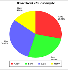
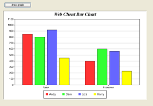
Some parts of this chapter refer to creating Charts and Graphs using the Graph2 window component, which is available for Window classes only, and therefore may not be available in your edition of Omnis Studio. You can however use the Graph2 External Object to generate a chart image in your Omnis code, save it as a JPG image and display it in the JavaScript Client in a remote form Picture control (this technique is shown in the JS Picture example app in the Hub in the Studio Browser), or you can add the chart image to a PDF report. Alternatively, you can use the Bar or Pie Chart JavaScript component to display a chart in your web & mobile apps.
You can create many different types of chart in Omnis using the Graph2 component and display them in your windows, remote forms, or reports. The data and appearance of a chart is based on the data stored in an Omnis list variable. The different chart types require a different list data structure to represent their data points. The Graph2 component supports four main types of chart: XY charts, Pie charts, Polar charts and Meter charts, each of which has a number of subtypes (except Pie). The major and minor types of the graph are specified as properties of the graph window object (found under External Components in the Component Store) and the associated list variable is specified in the $dataname property of the object.
Note to existing Omnis developers
The Graph2 component is based on a new graphing engine (called ChartDirector from Advanced Software Engineering Ltd) and was introduced to simplify graphing functionality in Omnis. The Graph2 component can produce many more types of chart and is easier to use than the old Graph component, which for backwards compatibility is still available in Omnis, but is no longer maintained or supported.
High Resolution Charts
From Studio 10.2 Rev 29538 onwards, the Graph2 component draws charts in high resolution suitable for display on high resolution displays. In this case, charts are generated at twice the size and are displayed at the correct physical size on high resolution displays.
You can disable this behavior by setting the property $disablehighresolution to kTrue (the default is kFalse meaning high resolution charts are supported). If the client is running on a display that does not support high resolution, the property will be set to kTrue automatically, and you will not be able to change the value of the property.
XY charts can be one of several different minor types or subtypes.
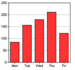
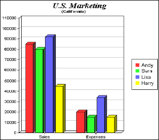
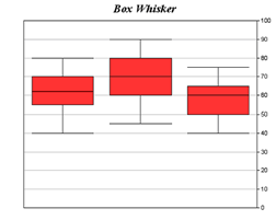
Bar charts represent individual amounts, or compare individual amounts; you can change the graph orientation to show horizontal bars. There are several subtypes which you can select, including Line, Scatter, Area, and Box whisker.
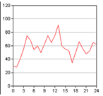
Line charts emphasize the rate of change rather than individual amounts.
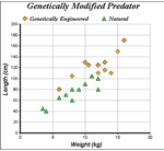
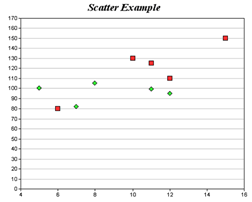
Scatter charts show the relationship of different groups of numerical data, and plot the data as xy coordinates.
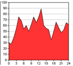
Area charts emphasize the amount or magnitude of change rather than the rate of change.
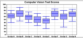
Box whisker charts normally consist of five items of data to represent each element. Gantt charts are also constructed using the Box Whisker type, using three items of data per graph element.
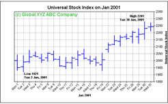
High/Low/Open/Close (HLOC) charts are used to represent financial data; this type uses four data items to represent each element.
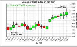
Candlestick charts are used to represent financial data; this type uses four data items to represent each element.
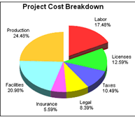
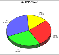
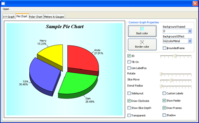
The data in a pie chart is represented as sections, or slices of a pie. There are no minor types for this chart type, but pies have numerous visual effects.
Polar charts represent data points on a radial axis with the values represented as the distance from the center; four minor types are available.
See later in this section for a description of how to draw the 2 graphs above.
Polar charts represent data points on a radial axis with the values represented as the distance from the center; four minor types are available.
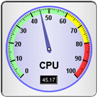
Numeric amounts or measurements can be shown as a meter or gauge; angular (or dial) or linear styles are available.
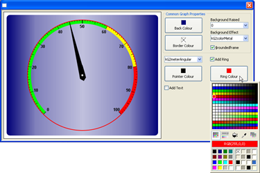
A meter chart with the Linear subtype. In addition to changing the orientation of meter charts, you can add extra pointers for showing multiple data points, and colored zones to mark the scale or dial, for example.
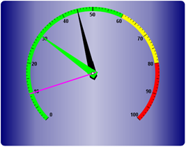
A Meter chart with Angular subtype providing a dial or gauge effect, shown here with rounded frame
There is an example library showing how the Graph2 component works, which is located under the Examples link in the Welcome window when you first launch Omnis – you can open this window by clicking on the New Users button in the main Omnis toolbar. Code from the example library is used later in this manual to show you how to use the component.
All the different graph types have the following properties; one of the most important properties is the $dataname which contains the name of the Omnis list variable containing the data for the graph; this is found under the General tab in the Property Manager.
| Property Name | Data Type | Description |
|---|---|---|
| $dataname | List | The name of the Omnis list variable supplying the data to the graph; the structure of the data in the list must match the type of graph you wish to draw |
The following common properties are found under the Prefs tab in the Property Manager.
| Property Name | Data Type | Description |
|---|---|---|
| $deviceindependent | Boolean | If True report printing creates a device independent bitmap (DIB), used for printing in the Web client and cross-platform applications |
| $imagesearchpath | Char | The path and folder name where the Graph component will search for images (on macOS the property uses a standard HFS colon-separated pathname); if empty (the default), the component searches in the Omnis\Icons folder |
| $legendbackgroundcolor | RGB Color | The legend background color |
| $legendbackgroundeffect | Constant | The legend background effect: kG2colorSolid, kG2colorMetal, or kG2colorNotUsed |
| $legendpos | Constant | The legend position: kG2legendNone, kG2legendLeft, kG2legendRight, kG2legendTop, kG2legendBottom, kG2legendManual ($legendx & legendy apply) |
| $legendtextcolor | RGB Color | The legend text color |
| $legendvert | Boolean | If True the legend is drawn vertically |
| $legendx | Integer | The X Position of the legend (only if $legendpos is kG2legendManual) |
| $legendy | Integer | The Y Position of the legend (only if $legendpos is kG2legendManual) |
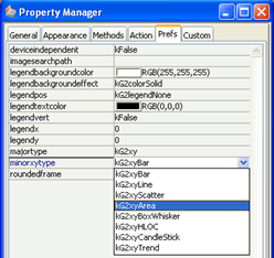
| $majortype | Constant | The graph type, a constant: kG2xy, kG2pie, kG2polar, or kG2meter |
| $minorxytype $minorpolartype $minormetertype |
Constant | Minor type for XY, Polar, or Meter graphs only; there are no minor types for Pie charts |
| $roundedframe | Boolean | If True the graph frame has rounded corners |
The following common properties are found under the Custom tab in the Property Manager for all graph types.
| Property Name | Data Type | Description |
|---|---|---|
| $3d | Boolean | If true the graph is 3d |
| $backgroundborder | RGB Color | The background border color |
| $backgroundcolor | RGB Color | The background color |
| $backgroundeffect | Constant | kG2colorSolid or kG2colorMetal |
| $backgroundraised | Integer | The degree to which the background is raised (if positive) or sunken (if negative); 0 is not raised |
| $columnheadings | List or row | A list or row containing the column headings of the list. |
| $labelfont | Character | Name of the font for the graph label (appears under the main title); must be a font in the Omnis/fonts folder; see the Labels section later in this manual |
| $maintitle | Character | The main title of the graph |
| $offsetwidth | Integer | The offset width for the graph |
| $offsetx | Integer | Additional x offset for the graph |
| $offsety | Integer | Additional y offset for the graph |
| $titlefont | Character | Name of the font for the graph title; must be a font in the Omnis/fonts folder; see the Labels section later in this manual |
| $titlefontheight | Integer | Height of the font for the graph title |
| $wallpaper | Character | The path/filename of an image; leave blank for no image |
| $xaxisfontangle | Integer | The angle of rotation, -1 is the default |
| $xaxistitle | Character | The title displayed on the X-Axis |
| $xlabelfontangle | Integer | angle of rotation for X axis label, -1 is the default |
| $y2axisfontangle | Integer | angle of rotation for Y2 axis label, -1 is the default |
| $yaxisfontangle | Integer | angle of rotation for Y axis label, -1 is the default |
| $yaxistitle | Character | The title displayed on the Y axis |
The different types of graph are specified using the $majortype and $minortype of the graph object. The following types are available, specified under the Prefs tab in the Property Manager:
| Major type ($majortype) | Minor type | Minor type constants |
|---|---|---|
| kG2xy | $minorxytype | kG2xyBar kG2xyLine kG2xyScatter kG2xyArea kG2xyBoxwhisker kG2xyHLOC kG2xyCandlestick kG2xyTrend |
| kG2polar | $minorpolartype | kG2polarArea kG2polarLine kG2polarSplineArea kG2polarSplineLine |
| kG2meter | $minormetertype | kG2meterAngular kG2meterLinear |
| kG2pie | No minor types |
When you have placed a Graph2 component on your window, you can set its $majortype in the Property Manager and select the appropriate minor type. As you change the major and minor type of the graph, several properties will be shown or hidden according to the graph type selected.
All the graph types have the following methods under the Methods tab in the Property Manager. More details about each method is supplied later in this section. Note these methods apply to the window graph object; methods are also available for the non-visual graph object, described in the second table.
| Method Name | Returns | Description |
|---|---|---|
| $addmark() | None | $addmark(iAxisID, nValue, iColor [,cText, cFontname, iFontsize]) adds a mark or separator at the specified axis, value and color; you can add text to the mark with the specified font name and size |
| $addtext() | None | $addtext(cText, iX, iY [,cFontname, iFontsize, iColor, iAlign, iAngle, bVertical]) adds the specified text positioned according to the X & Y co-ordinates; this must be done during the evPreLayout event; the co-ordinates are taken from the top left of the graph object and the Y component is inverted so that as Y increases the text string will appear further down the object |
| $addzone() | None | $addzone(iAxisID, iLowerlimit, iUpperlimit, iFillcolor) adds a zone from the lower and upper limits, in the color and on the axis specified |
| $convdate() | Integer | $convdate(dDatetime) converts a date/time variable to an integer equivalent which can then be used in graph data |
| $dispose() | None | Disposes the graph and rebuilds it. Useful if you need to change something other than a property on the graph which requires it to be rebuilt, such as adding more layers |
| $findobject() | kTrue for success | $findobject(iX, iY, iSetno, iItemno [,cSetname, cItemname]) obtains the set & item information for the graph object under the mouse given its position as the X & Y co-ordinates: see Drilldown |
| $formatvalue() | Char | $formatvalue(nValue, cFormatstring) formats a number/date using the formatting syntax described in the Parameter Substitution and Formatting section |
| $getcolors() | List | $getcolors([PaletteID]) returns a list of RGB colors used for the graph, or palette if specified, a constant: kG2paletteDefault, kG2paletteTransparent, or kG2paletteWhiteOnBlack |
| $getmainlayer() | Object | Returns the main layer object |
| $redraw() | None | Redraws the graph |
| $setcolors() | kTrue for success | $setcolors(lPaletteList) sets the colors for the graph using the specified list of RGB colors returned using $getcolors() |
| $setlinearscale() | None | $setlinearscale(iAxisid, nLowerlimit, nUpperlimit, [,nMajortick, nMinortick, lLabellist]) sets the linear scale for the specified axis; only available during Prelayout |
| $setlogscale() | None | $setlogscale(iAxisid, [cFormatstringORLowerlimit, nUpperlimit, ,cMajortick, nMinortick, nLabellist]) sets the log scale for the specified axis; only available during Prelayout |
| $snapshot() | Picture | $snapshot([iWidth, iHeight]) captures a snapshot of the graph with the specified width & height in pixels; omitting the parameters will return an image with the same dimensions as the current graph; the $snapshot() method causes the evPrelayout event to occur which allows you to add layers; see Graph Layers section below |
The following method is available for the non-visual graph object, that is, object variables based on the Graph2 object.
| Method Name | Returns | Description |
|---|---|---|
| $prelayout() | None | Available for object variables based on Graph2 component only; called during construction of the graph enabling layers to be added; see Graph Layers section below |
The XY chart type has several subtypes, which all share the following properties and methods.
| Property Name | Data Type | Description |
|---|---|---|
| $datacombine | Constant | The combine method of the data for Bar, Area, and Line graphs, a constant: kG2dataSide, kG2dataStack, kG2dataOverlay, kG2dataPercentage; these constants can also be used in the $addarealayer(), $addbarlayer(), and $addlinelayer() XY chart methods |
| $3ddepth | Integer | Specifies the depth of a 3d XY chart; the default is –1 but can be set to a positive integer value to specify a custom depth which is useful for 3d line and area graphs with multiple series |
| $hgridcolor | RGB Color | The horizontal grid color |
| $minorxytype | Constant | The minor type of a kG2xy graph; can be one of the following: kG2xyBar, kG2xyLine, kG2xyScatter, kG2xyArea, kG2xyBoxWhisker, kG2xyHLOC, kG2xyCandleStick |
| $offsetheight | Integer | The additional offset height of the graph |
| $subtitle | Character | The subtitle of the graph |
| $swapxy | Boolean | if true the X & Y axis are swapped |
| $xaxisontop | Character | if true the X axis is to be displayed on the top |
| $xaxiswidth | Integer | Width of the X axis in pixels |
| $y2axistitle | Character | Y2 axis title |
| $yaxisonright | Character | if true the Y axis is to be displayed on the right |
| $yaxiswidth | Integer | Width of the Y axis in pixels |
| $layereffect | Constant | The effect for all layers, a constant: kG2effectNone, kG2effectGlass, kG2effectSoftLight |
| $layereffectalign | Constant | The alignment or direction for the effect for all layers, as set by $layereffect; a constant: kG2alignTop, kG2alignBottom, kG2alignLeft, kG2alignCenter, kG2alignRight |
| $plotareacolorend | RGB Color | The end gradient color for the plot area |
| $plotareacolorstart | RGB Color | The start gradient color for the plot area |
| $vgridcolor | RGB Color | The vertical grid color |
All the following methods can only be executed during the evPreLayout event; see below for details.
| Method Name | Returns | Description |
|---|---|---|
| $addarealayer() | Integer | $addarealayer(pList [,iCombineType]) adds an area layer to the graph; pList is the area data* |
| $addbarlayer() | Integer | $addbarlayer(pList [,iCombineType]) adds a bar layer to the graph; pList is the bar data* |
| $addboxwhiskerlayer() | Integer | $addboxwhiskerlayer(pList) adds a box whisker layer to the graph; pList is the box whisker data* |
| $addcandlesticklayer() | Integer | $addcandlesticklayer(pList) adds candlestick layer to the graph; pList is the candlestick data* |
| $addhloclayer() | Integer | $addhloclayer(pList) adds a HLOC layer to the graph; pList is the HLOC data* |
| $addlinelayer() | Integer | $addlinelayer(pList [,iCombineType]) adds a line layer to the graph; pList contains the Line data* |
| $addscatterlayer() | Integer | $addscatterlayer(pList [,pSymbol, pSymbolSize]) adds a scatter layer to the graph.; pList is the scatter data*; pSymbol is an optional symbol type (of type kG2symbolXXX, defaults is kG2symbolSquare); pSymbolSize is the symbol size, default is 10. |
| $addtrendlayer() | Integer | $addtrendlayer(pList) adds a trend layer to the graph using the data in pList* |
| $getxaxis() | Object | $getxaxis([bSecondAxis]) returns the x-axis object, or the x2-axis object if bSecondAxis is true; only available during prelayout |
| $getyaxis() | Object | $getyaxis([bSecondAxis]) returns the y-axis object, or the y2-axis object if bSecondAxis is true; only available during prelayout |
* See appropriate chart section below for the format of the data in pList. In addition, see $datacombine for details of the various data combine types available.
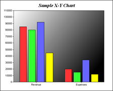
The bar chart is one of the most common forms of chart. The list format is one row per series with the first column being the group name followed by the data for each group. You can build the list data for your graph from a database or construct it on the fly: you need to use the $define() method to specify the columns in your list, and you can use $add() (or the SQL database list methods) to build the list line by line.
The following method will construct the list data for a simple bar chart.
The list variable listGraph is specified as the $dataname of the graph field. The above method will create a graph of two groups each with four series:
Note you can use the Omnis 4GL commands to build the list data for the graph, either from an Omnis database, a SQL database, or on-the-fly, such as the following:
The line and area chart in their data representation are very similar to the bar chart. So given the following data:
Note the use of the colList list in the portion of code, which can be assigned to the $columnheadings property of the graph field, overriding the normal x-axis variable names.
You should set the $majortype and minor type properties ($minorxytype or $minorpolartype) of the graph to specify its type and subtype. The above method will display the following line or area graph:
3d Line chart |
3d Area chart |
Each individual row in the chart list data represents a new plot (or series). The X & Y plot positions are then represented in two columns. Additional columns represent the other groups, so given the following data:
There are two groups of five series which will result in the following chart:
Note that the symbols used to represent each series are in the order of square, diamond, triangle, right-triangle, left-triangle, inverted triangle, circle, cross, and cross #2.
Box whisker charts represent data ranges as boxes and/or marks. A common application is to represent the maximum, 3rd quartile, median, 1st quartile and minimum values of some statistics.
Each individual row in the chart list data represents each series.
You can create Gantt charts using a Box Whisker chart and setting the $swapxy property to kTrue so the bars are displayed horizontally. For Gantt charts you only need to provide two groups of data in your list. The example Graph2 library contains a simple Gantt chart, as follows:
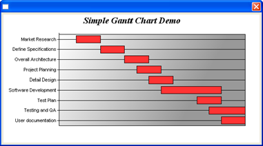
The following method is executed in the $construct() of the Gantt chart window:
The $addline() class method is:
You can use the $convdate() method to convert a date/time variable to an integer equivalent which can be used in graph data.
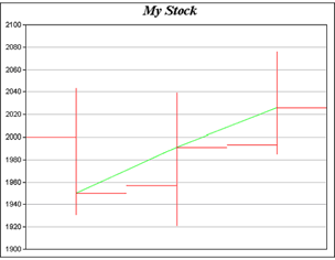
The HLOC chart is often used to represent financial stock data. Each series consists of four pieces of information, the highest price, the lowest price, the open price, and the close price.
The volatility is then shown as a vertical line, with the opening price as a horizontal line to the left and the closing price as a horizontal line to the right.
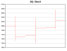
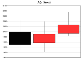
The candlestick chart is very similar to the HLOC chart and the list data is formatted in the same way. The difference in the graphical representation is that the area between the opening and closing price is shown as a filled rectangle; in the following example a black rectangle indicates that the closing price was lower than the opening price (a bad day). Both examples of the HLOC and Candlestick charts used the same data.
A trend chart allows you to view and compare data values over a given period or within a group. The first column in the data list contains the name of item and the second column onwards contains the data values for the item. A trend chart will contain one line for each row of data in the list.
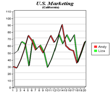
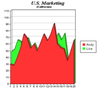
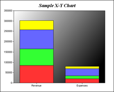
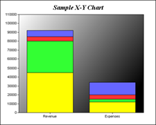
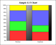
You can change the way data is presented in Bar, Area, and Line graphs using the $datacombine property, which can be set to one of the following constants: kG2dataSide, kG2dataStack, kG2dataOverlay, or kG2dataPercentage. When $datacombine is changed the bars, areas, or lines, and the Y-axis, are redrawn to reflect the selected combine type. The following example graphs shown how the different combine types affect the presentation of the same set of data (these graphs are available in the Graph example library).
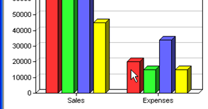
$datacombine = kG2dataSide: The data sets are shown as individual bars side-by-side (the default for XY bar charts) |
$datacombine = kG2dataStack: The data sets are combined by stacking up the bar segments, therefore showing individual amounts in relation to the total amount for the data group |
$datacombine = kG2dataOverlay: The data sets are overlayed each other providing a clearer comparison of data than the side-by-side type |
$datacombine = kG2dataPercentage shows each individual amount as a percentage of the total for the data group |
These different combine types can also be used when adding data layers to a graph using the $addarealayer(), $addbarlayer(), or $addlinelayer() XY chart methods; see the Graph Layers section.
Pie charts have the following properties and methods, in addition to the Common graph properties and methods.
| Property Name | Data Type | Description |
|---|---|---|
| $depth | Integer | The depth of the pie (-1 is default) |
| $depthcolumn | Integer | The column number (0 if not required) of the depth values in the list. This can be used to enable different slice depths |
| $donutradius | Integer | The amount of cut out from the center of the pie, specified as the percentage of the total radius of the pie; the range is 0-100, with 0 being no donut (the default) |
| $drawclockwise | Boolean | if true the slices are drawn clockwise |
| $feelercolor | RGB | The feeler color |
| $feelerwidth | Integer | The feeler width |
| $framecolor | RGB | The color of frame around pie slices, if $frameon is true |
| $frameon | Boolean | If true a frame is drawn around each pie slice |
| $labelformat | Character | Overrides the default formatting of labels; see section Parameter Substitution and formatting |
| $labelpos | Integer | Position of the labels relative to the edge of the pie, only used if $labelposon is true |
| $labelposon | Boolean | If true $labelpos is enabled |
| $rotate | Number | The pie rotation, in degrees |
| $shadow | Boolean | If true a pie shadow is displayed |
| $showfeeler | Boolean | if true feelers are shown |
| $sidelayout | Boolean | If true the labels are displayed by the side of pie |
| $tilt | Integer | If $tilton is enabled this contains the degree of tilt |
| $tilton | Boolean | if true the tilt is enabled (see $tilt); note $3d has to be enabled as well to display tilt |
Pie charts have the following method(s), in addition to the common methods.
| Method Name | Returns | Description |
|---|---|---|
| $slicemove() | None | $slicemove(iDistance, iSlice [,iSliceend]) moves iSlice or range of slices (iSlice to iSliceend) the specified iDistance from the center of the pie; the first slice in the chart is value 0; to move non-adjacent slices, iSlice should be a comma-separated list of slices, e.g. .$slicemove(iDistance,’0,2’) to move slices 1 and 3 |
Note that some ‘actions’ on a pie chart are controlled by setting a particular property, such as $tilt; see the previous section for pie chart properties. Note also that you cannot add layers to a pie chart using methods, such as those used on XY and Polar charts.
The following list data will result in the graph shown.

Pie charts have several properties that allow you to alter the appearance of the chart, such as $tilt and $rotate. These can be used together with a set of sliders to create a dynamic representation of the user’s data. See the Graph2 example in the Welcome screen when Omnis starts up (click the New Users button on the main Omnis toolbar) – the Graph2 example application shows many effects for Pie charts.
The code behind the slider can change the appropriate property in the pie chart, such as the following, which allows the user to change the tilt of the pie chart:
The following code for a slider component allows the user to change the rotation of the chart.
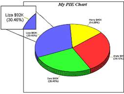
In addition, the $slicemove(iDistance, iSlice) method lets you move or ‘slice out’ one of the slices in the pie chart. For example, the Slice move slider in the above window has the following method:
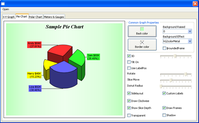
Using a combination of properties you can create some good effects for Pie charts. The following pie chart uses $sidelayout set to kTrue, a custom $labelformat, and $slicemove is set to slice out the first and the third slices in the chart.
The Polar chart has the following properties and methods, in addition to the Common graph properties and methods.
| Property Name | Data Type | Description |
|---|---|---|
| $angularcolor | RGB color | Color of angular grid |
| $angularlabelson | Boolean | If true labels are shown on the angular axis |
| $angularwidth | Integer | Width of the angular grid |
| $circulargrid | Boolean | If true the grid is circular, otherwise the default is polygonal |
| $minorpolartype | Constant | The minor type for kG2polar type graphs; can be one of the following: kG2polarArea, kG2polarLine, kG2polarSplineArea, kG2polarSplineLine |
| $radialcolor | RGB color | Color of radial grid |
| $radiallabelson | Boolean | If true labels are shown on the radial axis |
| $radialwidth | Integer | Width of the radial grid |
The following methods must only be executed during the evPreLayout event; see below for details.
| Method Name | Returns | Description |
|---|---|---|
| $addarealayer() | None | $addarealayer(pList [,iCombineType]) adds an area layer to the graph; pList is the area data* |
| $addlinelayer() | None | $addlinelayer(pList [,iCombineType]) adds a line layer to the graph; pList contains the Line data* |
| $addsplinearealayer() | None | $addsplinearealayer(pList [,pSymbol, pSymbolSize]) adds a spline area layer to the graph; pList is the spline area data list (same format as all polar charts) |
| $addsplinelinelayer() | None | $addsplinelinelayer(pList [,pSymbol, pSymbolSize]) adds a spline line layer to the graph; pList is the spline line data list (same format as all polar charts) |
| $getradialaxis() | Object | $getradialaxis() returns the radial axis object |
* See appropriate chart section for the format of the data in pList. In addition, see $datacombine for details of the various data combine types available.
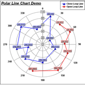
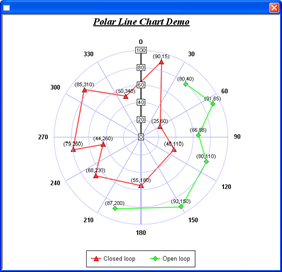
The data points in a polar chart are plotted using polar co-ordinates (radius,angle) whereby radius is the distance or amount from the center of the chart and angle is the relative angle with reference to the "12 o'clock position" in the chart. The first three columns in the Omnis list for a polar chart should therefore be Name (Label), Amount, Angle. If the angle is omitted from the list data, then the data points are distributed evenly around the chart. For example, consider the following data:
Will give the following polar chart:
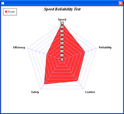
Note the following properties are set for the chart:
$majortype = kG2polar, $minorpolartype = kG2polarArea,
$legendpos = kG2legendManual, $legendx & $legendy = 10,
$angularlabelson = kTrue, $offsetwidth = 30,
$angularcolor = 187,187,255, $radialcolor = 153,153,255,
$maintitle = ‘Speed Reliability Test’
To draw a second set of data in a polar chart, from a second list perhaps, you can add the additional data in a layer over the first set of data. You can add layers to charts during the evPrelayout event which is triggered as the graph component is instantiated.
Consider the following example. The first set of data is constructed in the $construct() method of the graph window: the second set of data is added as a layer.
The second data set is constructed during the evPrelayout event for the graph object and added as a line layer using the $addlinelayer() method.
The above code produces the following graph:
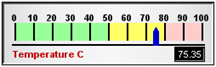
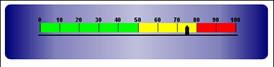
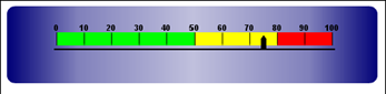
You can create Linear or Angular (radial) meter charts, and change their appearance using a range of properties and methods. Meter charts have the following properties and methods, in addition to the common graph properties and methods.
| Property Name | Data Type | Description |
|---|---|---|
| $minormetertype | Constant | The minor type for meter charts, a constant: kG2meterLinear, kG2meterAngular |
| $linearalignment | Constant | The alignment for linear meter charts, a constant: kG2alignTop, kG2alignBottom, kG2alignLeft, kG2alignRight, kG2alignCenter |
| $angulardegrees | Integer | The start and end degrees for an angular chart in the form n,n, the default is 0,360 |
| $angularpositionh | Integer | The horizontal position of the center (start) of an angular meter chart; the default is 50 which centers the chart horizontally |
| $angularpositionv | Integer | The vertical position of the center (start) of an angular meter chart; the default is 50 which centers the chart vertically |
| $majortickwidth | Integer | The width of the major tick in pixels; the default is 1 |
| $microtickwidth | Integer | The width of the micro tick in pixels; the default is 1 |
| $minortickwidth | Integer | The width of the minor tick in pixels; the default is 1 |
| $pointercolor | RGB color | The color of the pointer for a meter chart |
You can change the minor type of a meter graph using the following method:
or
Meter charts have the following methods in addition to the common methods.
| Method Name | Returns | Description |
|---|---|---|
| $addpointer() | None | $addpointer(nValue, iColor [,nPointertype]) adds a pointer to a meter chart with the specified value and color; this must be done during the evPreLayout event; the pointer type is a number in the range 0-5; see the Adding Pointers section below |
| $addring() | None | $addring(iStartradius, iEndradius, iFillcolor) adds a colored ring to an angular meter with the specified start and end radius in pixels; this must be done during the evPreLayout event; you can use this to add a colored band or a number of bands around a standard meter dial; you can color the entire face by setting the start radius to zero and the end radius to beyond the meter ticks |
The Meter chart type (kG2meter) lets you create Angular and Linear meters to represent single data points. The properties of the meter type let you specify analog and digital read outs, colored backgrounds, multiple pointers per chart, pointers of different shapes, and so on. The example library demonstrates angular/radial and linear charts.
The data in the list associated with the graph object is used to specify the data point and various properties of the graph, as follows:
The example library uses the above data to create the following chart:
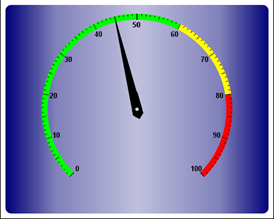
Note that this and the next meter chart has colored zones defined on the scale; these are described on the Adding Colored Zones section.
When the minor type is set to kG2meterLinear, the following method:
Can be used to build the following linear chart:
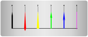
The standard meter chart represents a single data point, which is shown using the default pointer, but you can add one or more additional pointers to a chart to show other data. You can add extra pointers to a meter chart (angular or linear) using the $addpointer() method, which must be executed during the evPreLayout event for the graph object; see the Graph Layers section for information about evPreLayout.
$addpointer(nValue, iColor [,nPointertype])
adds a pointer to an angular or linear meter chart with the specified value and color; this must be done during the evPreLayout event; the pointer type is a number in the range 0-5, as follows:
| 0 | Pencil pointer (the default pointer for linear charts) |
| 1 | Diamond pointer (the default pointer for angular charts) |
| 2 | Triangular pointer |
| 3 | Arrow with square ends |
| 4 | Arrow with sharp/pointed ends |
| 5 | Line pointer |
The different pointer styles are shown in the following linear chart:
The following method adds two pointers to an angular chart:
The method produces the following chart:
A ring is the region in an Angular chart between two concentric circles. You can add rings to an Angular chart using the $addring() method, which is useful for adding circular borders and backgrounds to a meter; this must be done during the evPreLayout event.
$addring(iStartradius, iEndradius, iFillcolor)
adds a colored ring to an angular meter with the specified start and end radius in pixels
The difference between the start and end radius is, in effect, the width or thickness of the ring in pixels. If you use a start radius of zero, the ring will be drawn starting from the center of the chart face and, depending on the value of the end radius, will draw a circle on the chart with the given radius.
The example library demonstrates adding a ring to a radial meter chart, and uses the following method, which is added to the $event() method for the graph window object:
Which produces the following chart; note the ring has been changed to red using the color picker:
In the example library, the start and end radius settings for the $addring() method take account of the raised background, since when the background is raised or inset by any amount, the radius of the meter dial is reduced by the same amount. The color for the ring is taken from the color picker, which is returned in the value of the $contents property of the color picker button.
A ring must be added to a meter chart during the evPreLayout event, which is triggered following a $dispose() method for the graph object. For example, the method for the color picker in the example library is as follows:
This causes the $event() method for the graph window object to be called and the evPreLayout event is triggered, which in this case runs the method to add the ring.
You can add multiple layers to certain types of XY and Polar graph using the $add<layertype> methods during the Prelayout event (evPreLayout) event, which is triggered just before the graph instance is created in a window. Note you cannot add layers to Pie charts.
You can add layers to any type of XY or Polar chart using one of the $add<layertype> methods. In theory, any combination of chart type and layer is possible within the major XY and Polar types, but not all combinations are that meaningful. It largely depends on what type of data you are trying to represent or what data sets you might want to compare by showing the data sets as different layers.
You can specify how the layer data is combined with or added to the graph using one of the data combine type constants as follows:
| kG2dataOverlay | The additional data layer is added on top of the existing graph data |
| kG2dataPercentage | The existing and additional data sets are combined and scaled so each adds up to 100 |
| kG2dataSide | The existing and additional data sets are shown side by side |
| kG2dataStack | The additional data set is stacked on top of the existing graph data |
| kG2dataOverlay | The additional data layer is added on top of the existing graph data |
For example, in the case of the High/Low/Open/Close charts, it is quite common in financial applications to draw a line between the open and close points. This can be achieved by adding a line layer during the evPreLayout event using the $addlinelayer() method, as follows:
Refer to the appropriate layers section for the exact format of the list. The above method will result in the following graph:
When using an object variable based on the Graph2 component you can use the $prelayout() method in the object to add layers in the same way as described above.
Caution: A word of warning, evPreLayout events occur during the construction of a graph image which typically happens during the drawing of the graph control. This can make debugging the graph object’s $event() method potentially troublesome.
The Graph2 window component reports an evGraphClick event when the user clicks on the object. The event returns the following event parameters:
| pItem | The number of the item or data point clicked on within the current data set or group; the first item or data point is 1, the second is 2, and so on. |
| pItemname | The name of the data point clicked on. |
| pSet | The number of the data set or group clicked on; the first set or group is 1, the second is 2, and so on. |
| pSetname | The name of the data set or group clicked on. |
For example, using the following method behind the $event() method of the graph object:
# the $event() for the graph object
And clicking on the first item in the second set or group of the following graph
Will give the following message:
You can use the item and set number/name information to drilldown into the data by reformatting the list data and redrawing the graph.
Note that pSet and pSetname are not valid for pie charts since they represent a single set of data only.
The methods $getcolors() and $setcolors() allow you to get and set the color of elements within a graph at runtime. $getcolors() returns a list containing the RGB color of each element in the current graph.
The first eight color values in the color list have special significance. The first three palette colors are the background color, default line color, and the default text color of the chart. The fourth to seventh palette colors are reserved for future use. The eighth color is a special dynamic color indicating the “current data set”. The ninth color (index = 8) and subsequent colors in the list represent the elements in the graph, such as lines and text objects.
In a pie chart, Omnis will automatically use the ninth color for the first slice, the tenth color for the second slice, and so on. Similarly, for a multi-line chart, Omnis will use the ninth color for the first line, the tenth color for the second line, and so on.
The $setcolors() method allows you to set the color of any element in the graph. For example, the following method will set the color of the first data element in the chart to black (value 0):
You can return the color palette for a graph by specifying one of the palette constants in the $getcolors([PaletteID]) method. The constants are: kG2paletteDefault, kG2paletteTransparent, or kG2paletteWhiteOnBlack (the latter inverts the black and white colors in the graph). The following method can be used to switch to a transparent color palette for a graph:
The following method can be used to switch the graph colors back to the default palette, perhaps after having colored individual elements or switching the whole graph palette to transparent or White-on-black:
A zone is a color band on the back of the plot area. Like marks, zones can be horizontal or vertical. They are particularly useful for marking different parts of the scale on a meter chart, or adding bands of color behind a bar, area or line chart.
You can add zones to the background of a chart using the $addzone() method; this must be done in the evPreLayout event. For example, the following method can be used to set the color for different parts of the scale on a linear meter.
This method produces the following chart.
Charts often contain a lot of text strings, such as sector labels in pie charts, axis labels for XY charts, data labels for the data points, graph titles, and so on. You can substitute many of these parameters to allow you to configure precisely the information contained in the text and their format. For example, when drawing a pie chart with side label layout, the default sector label format is:
In drawing the sector labels, the graph component will replace "{label}" with the sector name, and "{percent}" with the sector percentage. So the label will be something like:
You can change the sector label format by changing the format string. For example, you can change it to:
Here is an example method that changes the $labelformat property in a pie chart.
Pie chart with default labels |
Same pie chart with modified labels |
For fields that are numbers, dates, or times, the Graph component supports a special syntax in parameter substitution to allow formatting of these values. Please refer to the Number Formatting and Date/Time Formatting sections below for details.
The following tables describe the fields available for various chart objects.
| Parameter | Description |
|---|---|
| sector | The sector number. The first sector is 1, the second is 2, and so on. |
| dataSet | Same as {sector}. See above. |
| label | The text label of the sector. |
| dataSetName | Same as {label}. See above. |
| value | The data value of the sector. |
| percent | The percentage value of the sector. |
The following are parameters that apply to all XY Chart layers in general. Some layer types may have additional parameters (see below).
Note that some parameters do not apply in certain cases. For example, when specifying the aggregate label of a stacked bar chart, the {dataSetName} parameter does not apply, because a stacked bar is composed of multiple data sets. It does not belong to any particular data set and hence does not have a data set name.
| Parameter | Description |
|---|---|
| x | The x value of the data point. |
| xLabel | The bottom x-axis label of the data point. |
| x2Label | The top x-axis label of the data point. |
| value | The value of the data point. |
| accValue | The accumulative value of the data point. This is useful for stacked charts, such as stacked bar chart and stacked area chart. |
| totalValue | The total value of all data points. This is useful for stacked charts, such as stacked bar chart and stacked area chart. |
| percent | The percentage of the data point based on the total value of all data points. |
| accPercent | The accumulated percentage of the data point based on the total value of all data points. This is useful for stacked charts, such as stacked bar chart and stacked area chart. |
| dataSet | The data set number to which the data point belongs. The first data set is 1, the second is 2, and so on. |
| dataSetName | The name of the data set to which the data point belongs. |
| dataItem | The data point number within the data set. The first data point is 1, the second is 2, and so on. |
| dataGroup | The data group number to which the data point belongs. The first data group is 1, the second is 2, and so on. |
| dataGroupName | The name of the data group to which the data point belongs. |
| layerId | The layer number to which the data point belongs. The first layer is 1, the second is 2, and so on. |
The following are in addition to the parameters for all XY Chart layers.
| Parameter | Description |
|---|---|
| high | The high value of the data representation. |
| low | The low value of the data representation. |
| open | The open value of the data representation. |
| close | The close value of the data representation. |
The following are in addition to the parameters for all XY Chart layers.
| Parameter | Description |
|---|---|
| top | The value of the top edge of the box-whisker symbol. |
| bottom | The value of the bottom edge of the box-whisker symbol. |
| max | The value of the maximum mark of the box-whisker symbol. |
| min | The value of the minimum mark of the box-whisker symbol. |
| med | The value of the median mark of the box-whisker symbol. |
The following are in addition to the parameters for all XY Chart layers.
| Parameter | Description |
|---|---|
| slope | The slope of the trend line. |
| intercept | The y-intercept of the trend line. |
| corr | The correlation coefficient in linear regression analysis. |
| stderr | The standard error in linear regression analysis. |
| Parameter | Description |
|---|---|
| radius | The radial value of the data point. |
| value | Same as {radius}. See above. |
| angle | The angular value of the data point. |
| x | Same as {angle}. See above. |
| label | The angular label of the data point. |
| xLabel | Same as {label}. See above. |
| name | The name of the layer to which the data point belongs. |
| dataSetName | Same as {name}. See above. |
| i | The data point number. The first data point is 1, the second is 2, and so on. |
| dataItem | Same as {i}. See above. |
The following method sets the label for the data points in a polar chart.
| Parameter | Description |
|---|---|
| value | The axis value at the tick position. |
For parameters that are numbers, the Graph component supports a number of formatting options in parameter substitution.
For example, if you want a numeric field (value) to have a precision of two digits to the right of the decimal point, you can use (value|2.,) where 2 and '.' (dot) is used to specify the decimal point precision, and ',' (comma) as the thousand separator. The number 123456.789 will therefore be displayed as 123,456.79.
For numbers, the formatting options are specified using the following syntax:
where:
| Parameter | Description |
|---|---|
| [param] | The name of the parameter |
| [a] | An integer specifying the number of digits to the right of the decimal point. The default is automatic. To use the default, simply skip this parameter. |
| [b] | The thousand separator. Should be a non-alphanumeric character (not 0-9, A-Z, a-z). Use '~' for no thousand separater. |
| [c] | The decimal point character. |
| [d] | The negative sign character. Use '~' for no negative sign character. |
You may skip the trailing formatting options if they are needed. For example, (value|2) means formatting the value with two digits to the right, where the thousand separator, decimal point character, and negative sign character are all using the default settings of the chart.
For parameters that are dates & times, the formatting options can be specified using the following syntax:
where [datetime_format_string] must start with an alphabetic character (A-Z or a-z), and may contain any characters except ')'. Certain characters are substituted according to the following table:
| Parameter | Description |
|---|---|
| yyyy | Year in 4 digits (e.g. 2005) |
| yyy | Year showing only the least significant 3 digits (e.g. 007 for the year 2007) |
| yy | Year showing only the least significant 2 digits (e.g. 07 for the year 2007) |
| y | Year showing only the least significant 1 digit (e.g. 7 for the year 2007) |
| mmm | Month formatted as its name. The default is to use the first 3 characters of the English month name (Jan, Feb, Mar ...). |
| mm | Month formatted as 2 digits from 01 - 12, with leading zero if necessary. |
| m | Month formatted using the minimum number of digits from 1 - 12. |
| dd | Day of month formatted as 2 digits from 01 - 31, with leading zero if necessary. |
| d | Day of month formatted using the minimum number of digits from 1 - 31. |
| w | The name of the day of week. The default is to use the first 3 characters of the English day of week name (Sun, Mon, Tue ...). |
| hh | The hour of day formatted as 2 digits, adding leading zero if necessary. The 2 digits will be 00 - 23 if the 'a' option (see below) is not specified, otherwise it will be 00 - 12. |
| h | The hour of day formatted using the minimum number of digits. The digits will be 0 - 23 if the 'a' option (see below) is not specified, otherwise it will be 0 - 12. |
| nn | The minute formatted as 2 digits from 00 - 59, adding leading zero if necessary. |
| n | The minute formatted using the minimum number of digits from 00 - 59. |
| ss | The second formatted as 2 digits from 00 - 59, adding leading zero if necessary. |
| s | The second formatted using the minimum number of digits from 00 - 59. |
| a | Display either 'am' or 'pm', depending on whether the time is in the morning or afternoon. |
For example, a parameter substitution format of (value|mm-dd-yyyy) will display a date as something similar to 09-15-2002. A format of (value|dd/mm/yy hh:nn:ss a) will display a date as something similar to 15/09/02 03:04:05 pm.
You can use a type of Mark Up Language (supported in the underlying graph engine and called ChartDirector Mark Up Language or CDML) to include formatting information in text strings by marking up the text with tags. This Mark Up Language allows a single text string to be rendered using multiple fonts, with different colors, and even embed images in the text. CDML is supported in all text objects including chart titles, legend keys, axis labels, data labels, and so on.
You can change the style of the text by using special tags. For example, the following code substitutes some of the parameters and formats the fonts using tags:
In general, all tags in CDML are enclosed by <* and *>. Attributes within the tags determine the styles of the text following the tags within the same block. If you want to include <* in text without being interpreted as CDML tags, use <<* as the escape sequence.
The following font style attributes can be used:
font
The font file name.
size
The font size.
width
The font width. This attribute is used to set the font width and height to different values. If the width and height are the same, use the size attribute.
height
The font height. This attribute is used to set the font width and height to different values. If the width and height are the same, use the size attribute.
color
The text color in hex format.
underline
The line width of the line used to underline the following characters. Set to 0 to disable underline.
You can embed images in text using the <*img*> tag and the following syntax:
You can use the $imagesearchpath property (on the Preference tab) to specify the folder where the Graph component will search for images (on macOS the property uses a standard HFS colon-separated pathname). If you leave the property blank (the default), the component sets the search path to the icons folder in the Studio tree, which means your image file must be located in this folder. Having set the image search path you can use the image file name only in the <*img*> tag. For example, the line:
embeds the image file sun_bullet.gif which is located in the Omnis\images folder.
You can override the default fonts for the main title and labels in a graph by setting the $titlefont and $labelfont properties (found under the Custom tab in the Property Manager). You can specify any true type font (TTF) or True type collection (TTC) that is located in the Fonts folder in the main Omnis folder. If a folder called ‘Fonts’ does not exist you can create one with this name. If you add fonts to this folder, you have to restart Omnis before the fonts become available in Omnis.
The default value is set to “(DEFAULT)” which means the default font for your system will be used (e.g. Times Roman under Windows). You can adjust the height or size of the main graph title by setting the $titlefontheight property.
You can add text to a chart using the $addtext() method, but this must be done during the evPreLayout event.
$addtext(cText, iX, iY [,cFontname, iFontsize, iColor, iAlign, iAngle, bVertical])
adds the specified text positioned according to the X & Y co-ordinates
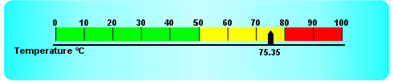
The X & Y co-ordinates are taken from the top left of the graph object, but the Y component is inverted, so that as Y increases the text string will appear further down the chart. The following method adds some text to a Linear meter chart. Note the $formatvalue() method is used to format a number before it is added.
This method produces the following chart:
You can use the Graph2 component on Omnis reports in much the same way as you can for windows for displaying data contained in an Omnis list. That is, you can place a graph component on a report class, assign a list variable to it, print the report and the data will be displayed in a chart as expected, depending on the properties you have set in the graph object.
However, if you wish to manipulate a graph using any of the graph methods, this must be done within the report instance itself and before the report is printed. Therefore to do this, you must instantiate an object variable based on the Graph2 component, execute any methods against the graph object and transfer the image of the graph to an Omnis picture variable using the $snapshot() method. The graph image contained in the picture variable can be displayed in the report using a standard Omnis Picture field.
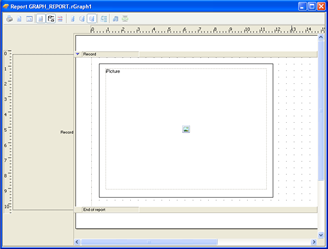
For example, the following report class has a single picture field with its $dataname set to the variable iPicture. The $height and $width properties are set to 7.9cm and 10.5cm respectively, which corresponds the height and width of the graph image created in the report instance.
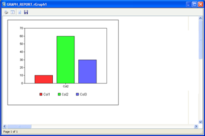
The following method is contained in the $construct() method of the report class, therefore the method is executed when the report is instantiated, and the graph object is created and transferred to the picture variable before the report is printed. The $snapshot() method is used to capture the graph image and returns it to the picture variable.
Note that the graph object will use all the default properties, so if you want to change the appearance, type or subtype of graph, you need to change the appropriate properties of the graph object at runtime using the notation. The above method sets the graph major type and assigns the list variable to the object.
The report will look something like the following:
If you wish to display a chart in a remote form you have to use a similar technique to displaying graphs in a report – this is because there is no visual graph component for use with remote forms. Instead, you can use the graph component as an object variable and construct the graph image in memory on the Omnis Server and ‘save’ and display it as a picture in the remote form. When the graph is constructed in memory, the $snapshot() method lets you transfer the graph image to an image variable suitable for displaying in an Omnis picture field in a remote form.
You have to create an Object variable in your remote form with the Graph object specified as the object subtype. The following method will do this:
This will result in this image:
The Graph2 example library contains a Remote form example, showing all the main chart types. In this case, the remote form uses an object class based on the Graph2 component and uses $snapshot() to transfer the graph image to a picture field in the remote form.
The remote form Picture field type reports the mouse X and Y co-ordinates when an evClick event is triggered. This allows you to pinpoint where in the image the user has clicked. You can use this information to find out which active graph element has been clicked, such as a bar, line or pie slice. Having captured the graph image using the $snapshot() method you can use the $findobject() method to return the item and set information for the selected object. For example:
The bar chart would look something like the following:
The mouse co-ordinates are returned in pMouseX and pMouseY in the evClick event. The $findobject() method uses the mouse co-ordinates to get the setno, itemno, setname, and itemname which contain information about the graph object clicked on. Clicking on the first bar in the second group of the above chart produces this data:
You can use the item and set number/name information to drilldown into the data by reformatting the list data and redrawing the graph in the remote form.
Note that the Set number and name are not valid for pie charts.