Omnis Technical Note TNGI0019 December 2007
Adding colors and icons to lists
For Omnis Studio 3/4
By Michael Hufschmidt
Problem
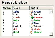
In nearly every Omnis application, lists are used somewhere. The most basic GUI control to display a list is the Headed List Box; for a detailed description please refer to the Omnis_Programming.pdf manual (November 2005) page 246. However, the simple text display of a list may not meet the requirements of a modern user interface, but you can make your lists more interesting visually by adding colors and icons.
Solution
In simple cases you can enhance the text contents of your list with Styles (see documentation of the style() function in manual Omnis_Function_Reference.pdf, November 2005, page 108) and display the modified Omnis list in a Headed List Box. This allows you to show the text of each line in a different color, to add icons, or to display the text in bold or italic. A possible result is shown in the following picture:
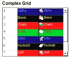
If you want to set the background color of each text field to a different color, you can use a Complex Grid instead of the Headed List Box, as follows:
The construction of this complex grid is as follows:
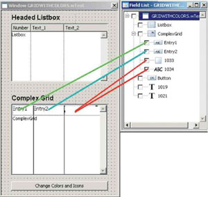
An entry field is included in the first and in the second columns of the grid; their properties are set as follows:
$fieldstyle = <None>
$edgefloat = kEFposnClient
$effect = kBorderNone
However, you cannot display icons in an entry field. If you want to show both different background colors and icons you can use the background controls - in this case, a combination of a rectangle (for the background color) with a text control (for the icon and the text). Make sure the text control is positioned in front of the rectangle (context menu: Order>>To Front). Both controls have to be the same size.
In order to show controls in a complex grid in a different color for each line, you must first create a reference to the control:
Set reference textRef to$cinst.$objs.ComplexGrid.$bobjs.1034
Then you can modify properties, such as the $text property, of this control line by line with:
Do textRef.[lineNumber].$text. $Assign(...)
The complete code to display the complex grid is as follows:
Do method $makelist Returns iGridList ;; Returns a 'naked'
list with only chars
Set reference entry2Ref to $cinst.$objs.ComplexGrid.$objs.Entry2 ;; Entry
field in Column 2
Set reference rectRef to $cinst.$objs.ComplexGrid.$bobjs.1033 ;; Rectangle
in Column 3
Set reference textRef to $cinst.$objs.ComplexGrid.$bobjs.1034 ;; Text
in Column 3
For lineNumber from 1 to iGridList.$linecount step 1
Calculate colorBack as pick(mod(lineNumber+iOffset-1,4),kBlack,kRed,kGreen,kBlue)
;; Select a new background color for each line
Calculate colorText as pick(mod(lineNumber+iOffset-1,4),kYellow,kWhite,kRed,kGray)
;; Select a new text color for each line
Calculate icon as 2140+mod(lineNumber+iOffset-1,6) ;; Select a new icon
number for each line
Do entry2Ref.[lineNumber].$forecolor.$assign(colorBack)
Do entry2Ref.[lineNumber].$textcolor.$assign(colorText)
Do rectRef.[lineNumber].$backcolor.$assign(colorBack)
Do textRef.[lineNumber].$text.$assign(con(style(kEscBmp,icon),' ',style(kEscColor,colorText),iGridList.[lineNumber].Text_1))
End For
Quit method
Unlike an entry field, a text control can only display text - it does not allow text entry. If this is required, you can implement an entry field in the appropriate column of the complex grid, as well as the rectangle control (to color the background) and a text control which in this case only displays the icon. The properties $forecolor and $textcolor of the entry field have to be adjusted dynamically as described above. The property $edgefloat should be set to kEFnone and the entry field should be moved to the right, so that the icon in the text control is visible. The $enterable property of the complex grid must also be set to kTrue.

 Facebook
 Github
 Instagram
 Linkedin
 Twitter
 Youtube
 Please logon or create a free account to download this file.
